Quick Answer (TL;DR)To create a color palette, begin by picking one primary color that reflects your brand’s core identity. Build 1 to 2 supporting secondary colors using a proven harmony rule from the color wheel (such as complementary colors). Next, add a single, high-contrast accent color reserved strictly for calls-to-action, and round out the system with 2 to 3 neutral colors for text and backgrounds. Before finalizing, verify every text-to-background pairing using a color contrast checker to ensure WCAG 2.2 compliance. Professional digital palettes rely on 3 to 6 core colors, expanded into lighter tints and darker shades for UI states. |
Every well-designed website, brand identity, or SaaS interface is built on a color palette that an expert deliberately engineered not a set of colors that simply “looked nice” together. Colors are functional tools that directly shape how users perceive trust, navigate interfaces, and take action.
A well-structured palette improves readability and drives conversions. A poorly built one confuses users, introduces accessibility barriers, and quietly undermines trust before anyone reads a single word of your content.
This guide walks you through the entire technical process: what a palette actually is, the foundational color theory behind it, an 8-step build process, real-world edge cases, and how to verify your choices for accessibility before you ship your code.
What Does It Mean to “Create a Color Palette”?
To create a color palette means selecting a specific, limited set of colors that work together harmoniously and consistently across a project whether that is a custom WordPress theme, a mobile app, or print collateral. The goal is to build a deliberate, mathematical system where every color serves a defined functional job.
Color Palette vs. Color Scheme: What is the Difference?
These terms are used interchangeably across the design industry, but technically, they are not the same thing. Understanding the distinction is the secret to building scalable design systems.
- A color scheme is the underlying geometrical rule. It dictates the 2 to 4 base hues chosen using a harmony relationship on the wheel (e.g., analogous or complementary). It is the wireframe of your color choice.
- A color palette is the full, expanded set built from that scheme. It typically includes 5 to 8+ actual colors once you have generated the necessary tints, shades, neutrals, and accent colors. It is the finished product you actually apply to your CSS.
In practice: you choose a color scheme first, then expand it into a full usable palette.
The Anatomy of a Complete Palette
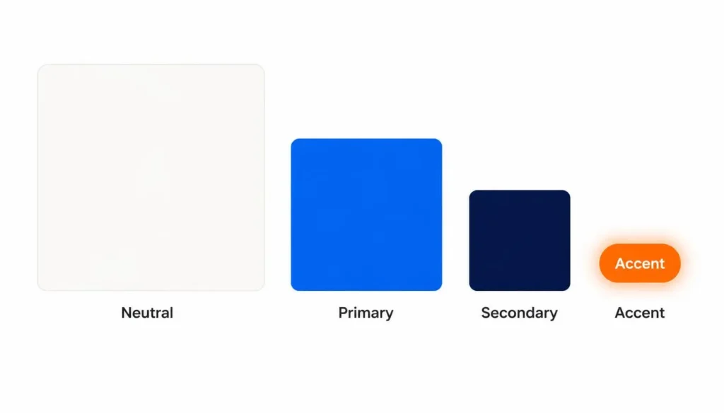
A complete, usable palette is built from four distinct functional roles:
|
Role |
Job |
Typical Surface Area |
|
Primary |
The main brand or design color carries the core identity. |
Dominant |
|
Secondary |
Supports the primary hue, adding depth and contrast. |
Supporting |
|
Accent |
Used for highlights, primary buttons, and critical alerts. |
Small, sparing use |
|
Neutral |
Backgrounds, body text, borders, and structural balance. |
Large (often 60%+) |
Color Theory Foundations You Need First
You do not need a fine arts degree to choose colors, but mastering these fundamentals turns random guessing into a repeatable, scientific process.
The Color Wheel & Primary, Secondary, Tertiary Colors
The color wheel dictates every combination rule:
- Primary colors: Red, Blue, Yellow the absolute base hues.
- Secondary colors: Green, Orange, Purple created by mixing two primaries.
- Tertiary colors: Red-orange, Yellow-green, Blue-violet, etc. created by mixing a primary with an adjacent secondary.
For the full geometry behind these rules, read our deep dive on the Color Theory Wheel.
Hue, Saturation, Lightness (HSL) Building Tints, Shades & Tones
Once you pick a base hue, you build the rest of your usable palette by adjusting three properties:
- Hue: The base color itself.
- Saturation: The intensity or vibrancy of the color.
- Lightness: How close the color sits to pure white or pure black.
|
Term |
What You Add |
Example (Using Base Blue #2D5EFF) |
|
Tint |
White |
#B8CBFF Lighter, ideal for alert backgrounds. |
|
Shade |
Black |
#122E80 Darker, ideal for typography or depth. |
|
Tone |
Gray |
#5A6C9E Muted, ideal for secondary UI borders. |
Expert Tip: Professional web developers build a full lightness scale from one base hue (usually labeled 50 through 900 in CSS variables). The lightest steps become backgrounds, the mid-range becomes the interactive color, and the darkest steps become high-contrast text.
Color Psychology at a Glance
Color shapes emotional response before anyone reads your copy. Use this as a starting signal, but be aware of cultural contexts.
|
Color |
Common Associations |
Good For |
Caution |
|
Red |
Urgency, energy, passion |
Sales, destructive alerts |
Overuse feels aggressive |
|
Blue |
Trust, professionalism |
Corporate, tech, SaaS |
Overuse feels cold or generic |
|
Green |
Growth, balance, success |
Finance, wellness, validations |
Low saturation looks dated |
|
Yellow |
Optimism, attention |
Highlights, warnings |
Very hard to use for text |
|
Black |
Sophistication, power |
Luxury brands, minimal UI |
Heavy use causes eye strain |
Cultural Caveat: These associations are common in Western design contexts. Always validate color choices against your actual target audience.
The 6 Color Combination Types
Choosing the right combination type determines whether your palette feels harmonious or accidental.
- Monochromatic Color Scheme: Different tints and shades of one single hue (e.g., #E8F1FF, #2D5EFF, #16336B). Clean and easy to manage, but can lack contrast.
- Analogous: Colors next to each other on the wheel (e.g., Blue, Blue-Green, Green). Natural feeling, but requires a strong accent color.
- Complementary Colors: Colors directly opposite on the wheel (e.g., Blue and Orange). High contrast, perfect for CTAs, but visually vibrating if overused.
- Split-Complementary: A base color plus the two colors adjacent to its complement. Balanced contrast, more flexible than strict complementary.
- Triadic: Three colors evenly spaced 120° apart. Playful and vibrant.
- Tetradic: Two complementary pairs. Very rich, but incredibly hard to balance.
How to Create a Color Palette: The 8-Step Process
Here is the exact workflow used when engineering custom themes and auditing digital infrastructure. Let’s work through an example using a mid-tone blue (#2D5EFF) as our starting point.
Step 1: Define Your Purpose and Audience
Before touching a color picker, define your goal. A dashboard UI needs to prioritize accessibility and data clarity; a localized B2B cold email outreach campaign template (like those targeting clinics in Dubai) prioritizes immediate trust and brand recognition.
Step 2: Extract a Color Palette From Image
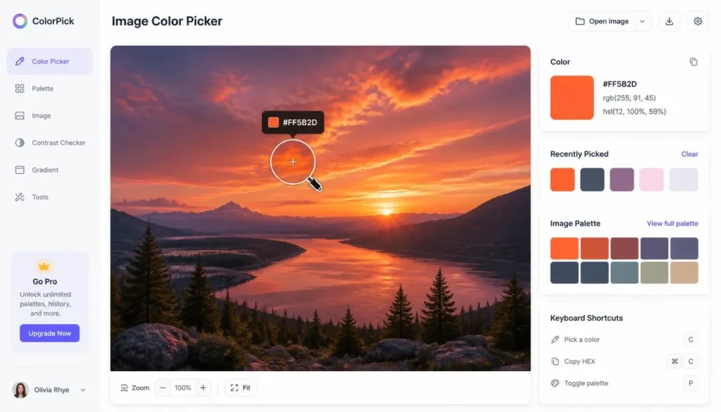
Select a primary color that anchors your message. Often, you aren’t starting from scratch you have a client logo or a hero image you need to match. Do not try to eyeball this. Instead, upload your asset to an image color picker to extract the exact HEX, RGB, and HSL values at the pixel level.
Step 3: Pick a Harmony Rule
Choose one of the combination types above based on your goal. Using our #2D5EFF blue, applying a split-complementary rule generates #FFAE2D (Orange) and #FF5B2D (Red-Orange). Instead of doing the math manually, run your base color through a color scheme generator to instantly pull mathematically perfect supporting colors.
Step 4: Build Out Tints and Shades
Expand your base hues into a lightness scale. Create 2–3 lighter tints for hover states and backgrounds, and 2–3 darker shades for active states and borders. This step turns a conceptual “mood board” into a functioning UI toolkit.
Step 5: Add One Accent Color
Reserve one bold color strictly for items that demand immediate attention (primary buttons, critical links). If your accent color is used everywhere, it stops functioning as an accent.
Step 6: Choose Neutrals
Add off-whites, mid-grays, and dark slates. In reality, neutrals cover the vast majority of your digital real estate. Pure white (#FFFFFF) and pure black (#000000) cause immense eye strain on screens opt for #F9FAFB and #121212 instead.
Step 7: Test Every Pairing for Contrast (Real-World Application)
A palette that looks beautiful in Figma can fail disastrously in the browser. You must check your text-to-background combinations against WCAG standards.
- The Reality Check: During a technical website audit and traffic drop recovery project for the e-commerce website Shanko, a major conversion roadblock was traced directly back to poor visual hierarchy and failing contrast on mobile checkout buttons. Adjusting the saturation of their primary action colors and strictly separating their neutrals recovered lost user trust and improved interaction rates.
Always verify your CSS pairings using a color contrast checker before pushing to production.
Step 8: Apply and Document
Document your exact hex codes as CSS variables or Design Tokens. Consistency is a documented reference that everyone on your team strictly follows.
Advanced Information Gain: Handling Edge Cases
What happens when a client’s strict brand colors fail WCAG accessibility standards?
This is a common issue when converting print-first brands to digital spaces. If an established brand yellow fails contrast against white backgrounds, do not abandon the brand identity. Instead, apply Information Architecture compromises:
- Use the non-compliant brand color only for decorative UI accents or large, non-functional hero elements.
- Darken the hue by 10-15% specifically for digital text use (users rarely notice this slight shift).
- Implement a structural Dark Mode toggle, allowing the bright brand colors to pass contrast against dark backgrounds instead.
The 60-30-10 Rule for Applying Your Palette
Once you create a color palette, how do you apply it without making the interface look chaotic? You use the 60-30-10 rule:
- 60% Dominant color: Usually your lightest neutral or primary brand color.
- 30% Secondary color: Adds depth, used for cards, headers, and navigation.
- 10% Accent color: Reserved strictly for primary buttons and CTAs.
Accessible Color Palettes: Meeting WCAG 2.2 Standards
Accessibility is an SEO ranking factor and a legal requirement. When optimizing local sites such as resolving technical bottlenecks for Abbotsford Physiotherapy or Cedar ridge dental ensuring that text contrast met WCAG AA guidelines directly improved time-on-site for older demographics navigating the clinic’s services.
|
Level |
Normal Text |
Large Text (18pt+) |
UI Components |
|
AA (Minimum) |
4.5:1 |
3:1 |
3:1 |
|
AAA (Enhanced) |
7:1 |
4.5:1 |
Not defined |

Best Tools for Creating a Color Palette
Manual hex math is outdated. Leverage algorithmic tools to build your CSS foundation:
|
Tool |
Best For |
Standout Feature |
|
Adobe Color |
Advanced, harmony-based generation |
Deep Creative Cloud integration |
|
Coolors |
Casual palette exploration |
Fast spacebar-generation workflow |
|
colorschemecalculator.com Color Palette Generator |
Building full developer palettes |
Generates automated tints/shades alongside a contrast checker |
If you are suffering from a creative block during a rebranding phase, running a random color generator can provide unexpected, algorithmically sound inspiration.
Frequently Asked Questions (FAQ)
What’s the difference between a color palette and a color scheme?
A color scheme is the underlying harmony rule typically 2 to 4 base hues chosen using a relationship like complementary or analogous. A color palette is the full, expanded set built from that scheme, usually 5 to 8+ colors once tints, shades, and neutrals are added.
How do I create a color palette from scratch?
Start by defining your project’s purpose, choose one primary color, apply a harmony rule from the color wheel to build 1 to 2 supporting colors, expand those into tints and shades, add one accent color and 2 to 3 neutrals, and finally test every pairing for WCAG contrast.
How many colors should a color palette have?
Most working palettes land between 3 and 6 core colors one primary, one to two secondary, one accent, and two to three neutrals before expanding any of them into lighter tints and darker shades.
What’s the difference between a primary, secondary, and accent color?
The primary color carries your main identity and dominates the design. Secondary colors support it and add depth. The accent color is used sparingly for the one element you want noticed most, like a call-to-action button.
How do I build a color palette from a photo or logo?
Upload the image to a pixel-level image color picker tool, hover to zoom into the exact area you want, and click to capture the precise HEX, RGB, and HSL values. This is mathematically more accurate than trying to match a brand color by eye.
What is the 60-30-10 rule?
It is a distribution ratio for applying a finished palette: 60% dominant color, 30% secondary color, and 10% accent color. It keeps a design structurally balanced and forces user attention to the accent, since it appears nowhere else.
What are complementary colors?
Complementary colors sit directly opposite each other on the color wheel (like blue and orange) and create high, vibrant contrast. Analogous colors sit next to each other and create calm, low-contrast harmony.
How do I choose a color palette for my brand vs. my website?
A brand palette needs to be memorable and perfectly consistent across every physical and digital touchpoint. A website UI palette must prioritize accessibility, readability, and conversion rates, using visual hierarchy to guide user actions.
What colors work best for a call-to-action button?
Warm colors such as red, orange, and yellow generally perform best for CTAs because they visually advance toward the eye and feel urgent, especially when placed against cooler, neutral backgrounds.
How do I know if my color palette is accessible?
Check every text and background pairing you plan to use against WCAG contrast requirements. Normal text requires a 4.5:1 ratio, and large text requires a 3.0:1 ratio. Free contrast checking tools verify this instantly.
What are the most common color palette mistakes?
Using too many core colors, ignoring digital contrast accessibility, following fleeting design trends instead of mathematical harmony rules, and failing to ocument exact hex codes as a single source of truth for your development team.
What’s the best free tool to create a color palette?
A dedicated color palette generator that includes a matching contrast checker and image color picker in one unified dashboard removes friction points allowing you to generate, verify accessibility, and export CSS instantly.
How do I turn a color palette into tints, shades, and tones?
Add white to a base hue to create a tint (lighter), add black to create a shade (darker), and add gray to create a tone (muted). Professional design systems build a full 9-step scale (100 to 900) from one base hue this way.
How do I keep a color palette consistent across a whole project?
Document the exact hex codes for every color, tint, and shade as a single source of truth. Implement them directly into your codebase as CSS variables or design tokens so no developer ever has to “eyeball” a match again.
|
About the Author: Authored by Adil Farooq, Senior SEO & Technical Growth Lead. Learn more about our editorial and design standards at Colorschemecalculator. |