Quick answer:
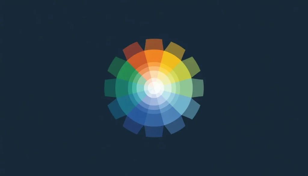
A color theory wheel is a circular diagram that arranges the visible hues in spectrum order, meaning colors sitting near each other share visual similarities and colors sitting opposite each other create maximum contrast. Designers use it to apply geometric harmony rules such as complementary, analogous, and triadic instead of guessing which colors belong together.
Every strong color decision in graphic design, digital marketing, and web development starts in the exact same place: the color theory wheel. It is the ultimate foundational tool that professionals reach for when a palette needs to look intentional instead of accidental. Whether you are designing a high-converting SaaS dashboard, building a brand identity, or shipping an interactive UI, the colors you choose dictate how users perceive, trust, and act on your product.
This master guide covers the color theory wheel end to end: the color models behind it, the six scientific harmony rules built on it, the psychology it triggers, and the strict WCAG accessibility math required to ensure your palette works for all real-world users.
Table of Contents In This Guide:
Instead of relying on guesswork, designers use the color theory wheel to make calculated, defensible choices.
A Brief History of the Color Theory Wheel
To master modern applications, you must understand the entities that pioneered color science:
- Isaac Newton (1666): Bent white light through a prism and arranged the resulting visible spectrum into a circle, effectively creating the first color theory wheel.
- Johann Wolfgang von Goethe (1810): Published Theory of Colors, arguing that color is inherently tied to human perception and emotion, laying the groundwork for modern color psychology.
- Albert H. Munsell (Early 1900s): Introduced a 3D color space defining hue, value (lightness), and chroma (saturation) as independent, mathematically measurable dimensions.
- Johannes Itten (1920s): A Bauhaus theorist who formalized the 12-hue wheel most digital designers use today, defining the distinct types of contrast we still teach.
|
Model |
Primary Colors |
Best Used For |
Where You’ll Meet It |
|
RYB (Traditional) |
Red, Yellow, Blue |
Painting, art theory |
Art class, print sketching |
|
RGB (Additive/Light) |
Red, Green, Blue |
Screens, UI, web design |
CSS, Figma, displays |
|
CMYK (Subtractive) |
Cyan, Magenta, Yellow, Key (Black) |
Print production |
Print shops, packaging |
|
HSL / HSB (HSV) |
Describes RGB geometry |
Adjusting lightness |
CSS hsl(), software sliders |
The practical implication: If you are designing for the web, think exclusively in RGB or HSL, not RYB. Mixing light (additive) behaves differently from mixing pigment (subtractive). The RYB color theory wheel is great for teaching concepts, but the actual colors your monitor emits are RGB.
The Modern Standard: Why OKLCH Replaces HSL in 2026 Web Design
While HSL (Hue, Saturation, Lightness) has been the web standard for years, it possesses a major conceptual flaw: it is not perceptually uniform. In HSL, a pure yellow at 50% lightness appears massively brighter to the human eye than a pure blue at 50% lightness.
In modern 2026 web development and UI systems, the OKLCH (Lightness, Chroma, Hue) color space has become the new standard. OKLCH guarantees perceptual uniformity. This means if you programmatically generate a color palette for a UI, every hue at 60% lightness will look identically bright to the human eye, ensuring consistent contrast across your entire application.
- Primary Colors: The base colors that cannot be created by mixing others. In digital (RGB), these are Red, Green, and Blue.
- Secondary Colors: Created by mixing two primary colors in equal parts (e.g., in RGB: Red + Blue = Magenta).
- Tertiary Colors: Formed by mixing a primary color with an adjacent secondary color (e.g., Blue-Cyan or Red-Magenta).
Warm Colors vs. Cool Colors
Draw a line straight through the center of your 12-hue color theory wheel to split it into two temperature halves.
|
Temperature |
Hues |
Visual Effect |
Common UI Use |
|
Warm |
Red, orange, yellow |
Advance toward the viewer; energetic, urgent |
CTAs, sales banners, alerts |
|
Cool |
Blue, green, violet |
Recede from the viewer; calm, professional |
Corporate backgrounds, tech brands |
Core Color Properties: Hue, Saturation & Lightness
Beyond its position on the wheel, every digital color has three measurable properties.
- Hue: The color itself (red, blue, green), expressed in CSS as a degree from 0–360° on the color theory wheel.
- Saturation (Chroma): The intensity of the color. High saturation is vivid and bold; low saturation is dull, muted, or grayish.
- Brightness (Value) vs. Lightness: These are not the same. HSB/HSV’s “Value” measures brightness independent of white content. HSL’s “Lightness” pushes any hue toward pure white as it approaches 100%. If your CSS colors look washed out, it is because you are confusing Lightness with Brightness.
Tint, Shade & Tone
|
Term |
What You Add |
Visual Effect |
Example (From Blue) |
|
Tint |
White |
Lighter, softer |
Sky Blue |
|
Shade |
Black |
Darker, deeper |
Navy Blue |
|
Tone |
Gray |
Muted, sophisticated |
Slate Blue |
1. Complementary Colors (High Contrast)
Colors sitting directly opposite each other on the color theory wheel.
- Example: Deep Blue (#2D5EFF) paired with Vibrant Orange (#FF8C2D).
- Best For: Call-to-action (CTA) buttons and alert badges.
- Warning: Using two fully saturated complementary colors side by side causes visual vibration and eye strain. Let one color dominate 90% of the space.
2. Analogous Colors (Low Tension)
Three colors sitting next to each other on the wheel.
- Example: Blue (#2D5EFF), Blue-Cyan (#2DB1FF), and Cyan-Green (#2DFFD1).
- Best For: Background gradients, calm branding, and cohesive digital aesthetics.
3. Triadic Colors (Balanced Vibrancy)
Three colors evenly spaced around the wheel, exactly 120° apart.
- Example: Red (#E63946), Yellow (#F4D35E), Blue (#457B9D).
- Best For: Creative agencies, playful SaaS platforms, and data visualizations.
4. Split-Complementary Colors
A base color plus the two colors directly adjacent to its true complement.
- Best For: Designers who want the boldness of a complementary pairing without the harsh visual vibration.
5. Tetradic (Double Complementary)
Two complementary pairs used together, forming a rectangle on the color theory wheel.
- Warning: This is the easiest scheme to overload. You must allow one color to dominate while the other three act strictly as accents.
6. Monochromatic Colors
Different tints, shades, and tones built from a single base hue.
- Best For: Clean, minimal, luxury UI/UX interfaces that require low cognitive load.
Quick Reference: Choosing Between Harmony Rules
- Need bold contrast for a CTA button? → Complementary
- Need a calm, cohesive background? → Analogous
- Need a playful, energetic brand? → Triadic
- Need strong contrast without harshness? → Split-Complementary
- Need a minimal, elegant, editorial look? → Monochromatic
- Choose a Base Color: Start with a primary brand color. If you are starting from scratch, use our Interactive Color Wheel Tool to visually map a hue that matches your brand’s emotional tone.
- Select a Harmony Rule: Apply one of the geometric rules (like Triadic or Analogous) based on your interface’s contrast needs.
- Generate the Palette: Instead of calculating HEX codes manually, push your base color through our Free Color Scheme Generator to automatically lock in your mathematically perfect harmonies.
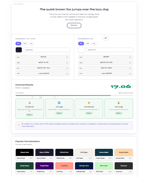
- Check Accessibility: A beautiful palette is useless if it is unreadable. Test your foreground text against your background hues using our Free Color Contrast Checker to verify WCAG AA or AAA compliance before you write a single line of code.
- Export for Production: Expand your approved colors into lighter tints and darker shades for UI hover states using our comprehensive Color Palette Generator.
|
Color |
Common Associations |
Best UI Use Cases |
Cultural Caution |
|
Red |
Energy, passion, urgency |
Alerts, sales, destructive actions |
Can read as aggressive if overused |
|
Blue |
Trust, calm, security |
Corporate tech, finance, healthcare |
Overuse feels cold or sterile |
|
Green |
Growth, success, nature |
Wellness, “Success” states, finance |
Low saturation can look sickly |
|
Yellow |
Optimism, attention |
Warnings, highlight accents |
Extremely hard to read as text |
|
Black/White |
Sophistication, space |
Minimalist design, luxury text |
Requires accents to avoid looking sterile |
Cultural Caveat: These associations are common in Western design but are not universal. White signals purity in the West but often signals mourning in East Asia. Always validate color choices against your specific global audience.
/* Example 60-30-10 Palette Implementation in CSS */
:root {
  /* 60% Dominant Surface (Backgrounds) */
  --surface-primary: #F7F9FC;

  /* 30% Secondary Structure (Text & Borders) */
  --text-main: #16233F;

  /* 10% Accent CTA (Split-Complementary) */
  --brand-accent: oklch(65% 0.18 45); /* Modern Web Standard */
  --brand-accent-hex: #FF8C2D;        /* Legacy Fallback */

  --brand-accent-hover: #E07A25;      /* Darkened shade for interaction */
}

.button-primary {
  background-color: var(--brand-accent, var(--brand-accent-hex));
  color: #FFFFFF; /* Verified 4.5:1 WCAG AA Contrast */
  transition: background-color 0.3s ease;
}

.button-primary:hover {
  background-color: var(--brand-accent-hover);
}
Accessibility & the Color Wheel: Meeting WCAG Standards
This is the most critical, yet most frequently skipped, step of applying color theory.
The WCAG (Web Content Accessibility Guidelines) defines the mathematical contrast ratios a color pairing needs to be considered legally and visually readable.

|
Level |
Normal Text |
Large Text (18pt+ or 14pt Bold) |
UI Components |
|
AA (Minimum) |
4.5:1 |
3:1 |
3:1 |
|
AAA (Enhanced) |
7:1 |
4.5:1 |
Not defined |
Accessibility Best Practices:
- Never rely on color alone: Color-blind users may not perceive a red border; always pair an error state’s color with an icon or a text label.
- Check interactive states: A button might pass AA contrast in its default state but fail when darkened during a “hover” or “disabled” state.
- APCA: Be aware that a newer perceptual contrast method called APCA is emerging, though 4.5:1 remains the strict legal standard today.
The 60-30-10 Rule in UI Design
To prevent your color theory wheel selections from turning into visual chaos, distribute them using the 60-30-10 rule:
- 60% Dominant Color: Usually a neutral background.
- 30% Secondary Color: Supports the layout (headers, structural UI).
- 10% Accent Color: Reserved exclusively for primary calls to action.
Frequently Ask Questions (FAQs)
What is a color theory wheel?
A color theory wheel is a circular diagram that arranges the visible hues in spectrum order so their relationships which colors are similar, which contrast most become visually obvious. Designers use it to apply harmony rules instead of guessing.
Who invented the color wheel?
Isaac Newton created the first circular color diagram in 1666 by arranging the hues produced by a prism into a circle. Johann Wolfgang von Goethe, Albert Munsell, and Johannes Itten later expanded on this with psychological and contrast-based refinements.
What are the three primary colors?
In the traditional RYB color wheel, the three primary colors are red, blue, and yellow. In digital screens (RGB), the primary colors are red, green, and blue.
What’s the difference between the RGB and RYB color wheels?
RYB is a subtractive, pigment-based model used in traditional art. RGB is an additive, light-based model used for screens and web design. Mixing light and mixing paint are physically different processes.
What’s the difference between HSL and HSB (HSV)?
Both describe a color using hue, saturation, and a third dimension of lightness or brightness. HSL’s Lightness pushes any hue to pure white at 100%. HSB’s Value keeps a color vivid at full brightness.
What are complementary colors used for?
Complementary colors sit directly opposite each other on the wheel and create the strongest possible contrast, making them ideal for call-to-action buttons, logos, and critical UI elements.
What’s the difference between analogous and triadic color schemes?
Analogous colors sit next to each other on the wheel and create calm harmony. Triadic colors are evenly spaced 120° apart and create vibrant, balanced contrast.
What is a split-complementary color scheme?
Instead of using a color’s exact opposite, you use the two colors adjacent to that opposite. This maintains strong contrast while feeling less visually harsh than a true complementary pairing.
What’s the difference between a tint, a shade, and a tone?
A tint is a hue with white added. A shade has black added. A tone has gray added, making it more muted and sophisticated.
Are warm or cool colors better for a call-to-action button?
Warm colors (red, orange, yellow) generally perform better for CTAs because they visually advance toward the viewer and read as energetic, making them stand out against cooler backgrounds.
How many colors should a website or brand use?
Most well-designed digital projects work strictly within 3 to 5 main colors.
What is the 60-30-10 rule in design?
It is a distribution ratio for color: 60% dominant color, 30% secondary color, and 10% accent color. It keeps a palette balanced and directs the eye toward the 10% accent.
What contrast ratio do I need to pass WCAG AA?
WCAG 2.2 Level AA requires a contrast ratio of at least 4.5:1 for normal text and 3:1 for large text (18pt+) and UI components like buttons.
Does color psychology change across cultures?
Yes. While “blue means trust” is common in Western contexts, it is not universal. Always validate color choices against the specific global audience.
What’s a free tool to build a color wheel palette with accessibility built in?
The color tools on this site allow you to pick a base color, apply harmony modes, and see a live WCAG contrast pass/fail result instantly.
Conclusion
Mastering the color theory wheel transforms UI/UX and graphic design from a guessing game into a repeatable, mathematical system. By understanding geometric relationships, applying structural harmony rules, and rigorously checking WCAG accessibility standards, your designs will become instantly more professional and user-friendly.
Start simple. Choose a base hue, apply a harmony rule using our calculators, verify your contrast, and ship your next project with absolute confidence.
Authored by Adil Farooq, Senior SEO & Technical Growth Lead. Learn more about our editorial and design standards at Colorschemecalculator.