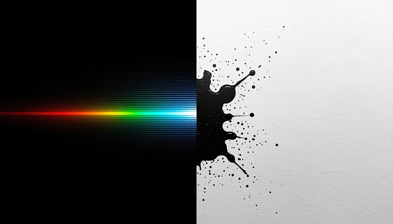
RGB and CMYK are the two color models that run almost every visual you will ever produce. The core difference between RGB and CMYK is that RGB is an additive color model that uses light to display colors on digital screens, while CMYK is a subtractive color model that uses physical ink to print colors on paper. Because screens emit light and paper absorbs it, these two models have completely different color ranges (gamuts).
If you only remember one rule from this article, make it this: design and QA on-screen work in RGB, and design and QA anything headed for a printing press in CMYK. Everything else—gamut limits, color shifts, and conversion workflows—is a consequence of that one crucial decision.
RGB vs CMYK at a Glance
Attribute | RGB | CMYK
Color model type | Additive (adds light) | Subtractive (removes light via ink)
Base channels | Red, Green, Blue | Cyan, Magenta, Yellow, Black (Key)
Medium | Light — screens, projectors | Ink, toner, or dye — paper, fabric, packaging
Approx. color gamut | ~16.7 million colors | Smaller range; misses many neons and deep blues
White is… | 255, 255, 255 (all channels full) | 0%, 0%, 0%, 0% (no ink — bare paper)
Black is… | 0, 0, 0 (all channels off) | Usually a “rich black” mix, not just 100% K
Typical use case | Websites, apps, social graphics | Business cards, packaging, magazines
What Is RGB? (Additive Color)
RGB is an additive model: a screen starts completely black, and every pixel adds red, green, and blue light on top of that darkness until it reaches the desired color. When all three channels are pushed to their maximum intensity, they create pure white light.
Each channel is typically expressed on an 8-bit scale from 0–255. This is the exact math behind hex codes—a hex code is simply RGB values packed into a six-digit base-16 shorthand that web browsers and design tools can read instantly. That is why RGB to HEX conversions are so common in web design; they are the same three numbers, just written in a different notation.
Most cameras, monitors, and design software default to the sRGB color space. This is intentionally a common denominator so images look reasonably consistent across devices. Wider spaces like Adobe RGB or Display P3 can reproduce noticeably more vivid colors, but only on hardware built to display them. This is one reason a color that looks electric on an expensive monitor can look flat on an older smartphone, long before print even enters the picture.
Where RGB Is Used:
• Websites, web apps, and user interface (UI) design
• Social media graphics, digital ads, and email campaigns
• Video, motion graphics, and streaming content
• Any asset that will only ever be viewed on a backlit screen
What Is CMYK? (Subtractive Color)
CMYK is a subtractive model: it starts from white paper reflecting all light back at your eye. Each layer of cyan, magenta, or yellow ink absorbs (subtracts) part of that light so only the intended color reflects back.
In theory, mixing cyan, magenta, and yellow at full strength should produce pure black. In practice, real-world ink produces a muddy, unsaturated dark brown. This is exactly why the fourth channel, K (Key/black), exists. It is added specifically to produce clean shadows and legible text without burning through three thick layers of colored ink.
This is also where “rich black” comes from. Professional printers often build black out of a mixture like 60% Cyan / 40% Magenta / 40% Yellow / 100% K rather than 100% K alone. A pure-K black can look thin and slightly gray on large print areas. Print production also layers in variables that do not exist on screen at all: paper stock (coated stock holds ink crisper than uncoated), halftone dot screening, and ICC printer profiles that tell a print shop’s equipment how to interpret your CMYK values.
Where CMYK Is Used:
• Business cards, brochures, and stationery
• Product packaging and labels
• Magazines, books, and offset press runs
• Apparel and merchandise printing
Why Colors Shift Between Screen and Print
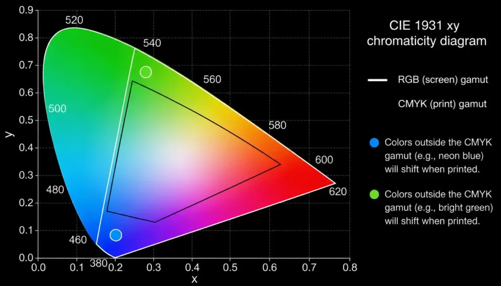
This is the question behind most “my colors printed wrong” support tickets, and it is rarely a mistake—it is math. Every monitor displays color using emitted light in a comparatively huge gamut. Every printer reproduces color using reflected light off ink-covered paper in a materially smaller gamut.
When software auto-converts an out-of-gamut RGB color to its nearest CMYK equivalent, it is making a judgment call, not a lossless translation. Neon greens, electric blues, and very saturated purples are the most common casualties. They exist happily in an RGB file and then clip to a duller, closest-available shade in CMYK. The fix is not a better monitor; it is building and testing your palette with the destination medium in mind from the very beginning.
Establishing Harmonious Core Colors Before You Finalize a Format
The mistake most beginners make is picking a color first and worrying about the color model second. Instead, you should lock in your color relationships—complementary, analogous, or triadic—before you commit to whether the final asset will live in RGB or CMYK.
This is exactly the gap a color theory calculator (https://colorschemecalculator.com/) is built to close. Instead of eyeballing whether two brand colors actually complement each other, run the base hue through a calculator first to confirm the harmony mathematically. Once you establish the foundation, you can then adapt that palette for the medium it is headed to. To speed up this conceptual phase, a dedicated color scheme generator (https://colorschemecalculator.com/color-scheme-generator/) will let you test accessible, visually pleasing palettes before you begin formatting files.
Converting Between RGB and CMYK Without Losing Quality
Color conversion has a vocabulary of its own, and it is worth being precise about it. RGB to HEX conversions stay entirely inside the digital world, so no color fidelity is lost. The conversion that actually costs you color fidelity is moving from RGB to CMYK, because you are forcing a larger gamut into a smaller one.
The reverse workflow also comes up constantly: a client hands you a logo built for packaging, and now it needs to go on the homepage. Because those original CMYK values were tuned for how ink absorbs light, a literal numeric conversion often looks flat and gray on a screen. Converting CMYK to RGB (https://colorschemecalculator.com/cmyk-to-rgb-converter-guide/) properly re-establishes the intended digital saturation and brightness so the digital version pops.
Whichever direction you are moving, treat every handoff as a deliberate step. Run your values through a proper color converter (https://colorschemecalculator.com/color-converter/) rather than eyeballing the shift. It takes the guesswork out of moving a design between screen and paper.
A Practical Pre-Press Checklist
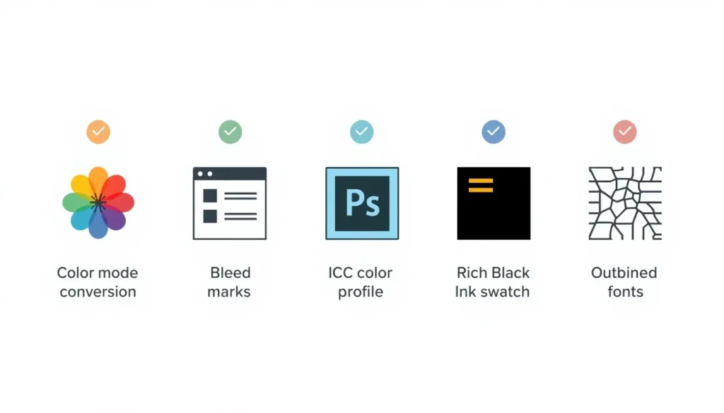
Before any file leaves your desk for a print run, run it through this list to ensure your CMYK conversion translates perfectly in the real world:
1. Convert the color mode to CMYK inside the file itself—do not let the printer’s software guess.
2. Embed the correct ICC color profile for your print vendor (ask them which one they expect).
3. Set your bleed margins (typically 0.125″) and keep critical text inside the safe zone.
4. Double-check your rich black recipe on any large dark areas.
5. Outline or embed all fonts so nothing reflows on the printer’s end.
6. Export as a press-ready PDF/X, TIFF, or EPS at 300 DPI minimum.
Do Not Forget Digital-Side QA Either
Print has pre-press checks, but digital work needs its own quality pass before launch. Run your RGB text-and-background pairings through contrast checks to confirm you are meeting WCAG accessibility ratios. A palette that reads perfectly to you on a high-end monitor may collapse into indistinguishable grays for a meaningful share of your audience. Establishing accessibility takes minutes and catches problems no amount of RGB-vs-CMYK precision will.
Design Once, Deploy Correctly Everywhere
The difference between RGB and CMYK is not a technicality to memorize once and forget. It is the reason your brand can look identical on a phone screen and on a printed box, or completely mismatched, depending on whether the switch between the two was handled deliberately. Build your palette on real color theory, design in the medium’s native mode, and treat every color handoff as a deliberate conversion step rather than an afterthought.
4. FREQUENTLY ASKED QUESTIONS
Q: Why does my CMYK print look different from my RGB screen design?
A: Because RGB (light) covers a larger color gamut than CMYK (ink) can physically reproduce. Highly saturated colors—especially neon greens, electric blues, and bright purples—get mapped to the closest reproducible CMYK equivalent, which is almost always less vibrant than what you saw on screen.
Q: Can I convert CMYK to RGB without losing color quality?
A: Yes, and it is actually the safer direction of the two conversions, since you are moving from a smaller gamut into a larger one, so nothing needs to clip. The main risk is the opposite problem: the converted color can look under-saturated on screen unless it is adjusted to reflect how much more vivid light-based color can appear.
Q: Should I design my logo in RGB or CMYK?
A: Design the master file in RGB, since that is the native mode of nearly every design tool. Then, export dedicated CMYK and Pantone spot-color versions specifically for print use cases. Keeping one RGB source file and generating format-specific exports from it is more reliable than maintaining two separate originals.
Q: What is “rich black” and why can’t I just use 100% K?
A: 100% K alone (pure black ink with no cyan, magenta, or yellow) can look slightly gray and thin, especially on large printed areas. Rich black blends a small amount of cyan, magenta, and yellow underneath the black to deepen it—a common recipe is roughly 60% C, 40% M, 40% Y, and 100% K.
Q: Do I actually need a color theory calculator, or can I just eyeball my palette?
A: You can eyeball it, but you are relying on intuition to confirm mathematical relationships. Complementary, analogous, and triadic harmonies are defined by precise positions on the color wheel. A calculator confirms those relationships hold before you invest time finalizing a palette, which is especially valuable right before you split that palette into separate RGB and CMYK versions.