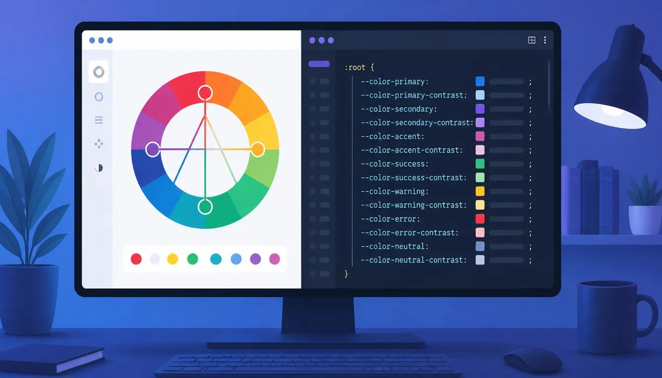
Every design system hits the same wall eventually: someone picks a blue, ships it, and three sprints later there are six near-identical shades of that blue scattered across the codebase and none of them pass a contrast check. A tailwind color generator solves the second half of that problem, turning one brand color into a full, predictable shade scale. But it only produces something worth shipping if you feed it colors that are mathematically related to begin with. This guide walks the whole pipeline: choosing harmonious base hues with real color theory, then wiring them into Tailwind CSS v4’s native @theme tokens and Bootstrap 5.3’s Sass color maps, with contrast and dark mode handled from the start instead of patched in later.
Why “Just Pick a Hex Code” Doesn’t Scale
Most broken theming systems don’t start broken. They start with one designer or developer eyeballing a brand color in a picker, typing the hex into a config file, and moving on. The cracks show up later, in predictable places:
- Hover, active, and disabled states get invented ad hoc instead of derived from a formula, so every component looks slightly different.
- Nobody checks whether the lightest tint still reads against a white card or the darkest shade still reads against black text, until a screen-reader or contrast audit flags it.
- Dark mode is bolted on by darkening a handful of grays, while the brand color itself stays exactly as saturated as it was in light mode, so it glows.
- Tailwind and Bootstrap projects in the same organization end up with two different “blues” that were never meant to be different.
Every one of these is a symptom of the same root cause: the color decisions were never anchored to anything mathematical. That’s the gap a proper color workflow, theory first, generator second, is built to close.
Start With Color Theory, Not With Hex Codes
A color wheel is a circle of hue values from 0° to 360°, and the classic color-theory relationships are just fixed angles on that circle:
- Complementary, 180° apart. High contrast, good for a primary/accent pairing.
- Analogous, within about 30° of each other. Low contrast, cohesive, good for backgrounds and subtle UI layers.
- Triadic, three hues spaced 120° apart. Balanced and vibrant, common in product illustration.
- Tetradic, two complementary pairs, spaced roughly 90° apart. Flexible but needs one hue to dominate or it gets noisy.
- Monochromatic, one hue, with lightness and saturation doing all the work. Safest option for a data-dense dashboard.
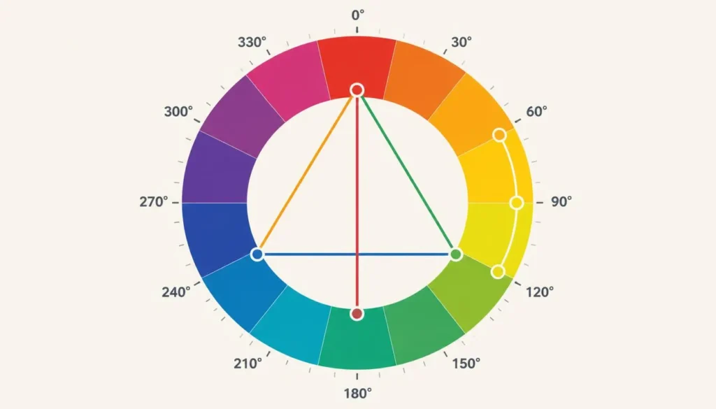
This is exactly where a color theory calculator earns its place in the workflow, ahead of any code editor: hand it one base hue and it returns the exact complementary, triadic, or analogous angles as numbers, not vibes. Say your brand hue is 250° (a blue-violet). Its complement is 70°, its triadic partners are 10° and 130°, and its analogous neighbors sit at roughly 220° and 280°. Those numbers are what you actually carry into the next step, not “a color that looked nice next to it.”
One more piece of theory pays off immediately in code: keep lightness and chroma (saturation) roughly constant across a set of hues, and only the hue angle changes. That’s what makes a generated palette feel like one coherent family instead of several unrelated colors that happen to share a project.
Turning a Base Palette Into a Tailwind CSS v4 Color System
Tailwind v4 moved theme configuration out of tailwind.config.js and into CSS itself, via an @theme block in your stylesheet. Any variable you declare there using the –color-{name}-{shade} naming convention automatically generates matching utilities, bg-*, text-*, border-*, fill-*, with no extra configuration.
Feed the Calculated Hue Into a Full Shade Ramp
Take the hue you calculated above and run it through a color scheme generator to expand it into the full 50–950 tint-and-shade ramp Tailwind’s own palette uses. Because OKLCH separates lightness, chroma, and hue into independent numbers, you can hold lightness and chroma steady across the ramp and only rotate the hue when you switch brand colors, which is why Tailwind’s built-in palette itself is authored in OKLCH rather than hex. This is the actual job a tailwind color generator should be doing for you: outputting a ready-to-paste block like this instead of you hand-tuning eleven oklch() values one at a time.
/* app.css */
@import “tailwindcss”;
@theme {
–color-brand-50: oklch(0.98 0.02 250);
–color-brand-100: oklch(0.95 0.04 250);
–color-brand-200: oklch(0.90 0.07 250);
–color-brand-300: oklch(0.82 0.11 250);
–color-brand-400: oklch(0.73 0.15 250);
–color-brand-500: oklch(0.63 0.19 250); /* base brand hue */
–color-brand-600: oklch(0.55 0.19 250);
–color-brand-700: oklch(0.47 0.17 250);
–color-brand-800: oklch(0.39 0.14 250);
–color-brand-900: oklch(0.31 0.11 250);
–color-brand-950: oklch(0.22 0.08 250);
/* complementary accent, calculated at 250° + 180° = 70° */
–color-accent-500: oklch(0.75 0.17 70);
}
Any element can now use bg-brand-500, text-brand-900, or border-accent-500 directly in your markup, and Tailwind also exposes each token as a plain CSS variable, so you can drop into var(–color-brand-500) anywhere you need it, inline styles, a canvas chart, or a third-party component that doesn’t know about Tailwind classes.
Wiring Up Dark Mode at the Token Level
Dark mode should be a variable swap, not a second parallel color system. Declare a runtime-overridable variable, then re-point it under a data attribute:
@import “tailwindcss”;
:root {
–brand-surface: oklch(0.98 0.02 250);
}
[data-theme=”dark”] {
–brand-surface: oklch(0.22 0.04 250);
}
@theme inline {
–color-surface: var(–brand-surface);
}
Toggle data-theme=”dark” on the <html> element and every bg-surface utility repaints instantly, with zero duplicated class names in your markup.
Building the Same Palette in Bootstrap 5.3 (SCSS)
Bootstrap’s theming model is older and Sass-based, but the underlying idea, one set of calculated colors, generated automatically into every utility and component variant, is identical.
Extending the $theme-colors Map
Bootstrap builds every .btn-*, .bg-*, and .text-* class from the $theme-colors Sass map. Adding a color means merging into that map, never replacing it, and doing so between the functions import and the main Bootstrap import so the !default variables haven’t locked in yet:
// 1. Functions first, needed for color math
@import “bootstrap/scss/functions”;
// 2. Your calculated brand colors
$brand: #3b5bfd; // hue 250°, from the calculator above
$brand-dark: #1c2f9e;
// 3. Core variables, then merge into the theme-colors map
@import “bootstrap/scss/variables”;
@import “bootstrap/scss/variables-dark”;
$theme-colors: map-merge($theme-colors, (
“brand”: $brand,
“brand-dark”: $brand-dark
));
// 4. Everything else
@import “bootstrap/scss/bootstrap”;
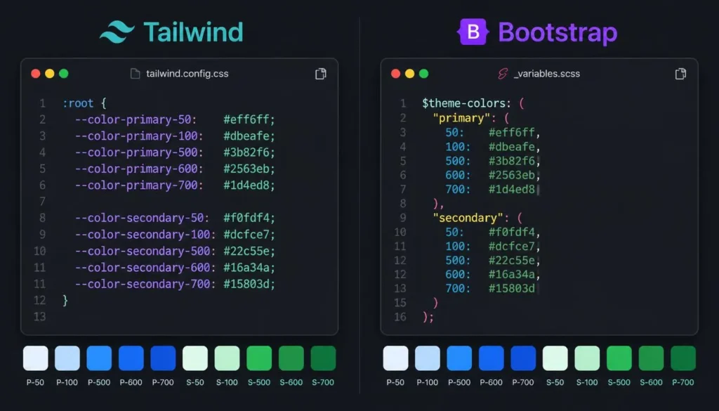
That single merge generates .btn-brand, .bg-brand, .text-brand, and .border-brand automatically, no extra Sass required. Anyone reaching for a bootstrap theme generator is, functionally, looking for a shortcut to exactly this map.
Color Modes (Bootstrap 5.3’s Built-In Dark Mode)
Bootstrap 5.3 introduced first-class color modes, controlled by a data-bs-theme attribute that can sit on <html> or on a single component. Under the hood it’s the same pattern as Tailwind’s dark-mode tokens: swap CSS variables, not classes.
[data-bs-theme=”dark”] {
–bs-body-bg: #101322;
–bs-body-color: #e6e8f5;
–bs-brand: #7c8cff; /* lighter, lower-chroma dark-mode variant */
}
Set <html data-bs-theme=”dark”> and the override cascades everywhere, or scope it to a single card, navbar, or modal by placing the attribute lower in the DOM.
Keep Both Stacks in Sync With One Source of Truth
Plenty of teams run Tailwind on one product and Bootstrap on another, often mid-migration. Rather than maintaining color decisions twice, treat the calculated hues as design tokens and generate both outputs from the same list:
- Calculate the base hue and its harmonious relationships once, with the color theory calculator.
- Expand each hue into an 11-step OKLCH (or hex) ramp with a color scheme generator.
- Store that ramp as plain JSON, name, shade, value.
- Generate the Tailwind @theme block and the Bootstrap $theme-colors map from the same JSON, so “brand-500” means the exact same color in both frameworks.
This is a small amount of tooling for a large amount of long-term consistency, and it’s the difference between a UI color palette that merely looks fine and a design system that actually holds up as the product grows.
Contrast and Accessibility Aren’t Optional
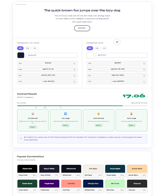
WCAG 2.1 AA requires a contrast ratio of at least 4.5:1 for normal text and 3:1 for large text and UI components like buttons and form borders; AAA raises the bar to 7:1. A hue and lightness that looked perfectly readable in a design tool can fail these numbers once it’s rendered as real text on a real background, which is why every foreground/background pairing your generated palette produces should be run through a free color contrast checker before it ships, not just the primary brand color.
A few checks worth making a habit rather than an afterthought:
- Test the lightest tint (50) against white and the darkest shade (950) against black, both ends of the ramp get used as backgrounds eventually.
- Re-check contrast separately for light mode and dark mode; a pairing that passes in one often fails in the other once lightness values flip.
- Run key UI states through a color blindness simulator, especially any place where color alone (not an icon or label) is the only signal, error states and “success vs. warning” badges are the usual offenders.
Extending the Palette: Gradients and Depth
Once the flat palette is locked in, gradients built from the same tokens read as intentional rather than decorative. In Tailwind v4:
<div class=”bg-gradient-to-r from-brand-500 to-accent-500″>
…
</div>
And the Bootstrap equivalent layers its built-in gradient utility on top of your merged theme color:
<div class=”bg-brand bg-gradient”>…</div>
Multi-stop gradients get hard to judge by editing CSS and refreshing repeatedly, so it’s worth previewing the stops in a CSS gradient generator first, then copying the finalized stop percentages into whichever framework’s syntax you’re using.
A Repeatable Tailwind Color Generator Workflow
Put together, the whole pipeline is six steps, and none of them require guessing:
- Pick one base hue for the brand color.
- Calculate its harmonious relationships (complementary, triadic, or analogous) with a color theory calculator.
- Expand each hue into a full 50–950 shade ramp.
- Paste the ramp into a Tailwind @theme block or a Bootstrap $theme-colors map merge.
- Verify every text/background pairing against WCAG contrast minimums, in both light and dark mode.
- Layer in gradients and dark-mode overrides last, once the base palette is confirmed accessible.
Frequently Asked Questions
What’s the fastest way to generate a Tailwind CSS v4 color palette?
Start with one brand hue, calculate its harmonious relationships with a color theory calculator, then expand each hue into a full 50–950 OKLCH ramp and paste it into a single @theme block, that’s faster and far more consistent than hand-picking eleven shades per color.
How do I add a custom color to Bootstrap 5.3 without breaking the default theme?
Merge it into the existing map instead of replacing it: $theme-colors: map-merge($theme-colors, (“brand”: #yourhex));, placed after @import “bootstrap/scss/variables” and before the main Bootstrap import.
Should Tailwind v4 colors be defined in hex or OKLCH?
OKLCH, where practical. Tailwind’s own default palette moved to OKLCH because lightness and chroma stay visually consistent as hue shifts, which is exactly what keeps a generated ramp looking even instead of muddy in the middle shades.
How many shades does a Tailwind color scale actually need?
Tailwind’s default scale runs 50 to 950 (11 steps). Matching that convention keeps custom colors compatible with any component library or plugin that expects a color-500 to exist; a smaller project can use fewer steps, but it’s worth keeping the same naming pattern.
How does dark mode differ between Tailwind v4 and Bootstrap 5.3?
Both land on the same pattern, swap a CSS variable rather than a class. Tailwind v4 scopes overrides to a selector like [data-theme=”dark”] re-declared through @theme inline; Bootstrap 5.3 does it through its built-in data-bs-theme=”dark” attribute and its _variables-dark.scss file.
What contrast ratio do I need for an accessible custom theme?
WCAG 2.1 AA requires at least 4.5:1 for normal text and 3:1 for large text and UI components. Run every foreground/background pairing from the generated palette through a contrast checker before shipping it, not only the primary brand color.
Can I reuse one calculated palette across a Tailwind project and a Bootstrap project?
Yes, the underlying color math (hue relationships, contrast ratios) is framework-agnostic. The only thing that changes is the output format: an @theme CSS block for Tailwind v4 versus a $theme-colors Sass map for Bootstrap 5.3.
Conclusion
A tailwind color generator is only as good as the math behind the colors it’s fed. Calculate harmonious hues first, expand them into a full shade ramp, verify contrast in both light and dark mode, and only then wire the result into Tailwind’s @theme tokens or Bootstrap’s $theme-colors map. Do the steps in that order and the palette holds up months later, in both frameworks, in both color modes, instead of quietly drifting into six shades of almost-the-same blue.