Four colors, one cohesive story, that’s the promise of a tetradic color scheme, and it’s also the hardest color harmony to get right without help. A tetradic color scheme generator removes the guesswork by applying the same geometric logic professional colorists use: two complementary pairs, positioned precisely around the color wheel, balanced by proportion rather than instinct. Whether you’re designing a dashboard, a brand identity, or a marketing site, this guide breaks down exactly what a tetradic scheme is, how a color theory calculator builds one, and how to apply it without your interface turning into a rainbow.
What Is a Tetradic Color Scheme?
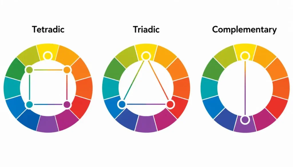
A tetradic color scheme, also called a double-complementary scheme, combines four colors arranged as two complementary pairs on the color wheel. Where a standard complementary pair sits directly opposite each other, a tetradic scheme doubles that relationship, pulling in a second pair from elsewhere on the wheel. The result is a palette with built-in contrast and built-in harmony at the same time: every color has a natural partner, and every pair carries enough visual tension to stay interesting.
Because it draws on four hues instead of two or three, tetradic is considered one of the more advanced color harmonies in color theory. It rewards careful proportion and punishes equal weighting. Give all four colors the same visual space and the design reads as chaotic; give one color dominance and use the other three as support, and the same four hues read as rich, intentional, and cohesive.
The Two Types of Tetradic Harmony
Not all tetradic schemes are built the same way. There are two structural variants, and the distinction matters for how the resulting palette feels:
- Rectangle (double complementary): four colors form a rectangle on the wheel, two pairs of complements that are unevenly spaced (commonly 60° and 120° apart). This is the more common form and the one most tetradic color scheme generators default to, because the uneven spacing gives one pair a bit more natural visual weight, which is easier to balance in a real layout.
- Square: four colors sit exactly 90° apart, evenly dividing the wheel. This produces maximum contrast and demands the most discipline, since no color has inherent dominance and you have to manufacture the hierarchy yourself through size, saturation, or placement.
How a Tetradic Color Scheme Generator (and Color Theory Calculator) Works
A tetradic color scheme generator isn’t guessing, it’s running the same hue math a design student would work out by hand, just instantly. Feed it one base color, and a proper color theory calculator will:
- Convert your base color into HSL (hue, saturation, lightness), since hue rotation is what defines color harmony, not the raw RGB or hex values.
- Rotate the hue by a fixed interval to generate the second complementary pair, positioning it consistently relative to the first.
- Preserve saturation and lightness relationships across all four colors, so the palette reads as one family rather than four unrelated swatches.
- Output hex, RGB, and HSL values for each color, ready to drop into CSS variables, a design tool, or a style guide.
The advantage over eyeballing a tetradic scheme by hand is consistency: a color theory calculator applies the same angular math every time, so the harmony is mathematically sound before you’ve made a single design decision. Try it yourself with our color scheme generator, which lets you preview the full four-color palette instantly from any starting hue.
Tetradic vs. Other Color Harmonies
Tetradic is one of several standard color harmonies, and choosing the right one starts with knowing how they compare against each other on the color wheel.
| Scheme | Colors Used | Contrast Level | Best For | Difficulty |
| Complementary | 2 (opposite) | High | Bold accents, CTAs | Easy |
| Analogous | 3 (adjacent) | Low | Calm, cohesive designs | Easy |
| Triadic | 3 (evenly spaced) | Medium-High | Playful, vibrant brands | Moderate |
| Tetradic (Rectangle) | 4 (two pairs) | High | Dashboards, multi-element UI | Advanced |
| Monochromatic | 1 hue, varied shades | Low | Minimalist, elegant UI | Easy |
Where tetradic distinguishes itself is range: no other standard harmony gives you four independently useful colors while still guaranteeing they’ll relate to one another. That range is exactly why it suits complex interfaces, dashboards, data visualizations, and multi-brand product suites, where two or three colors aren’t enough to encode meaning. If you want to see the underlying geometry for every harmony type side by side, the interactive color theory wheel maps out exactly how tetradic, triadic, and analogous angles differ. And because a tetradic scheme is built from two complementary pairs, it’s worth understanding complementary colors on their own first, that single relationship is the building block the entire tetradic system is layered on top of.
How to Use a Tetradic Palette in Web Design
Four colors is a lot of color for one interface. The schemes that work are the ones that assign every color a job, rather than letting each hue compete for attention.
Assign Roles, Not Just Colors
- Dominant (about 60%): typically your primary background or brand color, the hue that sets the overall tone.
- Secondary (about 30%): supports the dominant color, often used for headers, navigation, or secondary UI elements.
- Two accents (about 10% combined): reserved for buttons, alerts, and links. This is where the two “extra” colors in a tetradic scheme earn their place, they read as intentional accents rather than noise.
Where Tetradic Palettes Excel
- UI color palettes for dashboards that need to color-code multiple data categories at once
- Marketing sites that need a primary brand color plus distinct call-to-action and alert states
- Editorial or portfolio sites using color to separate categories or sections

Dark Mode and Tetradic Schemes
Dark mode color schemes are unusually well suited to tetradic palettes: the near-black background absorbs two of the four colors as neutral-adjacent tones, while the remaining two carry full saturation as accents. If you’re adapting a light-mode tetradic base for a dark UI, lower the saturation and raise the lightness slightly on any color that will sit behind body text, to avoid eye strain against a dark background.
Accessibility and Contrast in a Tetradic Palette
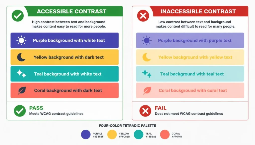
More colors mean more chances to fail a contrast check. A tetradic scheme with four saturated hues can look striking and still be functionally unreadable if any text-and-background pairing falls short of accessibility guidelines.
Before shipping a tetradic palette, run every foreground and background pairing you actually intend to use through a color contrast checker, not just the two “main” colors. It’s common for a scheme to pass on the dominant-and-background pairing and fail on one of the accent colors against white or dark text.
It’s also worth testing the palette against common color vision deficiencies. Because tetradic schemes rely on four distinct hues to carry meaning, a pattern common in dashboards and data visualization, they’re especially vulnerable to conditions like deuteranopia and tritanopia, where two of your four “distinct” colors can collapse into looking nearly identical. If your interface uses color as the only signal, add a secondary cue, an icon, a label, or a pattern, so the design stays usable even when a color pairing isn’t distinguishable.
Color Psychology and Branding With Tetradic Schemes
Because a tetradic scheme spans four points on the wheel, it naturally pulls from more than one “color family,” which is part of why it suits brands that need to communicate more than one attribute at once, trustworthy and energetic and premium, rather than leaning on a single dominant message.
- A warm dominant color paired with cool accents can project energy balanced by calm and trust.
- A brand that already owns one complementary pair, such as its existing logo colors, only needs a tetradic scheme generator to solve for the second pair, preserving ownership over half the palette.
Color meaning in marketing is well documented at the level of individual hues, but with four hues working together, the psychological read comes from proportion as much as from choice. The same four colors in different ratios can feel corporate, playful, or luxurious.
Step-by-Step: Generating Your Tetradic Color Scheme
- Start with your base color, usually your existing brand color or a hue that matches the mood you’re after.
- Enter it into a tetradic color scheme generator, by hex, RGB, or by picking directly on a color wheel.
- Review the four generated hues in HSL, hex, and RGB, and check that the lightness values give you enough range for both text and background use.
- Assign roles immediately: dominant, secondary, accent one, accent two. Don’t leave this decision for later in the design process.
- Run the full set of foreground-and-background combinations you’ll actually use through a contrast checker.
- Export the palette as CSS variables or a style guide, and lock it before starting layout work. Revisiting the palette mid-project is where inconsistency creeps in.
Common Mistakes to Avoid With Tetradic Color Schemes
- Giving all four colors equal visual weight, which produces a busy, uncoordinated result.
- Skipping contrast testing on the accent colors and only checking the primary pairing.
- Using all four colors at full saturation instead of varying saturation and lightness to create hierarchy.
- Choosing four colors that are technically tetradic by the numbers but clash in undertone, warm and cool versions of a similar hue can still feel mismatched.
- Relying on color as the only differentiator in data-heavy interfaces, with no backup cue for users with color vision deficiencies.
A tetradic color scheme rewards designers who treat it as a system rather than a paint swatch. Get the base math right with a tetradic color scheme generator, assign each of the four colors a clear role, and test the result for real-world contrast, and you’ll end up with a palette that’s genuinely harder for a two- or three-color scheme to compete with. Start with your base hue and let a color theory calculator handle the rest of the geometry.
FREQUENTLY ASKED QUESTIONS
What is a tetradic color scheme?
A tetradic color scheme is a four-color palette made of two complementary color pairs positioned around the color wheel, typically forming a rectangle with uneven 60°/120° spacing, or an evenly spaced 90°/90° square.
How do I use a tetradic color scheme generator?
Enter a single base color as hex, RGB, or by picking it from the wheel. The generator applies fixed hue-rotation math to output three additional colors that complete two complementary pairs, returning hex, RGB, and HSL values for all four.
What’s the difference between a tetradic and a triadic color scheme?
A triadic scheme uses three colors spaced evenly, 120° apart, around the wheel. A tetradic scheme uses four colors arranged as two complementary pairs, offering more range but requiring more care to balance, since there’s a fourth hue to account for.
Are tetradic color schemes good for web design?
Yes, particularly for interfaces that need to encode more than two or three meanings in color, such as dashboards or data visualizations. Success depends on treating one color as dominant and the other three as secondary or accent colors, rather than using all four equally.
Is a color theory calculator the same as a color scheme generator?
The terms are used interchangeably in practice. A color theory calculator refers to the underlying hue-rotation math behind complementary, triadic, and tetradic relationships, while a color scheme generator is the tool interface that applies that math to produce a usable palette.
How many colors are in a tetradic color scheme?
Four colors, arranged as two complementary pairs, most often positioned in a rectangle pattern with uneven spacing or a square pattern with even 90° spacing on the color wheel.
Do tetradic color schemes work in dark mode?
Yes. In dark mode, two of the four colors typically shift toward near-neutral background and surface tones while the remaining two stay saturated as accents, which suits dark interfaces naturally, though lightness and saturation should be adjusted from a light-mode base to reduce eye strain.