A color match happens when two or more colors sit in a relationship your eye reads as intentional rather than accidental, a pairing built on hue, saturation, and contrast rather than guesswork. Whether you’re picking an accent for a logo, a button color for a dashboard, or a trim color for a wall, the question is the same: which colors match this one? The answer isn’t random. It follows fixed rules from color theory, and the fastest way to apply them is with a color theory calculator that maps hue relationships, converts codes, and checks accessibility in one step.
What Does “Color Match” Actually Mean?
In practice, “color match” means one of three different things depending on who’s asking, and a genuinely useful workflow needs to account for all three:
- Harmony match, two colors sit in a mathematically fixed relationship on the 360-degree color wheel (complementary, analogous, triadic, or tetradic).
- Code match, two colors are numerically identical across formats, so a hex value converted to RGB or CMYK renders the same on screen and in print.
- Contrast match, two colors form a pair that meets WCAG contrast requirements for legible text and interactive UI elements.
Confusing these three is the most common reason a “matched” palette still looks off, fails a print run, or fails an accessibility audit. The sections below walk through each one.
The Color Harmony Rules Behind Every Match
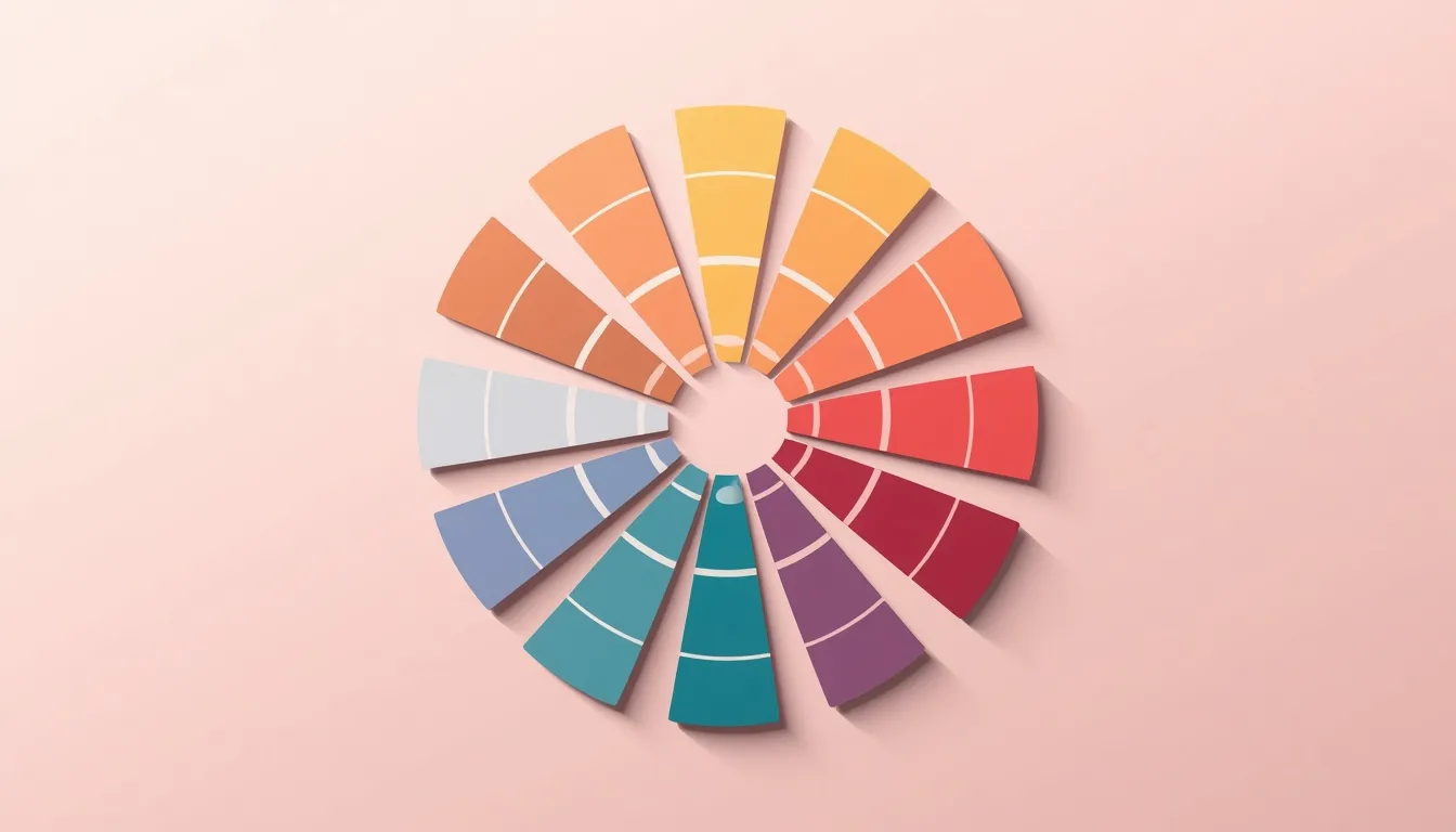
Every classic color pairing traces back to where the two hues sit on the wheel. The wider the angle between them, the higher the contrast; the narrower the angle, the calmer the pairing reads.
| Harmony Type | Wheel Relationship | Best Used For |
| Complementary | 2 hues, 180° apart | High-contrast CTAs, buttons, focal points |
| Analogous | 3 hues, ~30° apart | Calm, cohesive palettes with low visual tension |
| Triadic | 3 hues, 120° apart | Vibrant, balanced palettes for branding and illustration |
| Tetradic | 4 hues, 90° apart (2 pairs) | Rich, complex UI systems that need multiple accent colors |
| Monochromatic | 1 hue, varied lightness | Zero-risk matches for dashboards, minimalist brands |
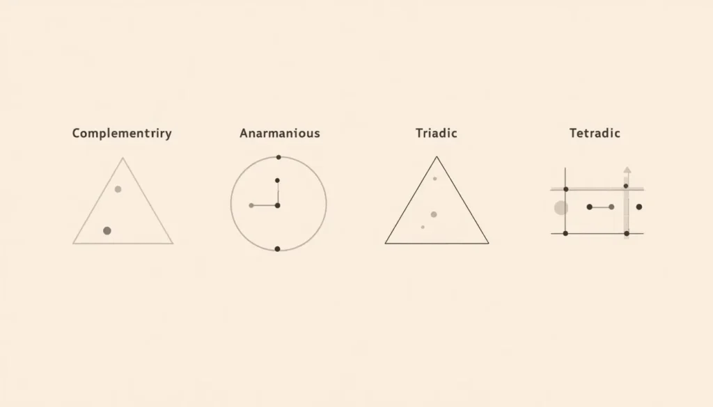
Complementary pairs, hues sitting exactly opposite each other, like blue and orange, create the strongest possible contrast and are the fastest route to a color match that draws the eye. For the full mechanics of this pairing, see our guide to complementary colors.
Rather than eyeballing degrees on a printed wheel, a color wheel tool plots the relationship for you and shows every valid match for a given hue at once, which is the core function a color theory calculator needs to get right before anything else.
Matching Colors by Hex, RGB, and CMYK Code
Designers and developers often need a match that’s numerically identical, not just visually similar. A hex code that looks correct on a monitor can shift noticeably once it’s converted to CMYK for print, because RGB (light-based) and CMYK (ink-based) cover different ranges of visible color. Converting deliberately, rather than letting software guess, is what keeps a brand color consistent from a website to a business card.
| Color | HEX | RGB | CMYK |
| Base color | #2A9D8F | 42, 157, 143 | 73, 0, 9, 38 |
| Complementary match | #9D4B2A | 157, 75, 42 | 0, 52, 73, 38 |
Notice that the complementary match above isn’t just “the opposite color” in a loose sense, it’s a specific, repeatable set of RGB and CMYK values derived from rotating the base hue 180 degrees. That precision is what separates a professional color match from an approximate one.
Matching Colors From a Photo or Image
Sometimes the color you need to match already exists, in a product photo, a competitor’s screenshot, or a piece of brand photography, and you need its exact code before you can find its harmony match.
An image-based eyedropper solves this directly: upload the image, pick color from an image, and the tool returns the exact hex, RGB, and CMYK values for that pixel. From there, apply any harmony rule from the table above to generate a color that legitimately matches it, rather than approximating by eye.
This workflow is especially valuable for extracting a full palette from a single hero image, since every dominant color in the photo can be matched and extended into a consistent scheme.
Matching Colors for Accessible, ADA-Compliant Interfaces
A harmony match and an accessible match are not the same thing, and treating them as interchangeable is one of the most common UI/UX mistakes. WCAG 2.1 requires a contrast ratio of at least 4.5:1 for normal body text and 3:1 for large text and UI components like buttons and form borders. A perfectly valid complementary pair can still fail these thresholds if both hues sit at a similar lightness value.
Color blindness adds a second layer: roughly 8% of men and 0.5% of women have some form of color vision deficiency, most commonly red-green. Running a proposed match through a free color contrast checker before shipping it confirms the pairing works for every visitor, not just for standard color vision.
How to Find a Color Match in 4 Steps
- Start with your base color code in hex, RGB, or CMYK, whichever format your project already uses.
- Choose a harmony rule based on the effect you want: complementary for contrast, analogous for calm, monochromatic for a zero-risk pairing.
- Convert the matched color into every format the medium requires, so the same pairing renders correctly on screen and in print.
- Test the finished pairing for WCAG contrast and color-blindness legibility before it goes live.
Frequently Asked Questions
What does it mean for colors to “match”?
It means the colors sit in a fixed, predictable relationship on the color wheel, such as a complementary pair 180 degrees apart or a group of analogous neighbors, rather than being paired by chance. That underlying relationship, not personal taste, is what makes the pairing look intentional.
How do I find a color that matches a specific hex code?
Convert the hex code to its position on the color wheel, then apply a harmony rule: rotate 180 degrees for a complementary match, or 120 degrees twice for a triadic set. A color theory calculator automates this conversion and returns the matching hex, RGB, and CMYK values instantly.
What is the safest color combination that always matches?
A monochromatic pairing, the same hue at different levels of lightness and saturation, is the safest option because there’s no second hue in the mix to clash with the first.
Can I match colors directly from a photo?
Yes. An image color picker lets you upload a photo and sample any pixel to return its exact hex, RGB, and CMYK values, which you can then run through a harmony rule to generate a matching color.
Do matching colors automatically mean they’re accessible?
No. Two colors can satisfy a color harmony rule and still fail WCAG contrast requirements for text and UI legibility, so any match intended for an interface should also pass through a contrast checker.
What’s the difference between a color match and a color scheme?
A color match is a single relationship between two colors. A color scheme is the complete set of colors, usually four to six, applied consistently across an entire design.
The Bottom Line
A reliable color match always comes back to the same three checks: does it follow a real harmony rule, does it convert cleanly across hex, RGB, and CMYK, and does it hold up under WCAG contrast standards? Running a color through all three manually is slow and error-prone. Running it through a dedicated color theory calculator turns a multi-step process into a single lookup, which is exactly the gap this kind of tool is built to close.