Most color palettes settle for two or three hues and call it a day. A tetradic color scheme pushes further: four colors, built from two complementary pairs, giving you more visual range without tipping into chaos. It’s the harmony experienced designers reach for when a dashboard, brand system, or product needs to carry more information than a simple two-tone palette allows, while still feeling controlled and intentional. This guide covers exactly what a tetradic color scheme is, the color theory that makes it work, how to build one step by step, and how to apply it in real UI/UX and web design work, including how to keep it accessible.
What Is a Tetradic Color Scheme?
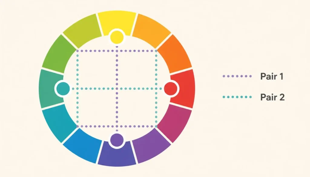
A tetradic color scheme is a four-color palette made of two complementary pairs positioned around the color wheel, most often at 90° intervals (a square tetrad) or spaced unevenly into a rectangle (a rectangle tetrad, also called a double-complementary scheme). Because it’s built entirely from complementary pairs, a tetradic scheme has warm and cool tones baked in from the start. That built-in balance is exactly what keeps four colors from competing with each other the way an arbitrary four-hue palette would.
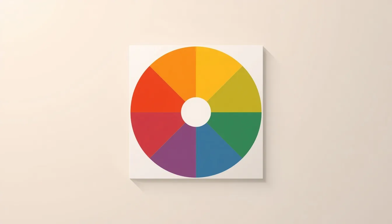
Every tetradic relationship is defined by geometry on the color wheel, not guesswork. If reading hue relationships doesn’t feel automatic yet, it’s worth spending a few minutes with an interactive color wheel before building a tetrad. Seeing the two complementary pairs sit directly opposite each other makes the whole system click faster than any written explanation.
Tetradic vs. Other Color Harmonies
Tetradic schemes sit at the high-contrast, high-complexity end of the color harmony spectrum. Here’s how the primary harmony types compare on a standard color wheel:
| Harmony Type | Colors Used | Contrast Level | Best For |
| Complementary | 2 (opposite hues) | High, focused | CTAs, logos, single-accent moments |
| Analogous | 3–5 adjacent hues | Low, cohesive | Calm branding, backgrounds, editorial sites |
| Triadic | 3 hues, 120° apart | Medium–High, vibrant | Playful products, illustration-heavy UI |
| Tetradic (Square) | 4 hues, 90° apart | High, evenly distributed | Data-dense UI, multi-category systems |
| Tetradic (Rectangle) | 4 hues, 2 comp. pairs | High, unevenly weighted | Layered brand systems with a clear lead color |
The most common point of confusion is tetradic vs. triadic: triadic uses three hues spaced evenly at 120°, while tetradic uses four hues built from two complementary colors pairs. And in the analogous vs. triadic comparison, the difference is contrast, analogous hues sit next to each other for a quiet, low-contrast palette, while triadic hues are spread out for energy. Tetradic sits beyond both: more hues, more contrast, more to manage.
Square Tetrad vs. Rectangle Tetrad (Double-Complementary)
Not all tetradic schemes are built the same way, and the distinction matters for how the final palette behaves:
- Square tetrad: four hues spaced at exact 90° intervals. Visual weight is evenly distributed across all four colors, which works well when every color needs equal importance, think category tags or status indicators.
- Rectangle tetrad (double-complementary): two complementary pairs spaced unevenly (for example 60° and 120° apart instead of 90°). This naturally creates a dominant pair and a secondary pair, which is easier to art-direct because one relationship can lead and the other can support.
For most web and product design work, the rectangle tetrad is the more practical starting point, it gives you a natural hierarchy instead of forcing four equally loud colors to share the same stage.
How to Build a Tetradic Color Scheme, Step by Step
- Choose your base hue. Start with the color that already anchors your brand or product, this becomes your dominant color.
- Find its complement, 180° away on the wheel. This is your first pair.
- Pick a second hue, roughly 60–90° from your base. This sets whether you’re building a square or rectangle tetrad.
- Find that second hue’s complement, 180° from it. You now have four colors in two complementary pairs.
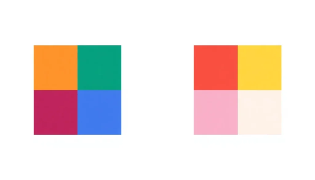
- Assign roles using a weighted split (roughly 60% dominant, 30% secondary, 10% split across the two accent colors) so the palette reads as one system instead of four unrelated colors fighting for attention.
Doing this math by hand is a good way to understand the theory once, but for production work, run it through a tetradic color scheme generator so you get exact hex values, locked angles, and instant variations without rounding errors creeping into your design system.
Using Tetradic Palettes in UI/UX and Web Design
A tetradic palette earns its complexity when a product genuinely needs four distinct visual categories rather than just wanting to look colorful. Common, well-justified use cases:
- Dashboards and analytics UI, four status or category colors (e.g., active, pending, warning, error) that need to be told apart at a glance.
- Data visualization, charts and graphs with multiple series benefit from hues that are deliberately spaced apart rather than picked at random.
- Multi-brand or multi-product suites, a rectangle tetrad lets a parent brand keep a dominant identity while sub-products carry a related but distinct accent.
- Editorial or portfolio sites, where richer website color schemes support strong visual storytelling without a client mistaking it for randomness.
Quick tip: If you’re deciding how to choose a website color scheme and you’re not designing for data-dense UI, start with a simpler harmony (complementary or analogous) and reserve tetradic for the moment your interface actually needs four distinct signals.
Color Psychology and Strategic Color Use
A tetradic scheme isn’t just four colors that are geometrically related, each one still carries the same psychological weight it would on its own, and in marketing, meaning compounds fast when colors sit next to each other. Warm hues (red, orange, amber) read as urgent, energetic, and action-oriented; cool hues (blue, teal, green) read as stable, trustworthy, and calm. In a tetradic palette, this contrast is a feature: reserve your warmest hue for calls to action and let the cooler pair carry structural UI elements like navigation and backgrounds.
For the best colors for call-to-action buttons within a tetradic system, pick the hue with the highest contrast against your dominant background color, not necessarily the one that’s technically “warmest.” A CTA only works if it’s the color the eye lands on first.
Making a Four-Color Palette Accessible
Four colors means four times the opportunity to fail a contrast check, so accessibility isn’t optional with tetradic palettes, it’s the step that separates a usable design system from a striking mockup that breaks in production. Before shipping any tetradic palette:
- Run every text-on-background pairing through a free color contrast checker and confirm it clears WCAG AA (4.5:1 for body text, 3:1 for large text) at minimum.
- Test the palette against an ADA-compliant standard if you’re building for a regulated industry or public-sector product.
- Check the palette in a color blindness simulator, deuteranopia and tritanopia are the two conditions most likely to collapse a tetradic palette’s four hues down to two indistinguishable ones.
- Never let color alone carry meaning. Pair each hue in a status system with an icon, label, or pattern so the interface still works for users who can’t distinguish the colors at all.
The fastest way to catch these issues before launch is to check every pair in your palette with a free color contrast checker as you build, not after the design is already approved.
Common Mistakes to Avoid With Tetradic Palettes
- Giving all four colors equal visual weight, which reads as chaotic instead of intentional, always establish a dominant hue.
- Skipping a neutral. Tetradic palettes almost always need a neutral background or surface color (white, black, or gray) to give the four hues somewhere to breathe.
- Building the palette by eye instead of by angle, which quietly breaks the complementary relationships that make the harmony work in the first place.
- Ignoring contrast testing until the design is finished, when fixing a failing pair means reworking the whole system instead of one color.
- Using all four colors at full saturation. Muting two of the four (typically the accent pair) keeps the dominant colors dominant.
Example Tetradic Palette for a SaaS Dashboard
Here’s a working rectangle tetrad built for a data-heavy interface, with roles assigned by weight rather than by color name:
| Role | Color Name | Hex | Suggested Usage |
| Dominant (60%) | Indigo Blue | #3057A6 | Navigation, primary buttons, headers |
| Secondary (25%) | Fern Green | #30A644 | Success states, secondary UI, charts |
| Accent (10%) | Amber Orange | #A67F30 | Calls to action, highlights, warnings |
| Accent (5%) | Orchid Magenta | #A63092 | Badges, alerts, used sparingly |

FAQs About Tetradic Color Schemes
What is a tetradic color scheme?
A tetradic color scheme is a four-color palette made of two complementary pairs positioned around the color wheel, most often 90° apart. It’s also called a double-complementary scheme.
Is a tetradic color scheme the same as double-complementary?
Yes and no. “Double-complementary” specifically describes the rectangle tetrad, where the two complementary pairs are spaced unevenly. “Tetradic” is the broader term that covers both the even square tetrad and the uneven rectangle tetrad.
How many colors are in a tetradic scheme?
Exactly four, two complementary pairs. That’s what separates it from a triadic scheme (three colors) and an analogous scheme (typically three to five adjacent colors).
Is a tetradic color scheme good for websites?
It can be, but it’s best suited to interfaces that genuinely need four distinct visual categories, dashboards, data visualization, or multi-product brand systems. For a simple marketing site, a two- or three-color harmony is usually easier to control.
What’s the difference between tetradic and triadic color schemes?
Triadic uses three hues spaced 120° apart on the color wheel. Tetradic uses four hues built from two complementary pairs, which gives it more range but also more risk of visual clutter if the roles aren’t clearly assigned.
How do I make a tetradic color scheme accessible?
Test every text-and-background combination against WCAG contrast minimums, check the palette in a color blindness simulator, and never rely on color alone to communicate status or meaning, back it up with icons or labels.
Conclusion
A tetradic color scheme gives you more visual range than a simple two-color palette, but only if you respect the structure it’s built on: two complementary pairs, a clear dominant hue, and a deliberate weight distribution across the other three. Used well, it’s one of the most versatile harmonies available for data-dense UI, multi-category systems, and brand ecosystems that need to say more than one thing at once. Used carelessly, it’s four colors shouting over each other. Start with the color wheel, respect the geometry, test for contrast before you ship, and a tetradic scheme will do exactly what it’s designed to do: carry complexity without losing control.