A traditional Japanese color palette is a system of muted, nature-derived hues, deep indigos, mossy greens, ash grays, and dusted pinks, cataloged in Japan’s historical dye and pigment records and still applied today across textiles, ceramics, and minimalist digital design. Unlike the saturated primaries common in Western branding systems, these colors were built around restraint: most trace to a single plant, mineral, or insect dye, and their names describe exactly what they came from, plum-blossom gray, decaying leaves, the inside of a sake bottle.
This guide compiles 23 design-relevant colors from Japan’s historical color canon, each with a verified hex code, its literal meaning, and where it fits inside a wabi-sabi or Japandi interface. You’ll also find the philosophy behind why these tones work so well for minimalist design, and how to test them for accessibility before you ship them.
What Is a Traditional Japanese Color Palette?
A traditional Japanese color palette (dentōshoku or washoku, 伝統色) is a documented set of over 250 named hues that trace back to the Twelve Level Cap and Rank System, established in 603 CE by Prince Shōtoku and based on the five Chinese elements. Rank and social hierarchy were displayed through color: kinjiki (禁色, “forbidden colors”) were reserved exclusively for the Imperial family and the highest-ranking court officials, the color ōtan, a deep orange, was reserved for the Crown Prince’s robes, and anyone else caught wearing it faced punishment. Colors available to commoners were called yurushiiro (許し色, “permissible colors”).
Most color names originate from the plants, flowers, minerals, and animals that produced or resembled them. Some dyeing techniques date to the Asuka period (538–710 CE); others weren’t standardized until the Meiji period, when synthetic dyes reached Japan. Two of the oldest surviving references are the Nihon Shoki (720 CE) and the Engishiki (927 CE), an early administrative code that prescribed exact dye recipes for the imperial court. Because this color system evolved over more than a millennium, some names carry regional or period-specific variations, but the core japanese color palette used by designers today is drawn from these same historical sources, standardized in modern references like Hibi and Fukuda’s The Colors of Japan (Kodansha International).
The Philosophy Behind the Palette: Wabi-Sabi, Ma & Japandi
Wabi-Sabi: Beauty in Imperfection and Transience
Wabi-sabi is the Japanese aesthetic principle, rooted in Zen Buddhism, that finds beauty in imperfection, impermanence, and incompleteness. It rejects symmetry and high-gloss perfection in favor of natural wear, asymmetry, and quiet simplicity. This is precisely why the historical palette leans so heavily on desaturated, “imperfect” tones rather than pure, flat primaries: colors like Rikyūcha, literally “Sen no Rikyū’s tea”, are named after the 16th-century tea master who codified wabi-sabi principles into the Japanese tea ceremony. A muted brown named after a philosopher of restraint is a fitting anchor for any minimalist palette.
Ma (間): The Role of Negative Space
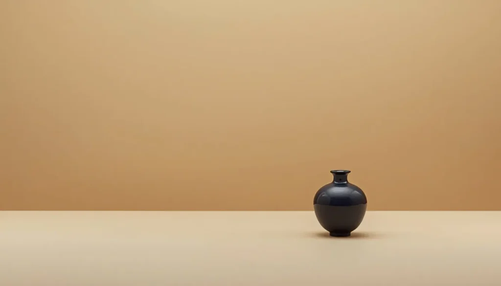
Ma is the Japanese concept of meaningful empty space, not an absence of content, but an active design element that gives the content around it room to breathe. In the Heian-era practice of kasane no irome (layered color combinations worn as court robes), large unbroken areas of a single muted tone functioned as visual rest between more detailed elements. That same logic underpins modern minimalist web design: negative space isn’t wasted space, it’s what makes a single indigo accent button legible against a page instead of one of ten competing colors.
Japandi: Japanese Minimalism Meets Scandinavian Design
Japandi is the design movement blending Japanese wabi-sabi restraint with Scandinavian hygge and functional minimalism. The two traditions converge on nearly identical values: natural materials, muted and earthy palettes, and function-first layouts with minimal ornamentation. This overlap is exactly why a historical japanese color palette translates so directly into a modern Japandi interface, a deep indigo, a celadon green, and an eggshell-paper neutral already form a complete, balanced three-color system without needing modification.
23 Traditional Japanese Colors With Hex Codes
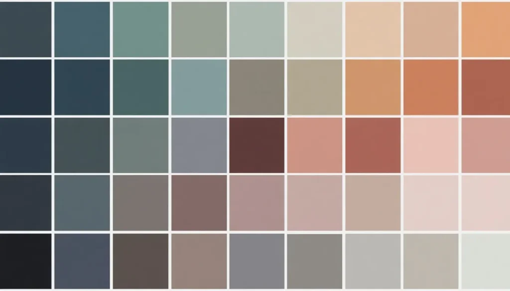
Below are 23 historically documented colors, grouped by family, with kanji, romanized name, verified hex and RGB values, and literal meaning. Note: these hex values are modern sRGB approximations of colors originally defined by natural dye and pigment recipes, an exact digital equivalent didn’t exist historically, but they match the standard reference figures used across contemporary Japanese design archives, including Hibi and Fukuda’s published color catalog.
Blues, The Indigo Family (Ai no Iro)
| Kanji | Name | Hex | RGB | Meaning |
| 紺 | Kon | #192236 | 25, 34, 54 | Dark blue, the deepest indigo, worn by samurai and merchants alike |
| 藍色 | Ai-iro | #264348 | 38, 67, 72 | Indigo color, dyed from the Polygonum tinctorium plant |
| 空色 | Sora-iro | #4D8FAC | 77, 143, 172 | Sky blue |
| 浅葱色 | Asagi-iro | #48929B | 72, 146, 155 | Light blue, literally “pale green onion” |
| 水色 | Mizu-iro | #86ABA5 | 134, 171, 165 | Water blue |
| 瓶覗 | Kamenozoki | #C6C2B6 | 198, 194, 182 | “Glimpse into a bottle”, the faintest hint of indigo dye |
Greens, Moss, Pine & Celadon
| Kanji | Name | Hex | RGB | Meaning |
| 緑青 | Rokushō | #407A52 | 64, 122, 82 | Patina, the green of oxidized bronze and copper roofs |
| 青磁色 | Seiji-iro | #819C8B | 129, 156, 139 | Celadon, named for the glaze color of Japanese and Chinese ceramics |
| 白緑 | Byakuroku | #A5BA93 | 165, 186, 147 | Whitish green |
| 松葉色 | Matsuba-iro | #454D32 | 69, 77, 50 | Pine needle color |
Earth Tones, Wabi-Sabi Browns
| Kanji | Name | Hex | RGB | Meaning |
| 利休茶 | Rikyūcha | #826B58 | 130, 107, 88 | Sen no Rikyū’s tea, named for the tea master who defined wabi-sabi |
| 鳥の子色 | Torinoko-iro | #E2BE9F | 226, 190, 159 | Eggshell paper, the color of traditional washi paper |
| 琥珀色 | Kohaku-iro | #CA6924 | 202, 105, 36 | Amber |
| 朽葉色 | Kuchiba-iro | #D57835 | 213, 120, 53 | Decaying leaves color |
Soft Accents, Sakura & Wisteria
| Kanji | Name | Hex | RGB | Meaning |
| 桜色 | Sakura-iro | #FCC9B9 | 252, 201, 185 | Cherry blossom color |
| 桜鼠 | Sakuranezumi | #AC8181 | 172, 129, 118 | Cherry blossom mouse gray |
| 藤色 | Fuji-iro | #89729E | 137, 114, 158 | Wisteria color |
| 薄色 | Usu-iro | #A87CA0 | 168, 124, 160 | “Thin color”, a pale, restrained purple |
Grays, The Nezumi Family
| Kanji | Name | Hex | RGB | Meaning |
| 銀鼠 | Ginnezumi | #97867C | 151, 134, 124 | Silver gray |
| 利休鼠 | Rikyūnezumi | #656255 | 101, 98, 85 | Greyish dark green, another Rikyū-linked tone |
| 素鼠 | Sunezumi | #6E5F57 | 110, 95, 87 | Plain mouse gray |
| 白鼠 | Shironezumi | #B9A193 | 185, 161, 147 | White mouse gray |
| 墨色 | Sumi-iro | #27221F | 39, 34, 31 | Ink color, the black of traditional calligraphy ink |
Sources: Hibi, Sadao & Fukuda, Kunio, “The Colors of Japan” (Kodansha International); cross-referenced against the Nihon Shikisai Gakkai color science handbook.
How to Use These Hex Codes in Minimalist Web & UI Design
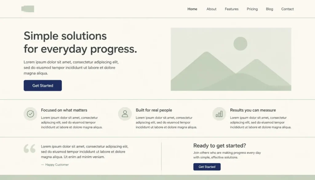
The fastest way to apply a japanese color palette to a website is to treat it like a Japandi room: one dominant neutral covering roughly 70% of the layout, one muted secondary at 20%, and a single deeper accent at 10% reserved for calls-to-action, rarely more than three hues total.
A working starting combination:
- Background (70%): Torinoko-iro #E2BE9F or a near-white derived from it
- Secondary surface (20%): Byakuroku #A5BA93 or Kamenozoki #C6C2B6
- Accent / CTA (10%): Kon #192236
For dark mode, swap the background for Sumi-iro #27221F or Kon #192236 instead of pure black, both read as softer, warmer darks than a digital #000000, and pair naturally with Torinoko-iro or Sakura-iro for text and highlights.
Because ma treats empty space as functional, resist the urge to fill it. Generous padding, one accent color reserved strictly for interactive elements, and no competing gradients will do more for a minimalist layout than any additional hue would. Before finalizing a pairing, run it through a color theory wheel to confirm the relationship is genuinely analogous or complementary rather than just visually similar, muted tones can look harmonious and still clash once scaled across a full UI. For a complete walkthrough of applying a restrained palette site-wide, our website color scheme guide covers header, body, and footer treatment in more depth.
The Meaning Behind the Colors: Symbolism in Japanese Design
In traditional Japanese design, color carried social and symbolic weight long before it carried aesthetic preference, the kinjiki system described earlier is the clearest example, but the symbolism runs deeper than court rank:
- Indigo (Ai): Beyond its visual appeal, indigo dye had genuine antibacterial and insect-repellent properties, which is why samurai wore it under armor and firefighters wore it as protective clothing. It came to represent durability and trust, the same associations blue carries in modern UX color psychology, where it’s the default choice for finance and healthcare interfaces.
- Purple (Murasaki): Historically the most expensive dye to produce, extracted from gromwell root, and reserved for the highest court ranks. Today, the same color psychology applies in marketing: purple still signals premium positioning and exclusivity.
- White (Shiro): Associated with purity and the sacred in Shinto ritual, worn at both weddings and funerals depending on context, a reminder that color meaning is never fully universal, even within one culture.
This is worth remembering before importing any palette wholesale for its meaning of colors in marketing: the emotional register of Kon or Murasaki was built for 8th-century court hierarchy, not a 2026 SaaS landing page. Borrow the tone; verify the message still lands for your actual audience.
Accessibility in Muted, Low-Contrast Palettes
Traditional Japanese colors are, by design, low-saturation and mid-value, which means pairings that look perfectly harmonious on screen can still fail WCAG contrast requirements when used for body text. WCAG AA requires a 4.5:1 contrast ratio for normal text and 3:1 for large text; many of the softer tones above, like Sakuranezumi #AC8181 on a Torinoko-iro #E2BE9F background, sit well under that threshold and should be treated as decorative or background elements rather than text colors.
Before shipping any pairing from this palette, run it through a color contrast checker to confirm it clears AA (or AAA, where required) at your actual font size and weight. This matters even more for a japanese color palette than for a high-saturation brand system, precisely because the whole point of the palette is restraint, you don’t have a bright red or pure black waiting in reserve to bail out a failing contrast pair. If you’re designing for a public sector or enterprise client, check whether an ADA compliant color checker is a contractual requirement before you finalize the palette, not after.
Build Your Own Japanese-Inspired Palette
Rather than combining several named traditional colors ad hoc, they weren’t necessarily designed to sit together in a single modern UI, the more reliable approach is to pick one hex value from this list as a seed color and build outward from it:
- Choose one anchor color from the tables above that matches your brand’s tone (Kon for trust and depth, Seiji-iro for calm and organic, Sakura-iro for warmth).
- Generate a harmonized scheme from that seed using a color palette generator, selecting an analogous or monochromatic rule to preserve the muted, low-contrast character that defines this style.
- Limit the output to three functional roles, background, surface, and accent, and resist adding a fourth “just in case” color.
- Test every text-on-background pairing for contrast before you build it into components.
Conclusion
A well-chosen japanese color palette gives minimalist design something most modern color systems lack: names and hex codes that carry centuries of documented meaning, not a brand guideline invented last quarter. Pair a deep indigo with an eggshell neutral, leave generous negative space around them, and you already have a Japandi-ready interface grounded in wabi-sabi restraint. The only step left is verifying it holds up under contrast testing, muted doesn’t mean immune to accessibility rules.
FAQs
What is the most iconic color in a traditional Japanese color palette?
Indigo, specifically Ai-iro (#264348) and the deeper Kon (#192236), is the most iconic. It was dyed from the Polygonum tinctorium plant and worn across social classes, from samurai armor linings to farmers’ work clothes, making it one of the most historically documented colors in the entire palette.
Are traditional Japanese colors the same as pastel colors?
No. Pastel colors are light in value and low in saturation. Many traditional Japanese colors, like Kon, Sumi-iro, or Rokushō, are mid-to-dark in value while still being desaturated; the defining trait is muted intensity, not lightness. Only a subset, like Sakura-iro, would read as a true pastel.
How do I make sure a Japanese color palette is accessible on my website?
Check every text-and-background combination against WCAG AA (4.5:1 for normal text) using a contrast checker before finalizing your design, since many of these tones are close in value and can fail contrast even when they look visually distinct.
What’s the difference between wabi-sabi and Japandi design?
Wabi-sabi is the underlying Japanese philosophy that finds beauty in imperfection, impermanence, and simplicity. Japandi is a specific interior and visual design movement that blends wabi-sabi’s restraint with Scandinavian minimalism’s functionality, wabi-sabi is the idea, Japandi is one modern design style built from it.