Complementary colors are the two hues that sit directly opposite each other on the color wheel, pairs like red and green, blue and orange, or yellow and purple. Placed side by side, they create the strongest visual contrast of any color combination, which is exactly why painters, brand designers, and product teams have leaned on them for centuries to draw the eye.
This guide breaks down the color theory behind complementary pairs, including RYB vs. RGB models, Isaac Newton’s original color wheel, and the opponent-process theory that explains why afterimages happen, then shows you exactly how to use complementary colors in real interfaces without them fighting each other. If you’d rather skip ahead, plug any hex code into the free interactive color wheel and get its precise complementary match instantly.
What Are Complementary Colors?
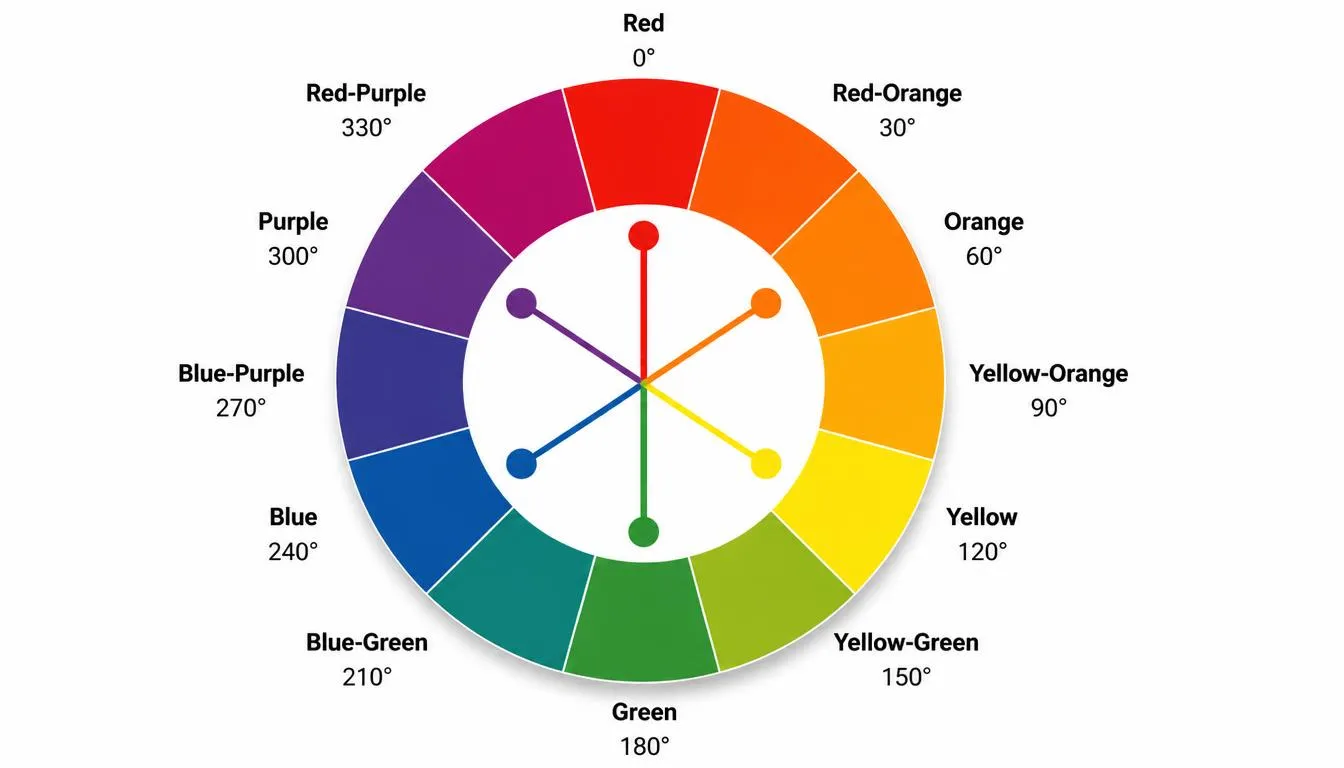
Complementary colors are two colors positioned 180 degrees apart on a color wheel. Because they sit at opposite ends of the spectrum, pairing them produces the highest contrast achievable between two colors, each hue appears more saturated and more vivid next to its complement than it does on its own.
The most commonly referenced complementary pairs are:
- Red & Green
- Blue & Orange
- Yellow & Purple (Violet)
- Red-Orange & Blue-Green
- Yellow-Green & Red-Violet
These pairings aren’t arbitrary. They come directly from how the color wheel is constructed and, at a deeper level, from how the human eye and brain actually process color.
The Color Theory Behind Complementary Colors
Isaac Newton and the Origin of the Color Wheel
The circular color wheel used in design today traces back to Isaac Newton. In his 1704 treatise Opticks, Newton took the visible light spectrum, the linear band of colors produced when white light passes through a prism, and bent it into a circle. That single decision was significant: by joining red back to violet, Newton created a structure where colors could be described in terms of their relationship to one another, including which colors sit in direct opposition. Every complementary color wheel used by designers since is a descendant of that original diagram.
RYB vs. RGB: Why Complementary Pairs Differ Between Tools
Two color models are commonly used to define complementary pairs, and they don’t always agree:
- RYB (Red-Yellow-Blue), the traditional artist’s model, used for pigment mixing. This is where the familiar red↔green, blue↔orange, yellow↔purple pairings come from.
- RGB / HSL (Red-Green-Blue, digital), the model used by screens, code, and modern design tools. Complements are calculated by rotating hue 180° on a 360° wheel, which is why a digital tool may show a slightly different complement than a traditional paint wheel (for example, red’s digital complement leans closer to cyan-teal than pure green).
If you’re designing for print with physical pigments, think in RYB. If you’re designing for screens, websites, apps, dashboards, use a tool built on the RGB/HSL model, since that’s the color space your users will actually see rendered.
The Opponent-Process Theory (Why We See Afterimages)
There’s a biological reason complementary colors feel so visually charged: opponent-process theory, developed by physiologist Ewald Hering, proposes that human vision processes color through three opposing channels, red-green, blue-yellow, and black-white. A single receptor pathway can’t signal ‘red’ and ‘green’ at the same time, so the brain treats them as a competing pair.
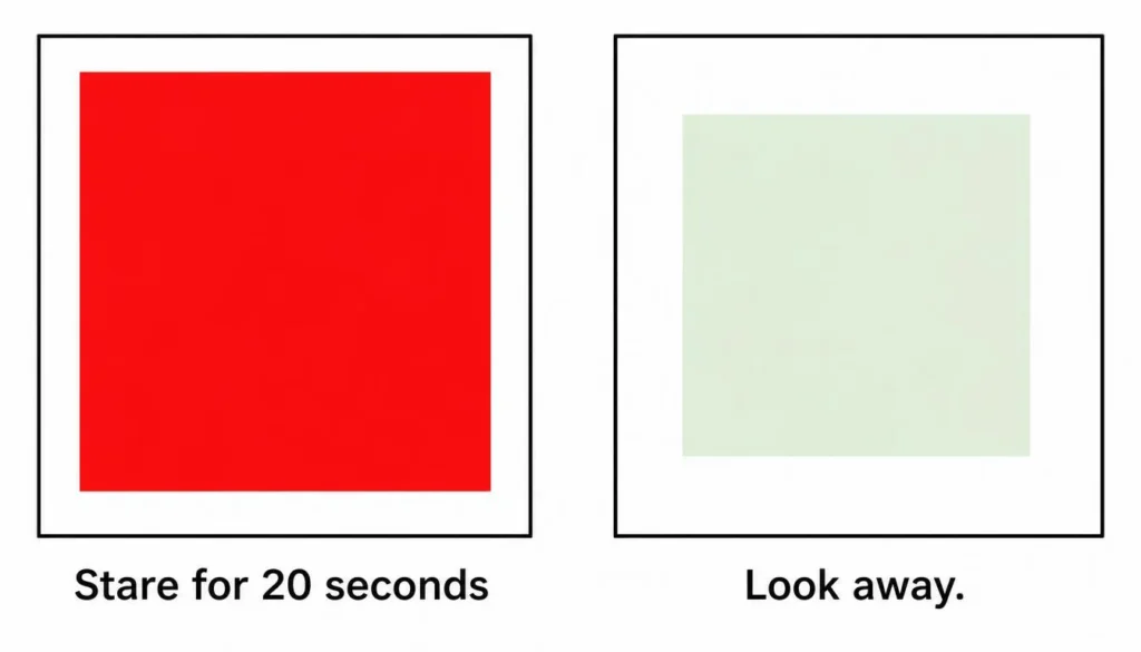
This is also what produces the afterimage effect. Stare at a solid red square for about 20–30 seconds, then look at a blank white surface, and you’ll see a faint green afterimage. The red-sensitive channel fatigues, and the opposing green signal fires on its own once the stimulus is removed. It’s a direct demonstration of why our visual system is wired to detect and amplify complementary relationships, and part of why complementary color schemes read as energetic or even a little unstable when overused.
How to Find Any Complementary Color
Manually, the method is simple: locate a color’s hue on the wheel, then find the hue exactly 180° opposite it. In HSL terms, the formula is:
Complementary Hue = (Original Hue + 180) mod 360
Saturation and lightness typically stay the same for the ‘pure’ complement, though many designers shift the tint or shade of the second color slightly so it doesn’t compete equally with the first. For example, a red like #E63946 has a raw digital complement around #46CADE, a teal-cyan, not a true green, because the wheel is being measured in RGB hue space rather than RYB pigment space.
Doing this math by hand for every project isn’t practical, which is exactly the problem our free color wheel tool solves, enter any hex code and it instantly returns the accurate complementary match, along with triadic and analogous alternatives, so you can compare options before committing to a palette.
Why Complementary Colors Create High Contrast
Most complementary pairs combine a warm color (red, orange, yellow) with a cool color (green, blue, purple). This warm/cool pairing is a major reason complementary schemes feel so visually loud, you’re not just contrasting hue, you’re contrasting temperature, which is a separate perceptual signal the eye picks up on independently. Together, hue contrast and temperature contrast produce what artists call simultaneous contrast: each color intensifies how the other is perceived.
Important caveat: hue contrast is not the same as accessibility contrast. Two complementary colors can look dramatically different to the eye while still failing WCAG contrast ratios for text, because accessibility contrast is calculated from luminance (lightness), not hue position. A mid-tone red on a mid-tone green, for instance, can be nearly unreadable for users with color vision deficiencies. Before shipping any complementary pairing as a text/background combination, run it through a color contrast checker to confirm it meets AA or AAA standards.
How to Use Complementary Colors in Design
Web & UI Design
Use one complementary color as the dominant tone across large surfaces (backgrounds, navigation, hero sections) and reserve its opposite for small, high-value accents, buttons, links, icons, notifications. A near-50/50 split of two fully saturated complements tends to visually vibrate and cause eye strain; an 80/20 or 90/10 balance gets you the contrast without the fatigue.
CTA Buttons & Conversion Design
Because complementary pairs maximize contrast, they’re a go-to strategy for call-to-action buttons: an orange CTA on a predominantly blue interface, or a green ‘buy now’ button on a red-toned promotional banner. The button pops precisely because it’s the visual opposite of everything surrounding it. That said, treat this as a starting hypothesis, not a universal rule, brand color psychology, cultural association, and your specific audience all influence which color actually converts best, so A/B testing the exact shade still matters.
Branding & Logos
Complementary schemes signal energy, boldness, and urgency, which is why they’re common in sports, entertainment, and food brands. A useful constraint is the 60-30-10 rule: 60% dominant color, 30% secondary color, and only 10% given to the full-intensity complementary accent, enough tension to feel dynamic without overwhelming the eye.
Print, Art & Illustration
Painters have used complementary relationships for centuries, for example, placing cool blue shadows opposite a warm orange light source to make a scene feel more vibrant and three-dimensional. The same logic scales directly into digital illustration and iconography. Once you’ve settled on a base complementary pair, extend it into a full working set of tints, shades, and neutrals using the color palette generator rather than trying to build every supporting shade by hand.

Complementary vs. Other Color Harmonies
Complementary is one of several color harmony models, and it isn’t always the right fit. Here’s how it compares:
| Harmony Type | Wheel Angle | Contrast Level | Best For |
| Complementary | 180° | Highest | CTA buttons, sports/energy brands, focal points |
| Split-Complementary | 150° / 210° | High (softer) | Beginner-friendly bold designs, illustration |
| Analogous | 0°–60° | Low | Calm, cohesive backgrounds, nature themes |
| Triadic | 120° apart | Medium-High | Playful, vibrant brands (e.g. children’s products) |
| Monochromatic | 0° (tints/shades) | Low | Minimalist UI, editorial, elegant branding |
For a deeper breakdown of how each of these harmonies is built directly off the wheel, including split-complementary and tetradic variations, see our full color theory and color wheel guide.
Common Mistakes to Avoid
- Using both complementary colors at equal saturation and equal size, this creates visual vibration and eye strain rather than a clean focal point.
- Assuming hue contrast equals readability contrast, always verify text/background pairs against WCAG standards, not just how the pairing ‘looks’ to you.
- Mixing up RYB and RGB complements when moving a palette from print (pigment) to a website or app (light-based digital color).
- Defaulting to fully saturated colors instead of using tints and shades of the complementary pair, which usually feels more refined for UI work.
- Skipping a color-blindness check, deuteranopia and protanopia in particular can flatten red/green complementary pairs into near-identical tones for a meaningful share of users.
Try the Free Complementary Color Tool
The fastest way to apply everything above is to stop calculating hue rotations by hand. Our free color wheel calculator instantly finds the accurate complement, split-complement, and triadic matches for any hex, RGB, or HSL value, built on the digital RGB model, so what you see in the tool is exactly what will render on screen.
Frequently Asked Questions
What are complementary colors?
Complementary colors are two colors located directly opposite each other on the color wheel, 180 degrees apart. Pairing them creates the highest contrast possible between two colors, such as red and green or blue and orange.
What is the complementary color of red?
In the traditional RYB (pigment) color wheel used by artists, red’s complement is green. In the digital RGB/HSL model used by screens and design tools, red’s true 180° hue complement is closer to a cyan-teal. Which one is ‘correct’ depends on whether you’re mixing paint or designing for a screen.
What is the complementary color of blue?
On the RYB wheel, blue’s complement is orange. This is one of the most widely used complementary pairings in branding and web design because of the strong warm/cool contrast it creates.
Why do complementary colors create such strong contrast?
Because they sit at opposite points on the wheel, complementary pairs typically combine a warm color with a cool color, contrasting both hue and temperature at once. This is amplified by opponent-process theory: the eye’s red-green and blue-yellow channels are wired to detect these opposites, making the contrast feel even stronger than the color values alone would suggest.
Can complementary colors be used together in web design without hurting readability?
Yes, but not at equal proportions or equal saturation. Use one color as the dominant tone and its complement sparingly for accents like buttons or icons, and always verify any text/background combination with a WCAG contrast checker before shipping it.
What’s the difference between complementary and contrasting colors?
All complementary colors are contrasting, but not all contrasting colors are complementary. ‘Contrasting’ is a broad term for any two colors that differ noticeably in hue, saturation, or lightness. ‘Complementary’ specifically refers to colors positioned exactly opposite each other on the color wheel, which produces the maximum possible hue contrast.
What is the opponent-process theory in color vision?
It’s a model of human color perception proposing that the eye and brain process color through three opposing channels, red-green, blue-yellow, and black-white, rather than through three independent channels. It explains phenomena like the afterimage effect and is one reason complementary color pairs feel especially vivid when placed side by side.