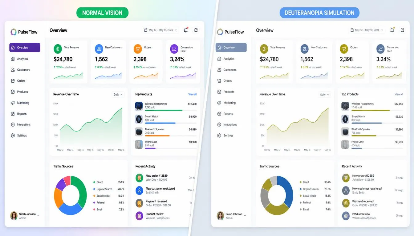
Roughly 1 in 12 men and 1 in 200 women live with some form of color vision deficiency, yet most design reviews still happen on screens calibrated for standard color vision. A color blindness simulator closes that gap: it lets you upload a real screenshot, mockup, or live URL and instantly preview it the way someone with protanopia, deuteranopia, tritanopia, or achromatopsia actually sees it. Instead of guessing whether your red “error” state and green “success” state are distinguishable, you can watch the colors shift in real time and catch the problem before it ships.
This guide covers the science behind color vision deficiency, why basic two-swatch comparison tools fall short for real interfaces, and exactly how to use a simulator to build color palettes that work for every visitor, not just the ones with typical color vision.
What Is a Color Blindness Simulator (and Why It Matters for Designers)?
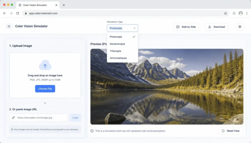
A color blindness simulator is a piece of software that mathematically remaps the color data in an image, screenshot, or live webpage to approximate how someone with a specific type of color vision deficiency (CVD) would perceive it. Rather than describing color blindness in the abstract, it shows you your actual design, the real logo, the real chart legend, the real call-to-action button, filtered through a simulated visual system.
For designers, product managers, developers, and content teams, this turns an invisible accessibility risk into something you can literally see. A palette that looks perfectly distinct in Figma can collapse into near-identical grays or browns once it’s run through a protanopia or deuteranopia filter, and no amount of staring at the original swatches will reveal that on its own.
| Quick Answer
A color blindness simulator is a tool that recolors an image, screenshot, or webpage to approximate how someone with protanopia, deuteranopia, tritanopia, or achromatopsia would perceive it, helping designers catch accessibility issues before a palette or interface goes live. |
Understanding Color Vision Deficiency (CVD): The Science Behind the Simulation
How Cone Cells Determine Color Perception
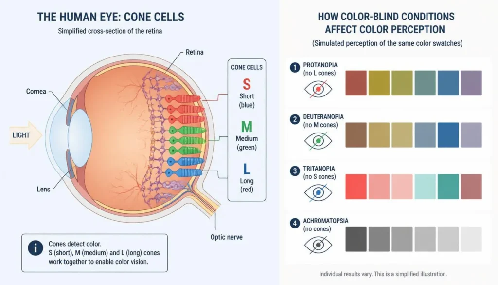
Human color vision starts in the retina, where three types of cone cells respond to different wavelengths of light: S-cones (short wavelengths, perceived as blue), M-cones (medium wavelengths, perceived as green), and L-cones (long wavelengths, perceived as red). The brain blends the relative signal strength from all three cone types to construct the full range of color most people see.
Color vision deficiency occurs when one cone type is missing, reduced in sensitivity, or spectrally shifted. A simulator recreates this mathematically: it takes each pixel’s color value, transforms it through a model of the affected cone response, and renders the result, which is exactly what lets you preview the effect on a real design instead of just reading about it.
The Four Main Types of Color Vision Deficiency
| Type | Affected Cones | Approx. Prevalence | What Changes Visually |
| Protanopia | L-cones (red) absent | ~1% of men | Reds appear darker and muddier, often confused with green or brown |
| Deuteranopia | M-cones (green) absent | ~1% of men, the most common red-green type | Greens shift toward beige/red and are hard to separate from red |
| Tritanopia | S-cones (blue) absent | Under 0.01% of the population | Blues read as greenish; yellows fade toward pale pink or gray |
| Achromatopsia | All cone types affected | Extremely rare, about 1 in 30,000 | Little to no color perception; the world appears in grayscale |
These four terms, protanopia, deuteranopia, tritanopia, and achromatopsia, along with the broader umbrella term color vision deficiency (CVD), are the entities a simulator needs to model accurately, since each one shifts a design’s palette in a distinct, non-interchangeable way.
Why Two-Color Swatch Comparisons Aren’t Enough
Most free accessibility tools ask you to pick two colors and tell you whether that single pair is distinguishable. That’s useful for spot-checking a button against its background, but it doesn’t reveal how an entire dashboard, hero section, chart legend, or map reads once dozens of colors interact across imagery, icons, and interactive states.
Real interfaces are rarely just two colors. A pricing table, a data visualization, or a photo used as a background all carry far more chromatic complexity than a swatch pair can represent, which is why it’s worth using a tool built to pick color from image and simulate an entire uploaded screenshot or live URL at once, rather than testing colors in isolation.
Basic Swatch Checkers vs. Full Image/URL Simulators
| Criteria | Basic 2-Color Swatch Tool | Full Image/URL Simulator |
| What it tests | One color pair at a time | An entire screenshot, mockup, or live webpage |
| Real-world accuracy | Low, ignores surrounding context | High, shows the actual layout, imagery, and charts |
| Best for | Quick single-element spot checks | Full design and QA reviews before launch |
| Catches | Isolated contrast failures | Palette-wide clashes across icons, charts, photos, and states |
| Workflow fit | Manual, pair by pair | Upload once, cycle through every CVD type instantly |
How to Use a Color Blindness Simulator to Audit Your Designs
- Capture the real surface. Use a full-page screenshot or the live URL, not just an isolated palette swatch, so the simulator sees your design the way a real visitor would.
- Upload the image or paste the URL into the simulator to generate the base rendering.
- Cycle through each CVD type. Step through protanopia, deuteranopia, tritanopia, and achromatopsia one at a time, a palette that survives one type can still fail another.
- Flag every element where meaning depends on color alone. Status badges, chart lines, form-validation states, and map pins are the highest-risk offenders.
- Cross-check flagged elements with a contrast checker. A simulator shows hue confusion; a dedicated color contrast checker confirms the luminance ratio actually meets WCAG thresholds, you need both checks, not just one.
- Re-test after every palette change. Adjusting one color can change how its neighbors read, so a single edit deserves a fresh pass through all four CVD types.
WCAG 1.4.1 and the Real Cost of Ignoring Color Accessibility
WCAG Success Criterion 1.4.1 (Use of Color) states that color must never be the only visual means of conveying information, indicating an action, prompting a response, or distinguishing a visual element. In practice, that means a red asterisk marking a required field, or a green dot signaling “online,” needs a second, non-color cue, a label, icon, underline, or pattern, so the information survives for users who can’t rely on that hue difference.
This isn’t only a design-quality issue. Digital accessibility complaints and lawsuits referencing color-only indicators and failed contrast have climbed steadily as more commerce and services move online, which is why an ADA compliant color checker and a contrast checker tool have become standard items in a modern QA workflow rather than a nice-to-have.
| Quick Answer
WCAG Success Criterion 1.4.1 (Use of Color) requires that color never be the sole way to convey information, indicate an action, or distinguish elements, every color-coded meaning needs a second cue, such as an icon, label, or pattern. |
Designing Color Palettes That Work for Every Vision Type
Don’t Rely on Color Alone
Pair every color-coded meaning with a secondary cue. Error states get an icon and text, not just red. Chart series get distinct line patterns or direct labels, not just hue. This single habit prevents the majority of CVD-related usability failures.
Prioritize Contrast Over Hue Variety
A palette with fewer, well-separated hues at strong contrast will almost always outperform a palette with many similar hues at low contrast for CVD users. When you’re building or refining a palette from scratch, an accessible color palette generator can help you lock in combinations that hold up under simulation, rather than relying on hue alone to create visual separation.
Test Data Visualizations and Dashboards Specifically
Charts and dashboards are the single highest-risk surface for CVD users, since a UI color palette built for status badges or buttons often gets reused for data series without a second look. Swap red/green qualitative palettes for blue/orange alternatives, add pattern fills for print or grayscale contexts, and label series directly wherever the layout allows. If you’re assembling a dashboard palette from scratch, a color scheme generator makes it easier to preview harmonious, higher-contrast options before they get simulated and shipped.
Color Blindness Simulator vs. Contrast Checker: What’s the Difference?
A color blindness simulator shows how colors visually shift for someone with a specific type of CVD, it answers, “Can this be told apart by hue?” A contrast checker instead calculates the mathematical luminance ratio between two colors against WCAG thresholds, it answers, “Is this legible regardless of hue?” A color pair can pass a contrast ratio and still be visually indistinguishable in hue for someone with deuteranopia, which is exactly why accessible design workflows run both checks rather than treating either one as sufficient on its own.
Quick Checklist: Auditing Any Interface for Color Vision Deficiency
- Run the full page or a real screenshot through all four CVD types, not just one.
- Confirm every status, error, or success state has a non-color cue (icon, label, or pattern).
- Check chart and map legends specifically, they fail more often than buttons or text.
- Verify text-to-background contrast separately with a dedicated contrast checker.
- Re-test after every palette or brand-color update, not just at initial launch.
- Review imagery and photography, not just UI chrome, busy photos can hide low-contrast overlay text.
- Document which CVD types were tested so future design changes get the same scrutiny.
Building Interfaces Everyone Can Actually Use
Color vision deficiency affects a meaningful share of your audience whether or not it shows up in your analytics. A color blindness simulator turns that abstract risk into something concrete: an actual preview of your actual design, run through the same four CVD types that affect real visitors. Paired with a contrast checker and a deliberate, icon-and-label-first approach to color-coded meaning, it’s one of the fastest ways to move a palette from “looks nice” to “works for everyone.” Upload your next mockup, cycle through protanopia, deuteranopia, tritanopia, and achromatopsia, and fix what you find before it ships, not after.
FAQs & JSON-LD Schema
What does a color blindness simulator actually simulate?
It mathematically remaps the color values in an image, screenshot, or webpage to approximate how someone with protanopia, deuteranopia, tritanopia, or achromatopsia would perceive that same content.
Which type of color blindness is most common?
Deuteranopia (and the milder deuteranomaly, reduced sensitivity in the same cones) is the most common form, affecting roughly 1 in 20 men, making red-green confusion the single most frequent color vision issue designers need to plan for.
Is a color blindness simulator the same as a WCAG contrast checker?
No. A simulator shows how colors visually shift for CVD users, while a contrast checker calculates whether two colors meet the WCAG luminance ratio required for legible text and UI elements. Accessible design relies on both checks.
Can I test a live website URL instead of uploading an image?
Yes, tools built for full-page auditing accept a URL directly, capturing the live layout, imagery, and interactive states rather than a single static color swatch.
What color combinations should designers avoid using as the only signal?
Avoid relying on red versus green, or blue versus purple, as the sole way to distinguish meaning, since these pairs collapse for large portions of colorblind users. Add an icon, label, or pattern as a backup cue.