
A demand letter naming your color palette sounds absurd, until you’re the one holding it. Every year, thousands of U.S. businesses receive a letter alleging that their website is inaccessible to people with disabilities, and a strikingly large share of those complaints cite one specific, checkable thing: text or interface elements that don’t have enough contrast against their background.
That’s not a coincidence. Unlike more subjective accessibility issues, contrast is mathematical. A lawyer, an automated scanner, or a plaintiff’s expert witness can point a tool at your homepage and get a pass/fail answer in seconds. That makes it one of the highest-risk, lowest-effort-to-fix items on any accessibility audit, and exactly why an accurate ADA compliant color checker belongs in every site owner’s toolkit, not just a developer’s.
This guide breaks down the contrast rules that actually get cited in real complaints, how they connect to ADA Title II, ADA Title III, and the Department of Justice’s evolving guidance, and exactly how to check and fix your site.
What “ADA Compliant” Actually Means for Your Website’s Colors
The Americans with Disabilities Act itself doesn’t publish a pixel-level color specification. Instead, courts, regulators, and plaintiffs’ attorneys have converged on the Web Content Accessibility Guidelines (WCAG), specifically WCAG 2.1 Level AA, as the practical technical standard for “ADA compliant” digital content. Understanding why requires separating two parts of the law that get confused constantly.
ADA Title III: Private Businesses as “Public Accommodations”
ADA Title III prohibits discrimination on the basis of disability in places of public accommodation, historically, physical spaces like restaurants, hotels, and retail stores. Over the past decade, federal courts have increasingly extended that definition to commercial websites and apps that operate as, or are closely tied to, a physical or transactional business. There is still no formal DOJ regulation spelling out exact web technical standards under Title III, which is precisely why litigation has filled the gap: plaintiffs’ firms and courts routinely point to WCAG 2.1 AA as the accepted benchmark for what “accessible” means in practice.
ADA Title II: State and Local Government Websites
ADA Title II covers services, programs, and activities provided by state and local governments, and here the standard is no longer ambiguous. On April 24, 2024, the Department of Justice published a final rule under Title II that formally adopts WCAG 2.1 Level AA as the required technical standard for state and local government websites and mobile apps. Compliance deadlines are staggered by jurisdiction size: April 24, 2026 for governments serving 50,000 or more people, and April 26, 2027 for smaller governments and special district entities.
Even if your organization isn’t a government entity, this rule matters: it’s the clearest signal yet of where DOJ enforcement expectations are heading for everyone else, and it removes any doubt about which version of WCAG regulators consider the current baseline.
Public Accommodation and the Color Connection
Whether the applicable framework is Title II or Title III, the underlying question is the same: can a person with a disability perceive, understand, and operate the content? Color contrast sits squarely inside that question, because low-vision users, aging users, and people using a phone in bright sunlight all depend on sufficient contrast to read text and identify interactive elements at all.
The Color Contrast Rules That Actually Matter
Strip away the legal framing and the technical requirement is narrow and specific. WCAG defines contrast using a luminance-based ratio between text (or a graphic) and its background, expressed as a ratio from 1:1 (no contrast) to 21:1 (pure black on pure white). Three success criteria do almost all of the work:
1.4.3 Contrast (Minimum), Level AA
This is the rule most demand letters and automated scans cite. Normal body text needs a contrast ratio of at least 4.5:1 against its background. Large text, defined as roughly 18pt (24px) regular weight or 14pt (about 18.67px) bold or larger, gets a slightly more forgiving contrast ratio of 3:1, because larger, heavier strokes remain legible at lower contrast.
1.4.11 Non-Text Contrast, Level AA
Introduced to cover everything that isn’t text, this criterion requires a 3:1 contrast ratio for user-interface components (button borders, form field outlines, toggle states) and for graphical objects that carry meaning, such as icons or chart elements. This is the criterion most site owners miss, because it’s easy to fix text contrast while leaving a pale gray input-field border that’s invisible to low-vision users.
1.4.6 Contrast (Enhanced), Level AAA (Optional)
A stricter 7:1 ratio exists at the AAA level for normal text. It isn’t required for ADA/WCAG 2.1 AA conformance, but government agencies, healthcare, and finance sites sometimes adopt it voluntarily as a best practice or internal policy.
| Content Type | Minimum Ratio | WCAG Criterion | Level |
| Normal body text (under 18pt / 24px) | 4.5:1 | 1.4.3 Contrast (Minimum) | AA |
| Large text (18pt+/24px+, or 14pt+/18.67px+ bold) | 3:1 | 1.4.3 Contrast (Minimum) | AA |
| UI components & form field borders (buttons, inputs, icons) | 3:1 | 1.4.11 Non-Text Contrast | AA |
| Focus indicators (keyboard outline states) | 3:1 | 1.4.11 Non-Text Contrast | AA |
| Meaningful graphics & data-visualization elements | 3:1 | 1.4.11 Non-Text Contrast | AA |
| Enhanced normal text (optional, higher standard) | 7:1 | 1.4.6 Contrast (Enhanced) | AAA |
| Logos, decorative text, disabled/inactive elements | No requirement | 1.4.3 (exempted) | — |
One important nuance: WCAG 2.2, published in October 2023, did not change any of these contrast ratios. It added nine new success criteria covering things like focus appearance, target size, and dragging movements, none of which touch color contrast math. In other words, the 4.5:1 and 3:1 threshold you meet today under WCAG 2.1 AA remain the same thresholds under WCAG 2.2. What changes is the overall surface area of what “fully compliant” covers, not the color rules themselves.

How to Check Your Site with an ADA Compliant Color Checker
Manually calculating relative luminance for every color pair on a site isn’t realistic, which is why a dedicated contrast tool matters. Here’s the process worth following, whether you’re auditing an existing site or reviewing a new design before launch:
- Test every real text/background pairing, not just your design system swatches, hero overlays, hover states, and placeholder text are common failure points that get skipped.
- Classify each text block correctly as normal or large text, since the passing threshold changes from 4.5:1 to 3:1 based on font size and weight.
- Check non-text elements separately: button borders, form outlines, icons, and focus rings all need their own 3:1 check under 1.4.11.
- Test interactive states, hover, focus, active, and disabled, because a button that passes at rest can fail the moment a user interacts with it.
- Re-test after any brand refresh or dark-mode addition, since a palette that passes in light mode frequently fails when inverted.
You can run every one of these checks with our free ADA compliant color checker, which calculates the exact WCAG ratio for any two colors and flags whether the pair passes AA or AAA for both normal and large text, no design software required.
Beyond Contrast Ratios: Designing for Color Vision Deficiency
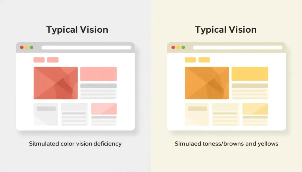
Contrast ratios solve for legibility, but they don’t fully solve for color vision deficiency (CVD), commonly called color blindness. Research consistently puts CVD prevalence at roughly 1 in 12 men (about 8%) and 1 in 200 women (about 0.5%) worldwide, with red-green deficiencies (protanopia and deuteranopia) the most common forms. On a typical e-commerce or SaaS site, that means a meaningful share of visitors may not reliably distinguish red “out of stock” labels from green “in stock” ones, or a red error state from a neutral gray one.
This is where WCAG’s separate “Use of Color” criterion (1.4.1) comes in: color can never be the only way information is conveyed. A red form field also needs an icon or text label; a green success state needs more than a color shift to register as “success.”
Before shipping a palette, run your key screens through a color blindness simulator to see how status colors, charts, and CTAs render for the most common forms of CVD, then confirm nothing critical depends on color alone.
Fixing Failing Colors: Build an Accessible Palette From the Start
Retrofitting contrast into an existing brand palette is possible, but it’s far easier, and far cheaper, to design for it from the beginning. A few practical adjustments consistently resolve the majority of contrast failures without a full rebrand:
- Darken (or lighten, for dark mode) your brand’s primary color by small increments until it clears 4.5:1 against its actual background, rather than against white in isolation.
- Avoid mid-tone grays for body text; pure light-gray-on-white and mid-gray-on-dark are two of the most common contrast failures on the web.
- Give buttons and form fields a visible border or shadow that independently clears 3:1, so the element remains identifiable even if the fill color shifts.
- Build a documented, accessible palette once and reuse it everywhere, instead of letting individual pages introduce one-off colors that were never tested.
Our accessible color palette generator can help you build and export a palette with contrast-safe pairings baked in from the start, rather than checking colors one at a time after the fact.
The Legal Landscape: Demand Letters, DOJ Enforcement, and Lawsuit Trends
This section describes publicly reported litigation trends and is not legal advice; consult an attorney regarding your specific situation.
Most website accessibility complaints never reach a courtroom. Instead, a business receives a demand letter from a law firm or advocacy group alleging that the site violates the ADA, typically listing specific, verifiable defects, missing alt text, unlabeled form fields, and, frequently, insufficient color contrast, and requesting a settlement or remediation commitment to avoid litigation.
The volume of formal litigation gives a sense of scale. According to Seyfarth Shaw’s annual ADA Title III tracking, plaintiffs filed 2,452 website accessibility lawsuits in federal court in 2024, down from 2,794 in 2023 and a record 3,225 in 2022. Federal filings are only part of the picture, however; when state-court filings are included, other legal trackers have reported total website accessibility lawsuit volume exceeding 4,000 per year in recent years. Demand letters that never become lawsuits at all likely number several times higher still, since most are resolved privately.
Two dynamics keep contrast near the top of these complaints: it requires no assistive technology to demonstrate (a plaintiff’s attorney can show a screenshot), and automated accessibility scanners can flag it with high confidence, making it cheap to find at scale across thousands of sites.

A Practical Pre-Launch Compliance Checklist
- All normal body text passes 4.5:1 contrast against its actual rendered background.
- All large/heading text (18px+ / 24px+, or 14pt+ bold) passes 3:1 contrast.
- Button borders, input outlines, icons, and focus indicators independently pass 3:1 (WCAG 1.4.11).
- Hover, focus, active, and disabled states are re-tested, not assumed to inherit the default state’s contrast.
- No status, error, or success message relies on color alone, each pairs with text, an icon, or a pattern.
- Dark mode and any seasonal/alternate themes are tested as separate palettes, not just inverted defaults.
- Contrast checks are documented, dated, and re-run after every brand or design-system update.
Designing Accessibility In From the Start
The businesses that spend the least time worrying about demand letters are the ones that treat accessible contrast as a design-system rule, not a post-launch audit item. That starts with choosing a base palette that’s built to pass WCAG 2.1 AA in the first place, then documenting exactly which color pairings are approved for text, buttons, and status indicators so no one on the team has to guess.
If you’re building or refreshing a palette now, our website color scheme guide walks through choosing a base palette that balances brand identity with accessibility from day one, so contrast is solved before a single line of CSS is written, not after a demand letter arrives.
Whatever stage your site is at, the fastest way to know where you stand is to test it. Run your current color pairings through a free ADA compliant color checker, fix what fails 4.5:1 or 3:1, and document the palette that passes, that single habit resolves one of the most commonly cited issues in website accessibility complaints today.
Frequently Asked Questions
Is there an official, government-certified “ADA compliant color checker”?
No. Neither the DOJ nor any federal agency certifies specific tools or issues an official seal of “ADA compliance.” What exists is a technical standard, WCAG 2.1 Level AA, that courts and regulators reference. A color contrast checker is considered reliable when it correctly implements the WCAG relative luminance formula and reports the standard 4.5:1 / 3:1 thresholds, which is exactly what a properly built contrast tool does.
What contrast ratio do I actually need for ADA compliance?
For WCAG 2.1/2.2 Level AA, the standard referenced in ADA Title II regulation and most Title III litigation, normal text needs at least 4.5:1 contrast against its background, large text needs at least 3:1, and non-text elements like buttons and icons need at least 3:1.
Does WCAG 2.2 change the color contrast requirements?
No. WCAG 2.2 kept the existing 1.4.3 and 1.4.11 contrast criteria unchanged from WCAG 2.1. It added new success criteria in other areas, such as focus appearance and target size, so a site that already meets WCAG 2.1 AA contrast rules doesn’t need to change its colors for WCAG 2.2, though it may need other updates elsewhere.
Can a business actually get sued over color contrast alone?
Contrast is rarely the sole issue named in a complaint, but it’s frequently one of several defects listed together, since it’s straightforward to document and demonstrate. A demand letter or lawsuit typically cites multiple accessibility barriers at once rather than color in isolation. This is general information, not legal advice about your specific risk.
Do I need to fix every color on my site, or just the ones people notice?
WCAG 2.1 AA applies to all meaningful text and interface elements on a page, not just prominent ones, a low-contrast footer link or a pale form-field border can fail the same criteria as your homepage headline. A full-site audit, rather than a spot check of a few pages, is the only way to know your actual compliance status.