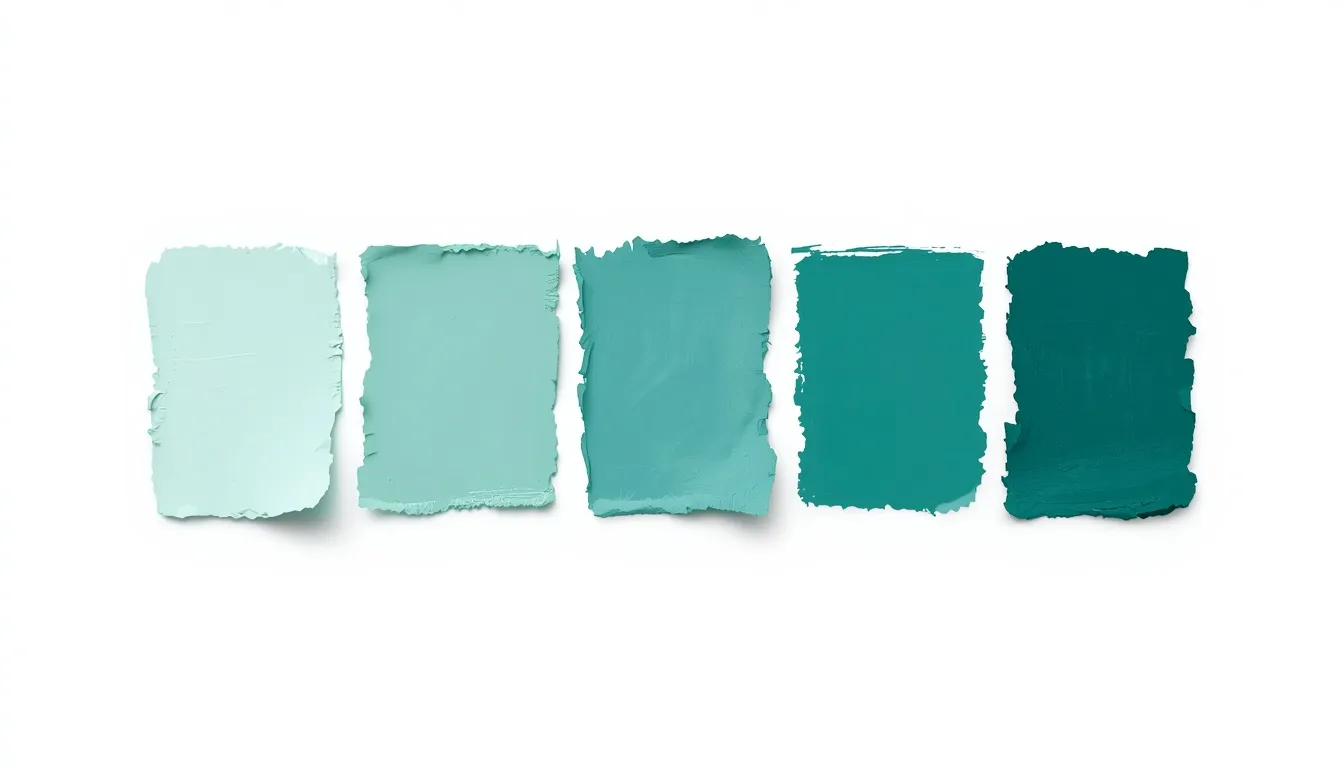
A monochromatic color scheme builds an entire palette from one hue, using only shifts in tint, tone, shade, and value to create depth and contrast. Because every color in the palette shares the same root, monochromatic schemes are one of the most reliable ways to achieve visual cohesion, which is why they show up constantly in minimalist design, modern dashboards, and brand systems that need to feel calm and controlled rather than busy. This guide breaks down exactly how monochromatic color schemes work, how to build one correctly, and where they perform best (and worst) in real design work.
What Is a Monochromatic Color Scheme?
A monochromatic color scheme is a palette generated from a single base hue, one color, expressed across a range of tints, tones, and shades rather than combined with other hues. Where a complementary or triadic scheme pulls multiple colors from different points on the color wheel, a monochromatic scheme stays fixed on one point and creates all of its variation by adjusting value and saturation instead.
That constraint is the entire appeal. A single-hue palette removes the guesswork of pairing colors that clash, which is why it’s a default choice for minimalist design: it guarantees harmony by design, not by trial and error.
Hue, Tint, Tone, and Shade: The Building Blocks
Every monochromatic palette is really just one hue run through four variables. Understanding each one is what separates a flat, one-note palette from a genuinely usable design system:
- Hue, the base color itself (e.g., teal, coral, indigo). In a monochromatic scheme, this stays fixed; everything else moves around it.
- Tint, hue mixed with white. Tints lighten a color and are typically used for backgrounds, hover states, and secondary surfaces.
- Tone, hue mixed with gray. Tones desaturate a color without necessarily changing its lightness, producing the muted, understated variations common in premium brand palettes.
- Shade, hue mixed with black. Shades darken a color and are typically reserved for body text, icons, and borders, since darker values read as more grounded on a page.
- Value, the overall lightness or darkness of a color. Value is what the eye reads first, which makes it the primary tool for establishing visual hierarchy inside a monochromatic system, since hue itself never changes.

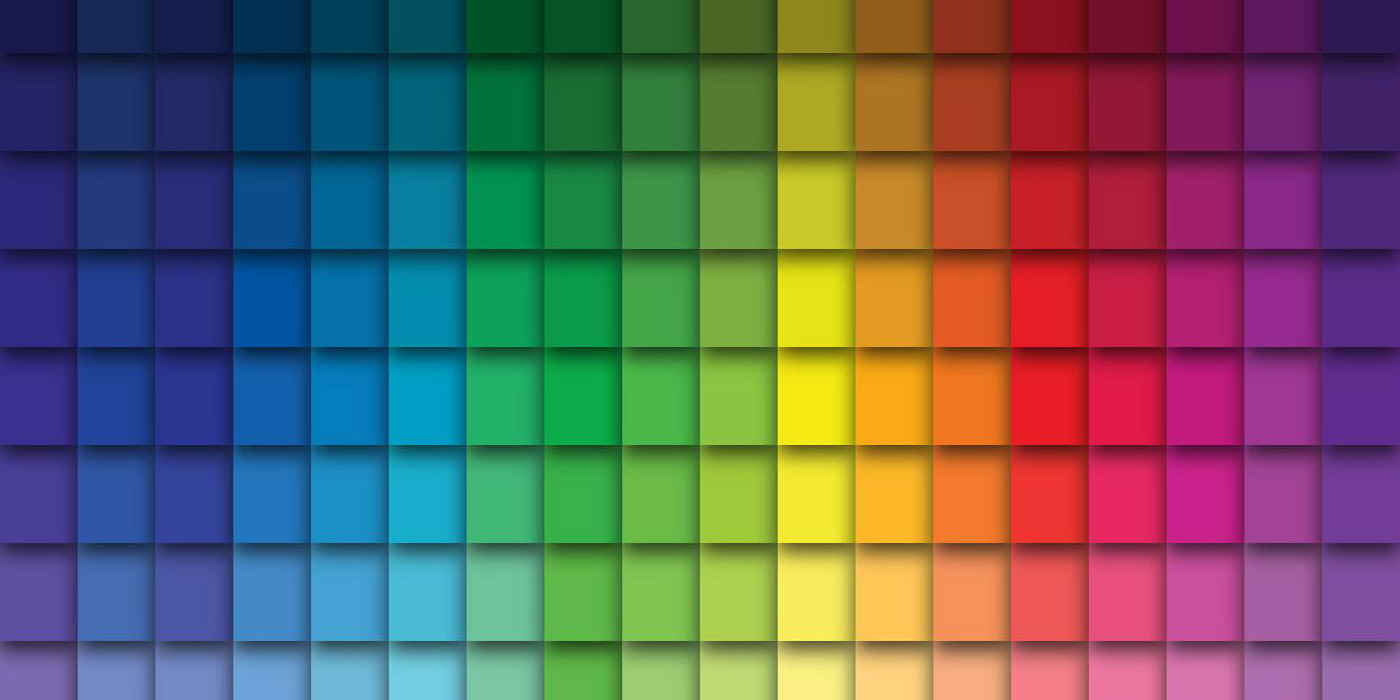
Before adjusting tint, tone, and shade, it helps to see exactly where your base hue sits, the color wheel is the fastest way to confirm that starting point.
Monochromatic vs. Other Color Harmonies
It’s easier to judge when a monochromatic scheme is the right call once you see it next to the alternatives:
- Complementary colors sit directly opposite each other on the wheel and are built for contrast, the opposite goal of a monochromatic palette, which is built for cohesion.
- Triadic and analogous schemes both introduce multiple hues. A triadic color scheme is designed for vibrancy and energy; analogous sits between the two, using neighboring hues for gentler variety.
- A tetradic color scheme goes furthest in the other direction, combining two complementary pairs (four hues) for maximum variety, and the most risk of visual clutter if it isn’t balanced carefully.
If the goal is calm, professional, and tightly controlled, monochromatic is usually the stronger choice. If the goal is energy, contrast, or multiple competing focal points, complementary or triadic schemes are worth testing instead.
How to Build a Monochromatic Color Scheme
- Choose a base hue that matches your brand or content, this is the one color the entire palette will be derived from.
- Set your value range early. Decide how light and how dark you’re willing to go before generating tints and shades, since a range that’s too narrow flattens the whole palette.
- Generate tints for backgrounds, cards, and low-emphasis surfaces.
- Generate shades for text, icons, and borders, anything that needs to feel grounded or stay readable at small sizes.
- Add one or two tones for secondary elements like disabled states, dividers, or muted labels.
- Check contrast between your lightest and darkest values before finalizing anything, since monochromatic systems lean entirely on value contrast rather than hue contrast.
Doing this manually is slow; a color scheme generator can automate the whole sequence, feed it one hue and it outputs a working tint-tone-shade range in seconds instead of by trial and error.
Using Monochromatic Color Schemes in Web and UI Design
This is where monochromatic schemes earn their reputation. A few common applications:
Dashboards and data-heavy interfaces
When a screen already has a lot of visual noise, charts, tables, numbers, a single-hue palette keeps the interface chrome quiet so the data itself stays the focal point.
Minimalist landing pages
Monochromatic palettes are a natural fit for minimalist design because they reinforce restraint instead of fighting it.
CTA buttons and visual hierarchy
Without multiple hues to lean on, visual hierarchy has to come from value contrast alone: your darkest shade becomes the primary action color for buttons and key CTAs, mid-tones handle secondary actions, and light tints stay reserved for backgrounds and cards.
Because there’s no second hue to fall back on for emphasis, getting this value hierarchy right matters more in a monochromatic system than in almost any other color scheme. For a deeper walkthrough of applying color decisions across an entire site, the website color scheme guide covers navigation, backgrounds, and interface states in more depth.

Color Psychology and Branding with Single-Hue Palettes
Because a monochromatic scheme leans on one color, that color’s psychological association carries more weight than it would in a multi-hue palette, there’s nothing else competing for meaning. This is part of why single-hue palettes are common in luxury branding, where a deep charcoal or muted burgundy range reads as restrained and premium, and increasingly common in SaaS branding as a shortcut to a professional, trustworthy feel without a full multi-color system to manage. If color meaning matters to your decision, choose the base hue with that association in mind before building out tints and shades, the palette will only reinforce whatever the root color already signals.
Accessibility and Visual Hierarchy: Contrast Best Practices
Because a monochromatic scheme relies on value differences instead of hue differences, contrast management isn’t optional, it’s the mechanism the whole palette depends on. A few practical checks:
- Run your text and background combinations through a contrast checker before shipping; WCAG AA generally requires a 4.5:1 ratio for normal text.
- Don’t rely on tone alone for anything that needs to stay legible, desaturating a hue doesn’t always create enough value difference to pass a contrast check.
- Test with an accessibility-focused review, not just visual judgment, since a palette that looks high-contrast on a bright monitor can still fail for users with low vision or color vision deficiencies.
For more detail on building contrast and hierarchy correctly across a full palette, the color palette best practices guide is worth reviewing before finalizing anything client-facing.

Pros and Cons of Monochromatic Color Schemes
Pros
- Guaranteed cohesion, colors from one hue can’t visually clash.
- Reinforces brand consistency and a minimalist design aesthetic.
- Faster decision-making than managing multiple hues.
- Feels calm, timeless, and professional across most use cases.
Cons
- Accessibility risk if the value range is too narrow to hit contrast minimums.
- Can read as flat or monotonous without deliberate tint, tone, and shade variation.
- Harder to build strong visual hierarchy without careful value planning, since there’s no second hue to fall back on for emphasis.
Frequently Asked Questions
What is a monochromatic color scheme?
A monochromatic color scheme is a palette built from a single hue, varied only through tints (hue + white), tones (hue + gray), and shades (hue + black) rather than combined with other colors.
What’s the difference between tint, tone, and shade?
Tint is a hue mixed with white and produces a lighter version of the color. Tone is a hue mixed with gray and produces a desaturated, muted version. Shade is a hue mixed with black and produces a darker version. All three keep the same base hue while changing its value or saturation.
How do I create a monochromatic color scheme?
Pick one base hue, set a value range from light to dark, then generate tints for backgrounds, shades for text and borders, and one or two tones for secondary elements, checking contrast at each step.
When should I use a monochromatic color scheme in web design?
Monochromatic schemes work well for minimalist layouts, data-heavy dashboards, and any interface where a calm, cohesive feel matters more than competing hues drawing attention away from content.
Is a monochromatic color scheme accessible?
It can be, but it requires deliberate contrast checking, since the palette relies entirely on value differences rather than hue differences to separate text from backgrounds and signal hierarchy.
Does monochromatic mean using only one color?
Effectively yes, one hue, but that single hue is expressed across many tints, tones, and shades, so the finished palette can still include a wide range of usable colors.