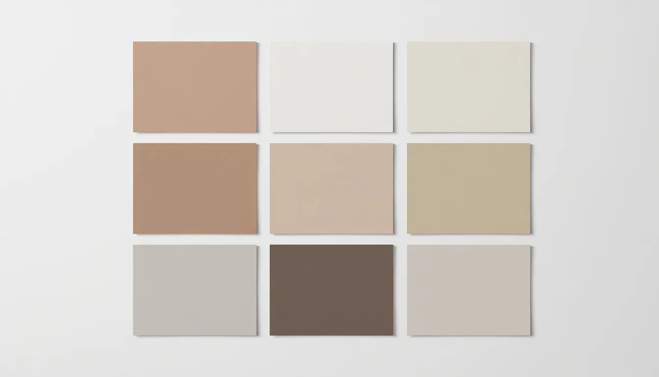
The moment someone lands on your website, their brain starts making judgments before they’ve read a single word. Color does most of that early work, signaling whether a brand feels trustworthy, playful, premium, or approachable, and quietly shaping whether a user feels comfortable enough to keep scrolling. Get the palette wrong, and even flawless typography and layout struggle to save the first impression.
That’s why color palette best practices have become a core competency for web designers, UI/UX professionals, and front-end developers, not a decorative afterthought bolted on at the end of a project. A well-built UI color palette is a system: a small, deliberate set of colors that carries meaning, meets accessibility standards, and holds up across light mode, dark mode, and every screen size in between.
This guide breaks down the color theory, accessibility rules, and practical frameworks you need to build palettes that actually perform, for conversions, for usability, and for the millions of users who rely on assistive technology or have some form of color vision deficiency.
What Makes a Color Palette “Best Practice” Ready?
A best-practice color palette isn’t just a set of hues that look good together, it’s a functional system with defined roles. Every mature palette assigns a job to each color: a dominant neutral for backgrounds, one or two brand colors for identity, a single accent for calls to action, and a neutral scale for text, borders, and dividers.
This is also where a minimalist color scheme earns its reputation. Constraining a palette to a small number of well-defined colors makes a design system easier to maintain, easier to extend into dark mode, and easier to keep accessible, because fewer combinations need to be tested and documented.
Color Theory Foundations Every Designer Should Master
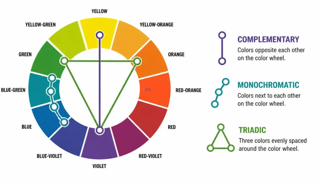
Every reliable palette starts on the color theory wheel, where hue relationships determine how colors will interact once they’re placed side by side in an interface. Understanding a few core harmony types makes palette-building far less guesswork and far more repeatable.
Complementary Colors
Complementary colors sit directly opposite each other on the wheel, think blue and orange, or red and green. They create the highest possible contrast between two hues, which makes them excellent for accents, buttons, and anything that needs to visually pop against the rest of the interface. Used across large areas, however, complementary pairs can vibrate and cause eye strain, so they work best as a dominant color paired with a small, high-impact accent rather than an even split.
Monochromatic Color Schemes
A monochromatic color scheme uses a single hue varied by saturation and lightness. It’s a dependable choice for minimalist branding and data-heavy interfaces because it keeps visual noise low and hierarchy easy to read through shade alone. The tradeoff is that a purely monochromatic palette can feel flat, so many designers pair it with one small complementary accent reserved strictly for primary actions.
Triadic and Tetradic Harmonies
Triadic schemes use three hues spaced evenly around the wheel, giving a palette energy and balance without the harshness of a direct complementary pair. Tetradic schemes add a fourth hue, which can work well for illustration-heavy sites or dashboards that need to distinguish several categories at once.
When choosing between analogous vs triadic colors, remember the psychological impact: analogous hues (neighbors on the wheel) read as calm and cohesive, while triadic hues read as vibrant and highly attention-grabbing. The right choice depends entirely on the tone your brand is going for.
The 60-30-10 Rule: Building a Functional Palette
Borrowed from interior design, the 60-30-10 rule gives designers a reliable starting ratio for distributing color across a layout:
- 60% Dominant Neutral (backgrounds and large surfaces)
- 30% Secondary Color (cards, navigation, section backgrounds)
- 10% Accent (buttons, links, and other calls to action)
Translated into a design system, this ratio maps naturally onto tokens: background, surface, primary, secondary, accent, and a neutral scale for text and borders. Keeping the accent color to roughly 10% of the visual weight is what keeps calls to action distinct. The moment an accent color starts showing up everywhere, it stops signaling anything special.
Instead of picking secondary colors at random to fill these ratios, use a color palette generator to find hues that naturally complement your base color mathematically.
Color Accessibility Best Practices (WCAG-Compliant Design)
Accessibility is not an optional layer applied after the design is finished. Search engines and users alike penalize websites with poor accessibility. A meaningful share of any audience has some form of visual impairment, and low-contrast or hue-dependent design excludes them by default.
Understanding Contrast Ratios
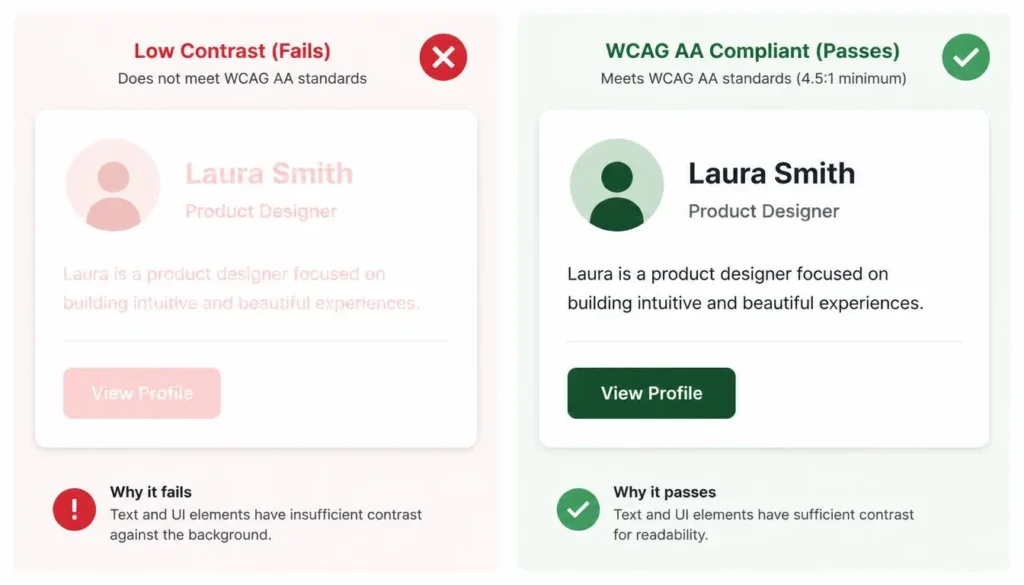
WCAG 2.1 Level AA requires a contrast ratio of at least 4.5:1 for normal body text, and 3:1 for large text (around 18pt, or 14pt bold) and for meaningful UI components such as button borders. Level AAA raises the bar further, requiring 7:1 for normal text.
This is where trendy, low-saturation pastel palettes most often fail. A soft pastel button that looks elegant in a mockup frequently falls well below the 3:1 threshold once placed against a light-gray background. Run every text-and-background pairing in your palette through an ADA compliant color checker before a design is considered final, checking not just the dominant combinations, but hover, active, and disabled states too.
Designing for Color Blindness
Some form of color vision deficiency affects a meaningful portion of the population, most commonly red-green deficiencies like deuteranopia and protanopia, with blue-yellow tritanopia occurring less frequently.
The most common design mistake is relying on hue alone to communicate meaning: red for error, green for success, with no other differentiator. If a user can’t distinguish those hues, that signal disappears entirely. Always pair color with an icon, a text label, or a pattern so meaning survives even when hue doesn’t. Before finalizing, run your UI mockups through a color blindness simulator to confirm adjacent colors remain distinguishable by luminance, not just by hue.
Applying Color Palette Best Practices Across UI/UX Contexts
Color theory and contrast rules are the foundation, but how they get applied changes depending on what you’re designing.
Website and Landing Page Color Schemes
General website color schemes need to stay consistent across many pages and content types, so restraint matters, a small, well-documented palette scales far better than one built page-by-page. Landing pages, by contrast, are built around a single conversion goal, so it’s common (and effective) to push the accent color usage and contrast slightly higher on a landing page than you would on a standard site template.
Dashboard and Data Visualization Palettes
A dashboard color palette has entirely different rules than a marketing page. Categorical data (distinct, unordered groups) needs clearly distinguishable hues, and colorblind-safe categorical sets should be capped well below a dozen colors. Ordered, single-direction data (low to high) reads best as a sequential palette built from one hue varied in lightness, while data that moves in two directions from a neutral midpoint calls for a diverging palette with two hues meeting at a neutral center.
Dark Mode Considerations
A dark mode color scheme is not simply a light palette with the values inverted. Pure black backgrounds often cause light text to “halo” uncomfortably, so most well-built dark palettes use a dark, slightly desaturated gray for surfaces instead of true black. Saturated accent colors that read cleanly on white can vibrate against dark backgrounds, so accents are often pulled back slightly in saturation for dark mode. Critically, contrast ratios need to be re-verified independently for dark mode.
Choosing the Best Colors for Call-to-Action Buttons
There’s a lot of folklore about which specific hue converts best for call-to-action buttons. In practice, contrast against the surrounding background matters far more than the hue itself. A button only needs to be the single highest-contrast, most visually distinct element in its section. Test the button color against its actual background, and test every state, default, hover, active, and disabled, individually.
Color Psychology and Brand Consistency
Color psychology in UX design is a genuinely useful lens, but it works best as a loose guide rather than a rulebook. The meaning of colors in marketing shifts significantly across cultures, industries, and even individual brand positioning. A color that reads as “trustworthy” in one context can read as “cold” or “corporate” in another.
Use psychology to narrow your starting point, then validate the actual palette against your specific audience and competitors. Where psychology matters most is consistency. A brand color system should be documented once, hex values, usage rules, and accessible pairings, and referenced by everyone touching the product.
Common Color Palette Mistakes to Avoid
- Choosing colors before defining what role each one will play in the interface.
- Relying on hue alone to communicate status, without an icon, label, or pattern as backup.
- Testing contrast only on default states and skipping hover, active, and disabled states.
- Assuming a palette that passes accessibility checks in light mode will also pass in dark mode.
- Using more than one or two accent colors, which dilutes what an accent is supposed to signal.
- Leaving color-blindness testing until after launch instead of building it into the design QA process.
A Step-by-Step Framework for Palette Creation
- Define Tone: Define the brand personality and emotional tone the palette needs to support.
- Pick a Primary: Pick one primary hue that reflects that personality, then build out a harmony (complementary, analogous, monochromatic, or triadic) from the color wheel.
- Assign Roles: Assign roles using the 60-30-10 ratio: a dominant neutral, a secondary color, a single accent, and a supporting neutral scale.
- Check Minimums: Check every text-and-background pairing against WCAG AA contrast minimums.
- Simulate Deficiencies: Run the full palette through a color-blindness simulation covering deuteranopia, protanopia, and tritanopia.
- Document Tokens: Document the final palette as reusable tokens with hex values and validate light and dark mode separately.
Conclusion: Treat Color Palette Best Practices as an Ongoing Discipline
A great palette is never really “finished.” Following color palette best practices consistently, through every new feature, every dark mode variant, and every brand refresh, is what separates a palette that merely looks good on day one from one that keeps performing as a product grows. Build the system once, document it clearly, and revisit the accessibility checks every time the palette changes.
Frequently Asked Questions
What is the best color palette for a website?
There’s no single universal answer, since the right palette depends on brand personality, audience, and industry. That said, the strongest website palettes follow the same underlying structure: one dominant neutral, one or two brand colors, a single accent for calls to action, and a supporting neutral scale for text and borders. Whatever hues you choose, every text and background pairing should meet WCAG AA contrast minimums before the palette is considered launch-ready.
How many colors should a color palette include?
Most well-functioning UI palettes use four to six core colors: one primary color, one or two secondary colors, a single accent for buttons and links, and two or three neutrals for backgrounds, text, and borders. Adding more than this usually dilutes visual hierarchy rather than adding value, and it makes a consistent design system harder to maintain across a growing product.
What contrast ratio is required for WCAG accessibility compliance?
WCAG 2.1 Level AA requires a contrast ratio of at least 4.5:1 for normal body text and 3:1 for large text (roughly 18pt, or 14pt bold) and for meaningful UI components like button borders and icons. Level AAA, a stricter standard, raises the requirement for normal text to 7:1. These ratios should be checked for every state of an element, default, hover, active, and disabled, not just the resting state.
How do I choose a color palette that works for color-blind users?
Start by never using hue as the only signal for meaning, pair color with icons, text labels, or patterns so status is still clear if a hue can’t be distinguished. Then run your full palette through a simulator that models deuteranopia, protanopia, and tritanopia, checking that adjacent colors still have enough luminance contrast to be told apart even when their hues look similar.