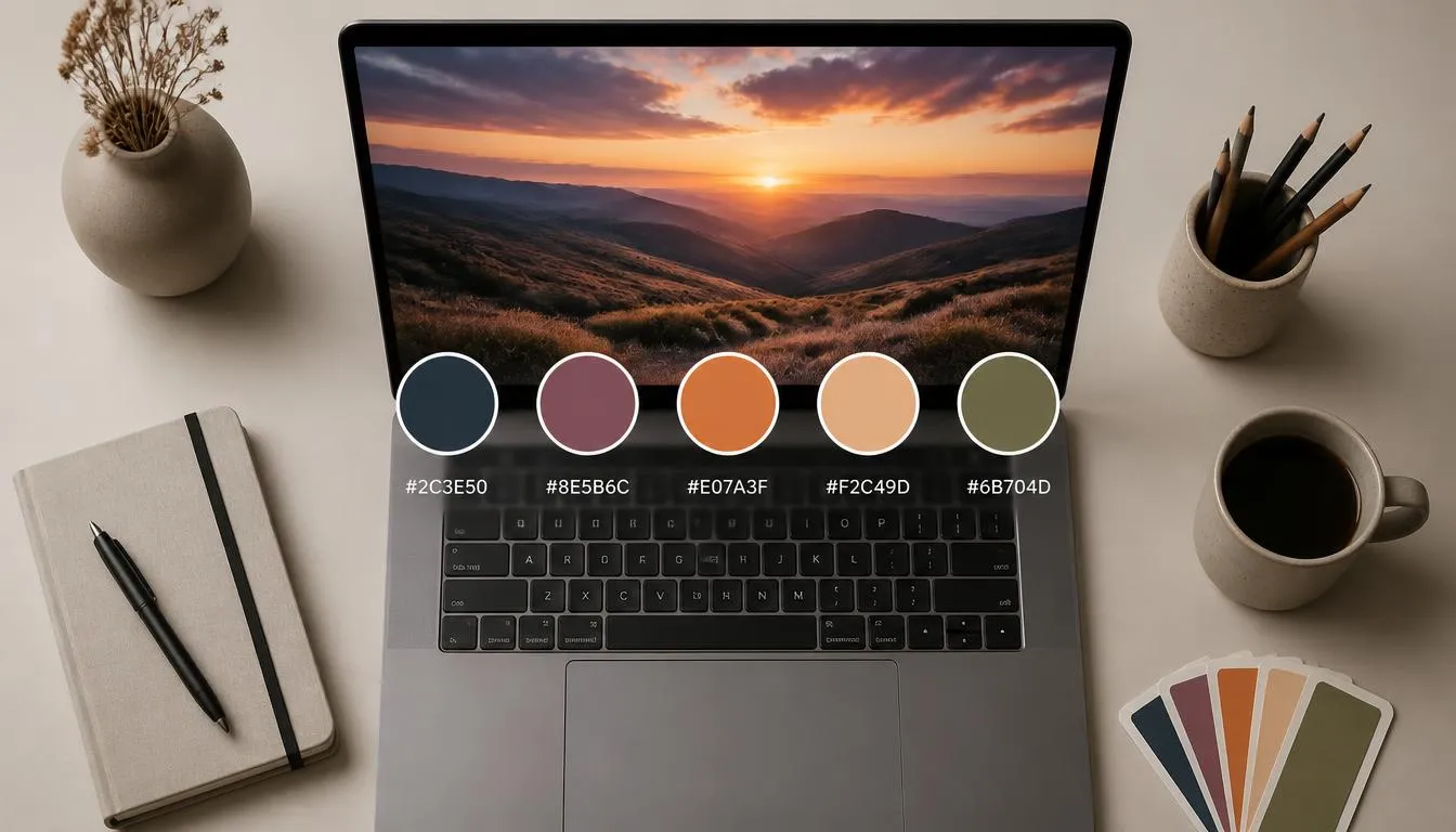
Open any photo you love and you’re already looking at a finished color scheme, you just haven’t pulled it out yet. The sunset on your camera roll, last week’s product shot, the screenshot of a website you admired: each one is a ready-made set of HEX and RGB values waiting to become your next brand palette, website theme, or UI design. Getting a color palette from image files is one of the fastest ways to build a cohesive, professional-looking design system without guessing at colors from scratch.
This guide covers exactly how image-based color extraction works, how to pull a usable palette from any photo in seconds, and how to turn those raw swatches into a complete, accessible color scheme you can actually ship.
What Is a Color Palette From an Image?
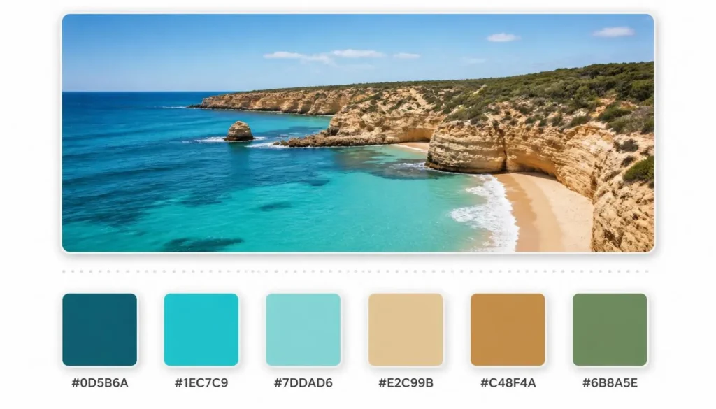
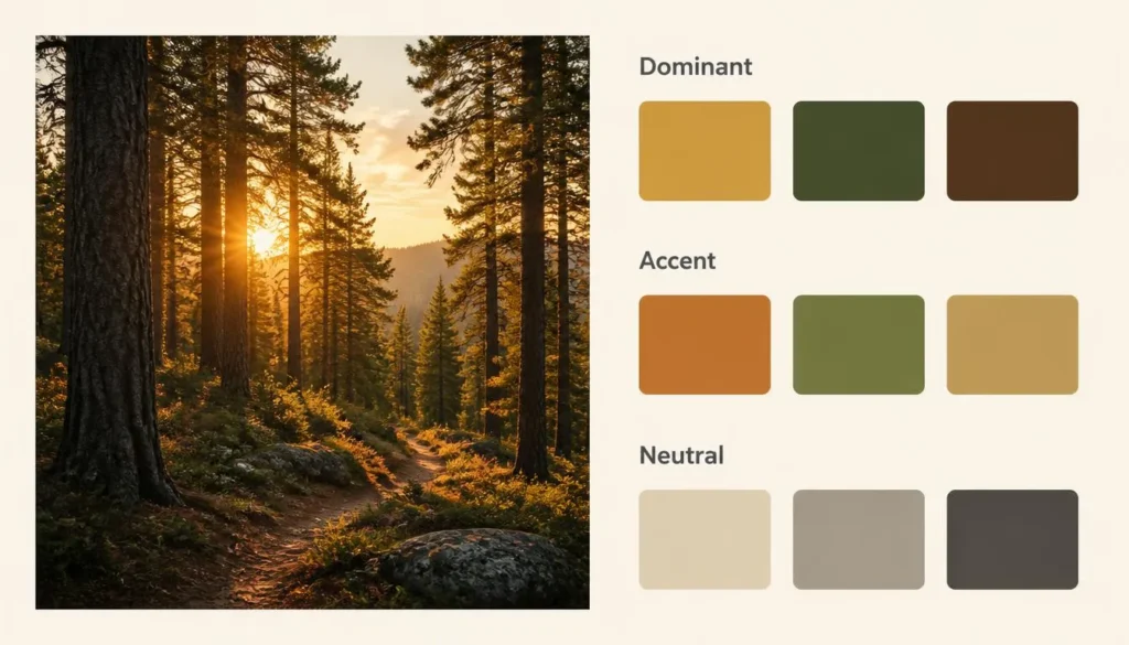
A color palette from image is a set of representative colors, typically shown as HEX, RGB, or HSL swatches, that a color-extraction tool identifies by analyzing the pixel data of a photo or graphic. Instead of picking colors by eye, the tool scans every pixel, groups similar tones together, and surfaces the shades that visually define the image.
A well-built extraction typically returns:
- A dominant color, the single most prevalent tone in the image
- Several accent colors, smaller but visually important tones, like a red umbrella in a gray street scene
- Neutral or background tones, the shadows, highlights, and muted colors that hold the palette together
- Exact color codes for each swatch, HEX, RGB, and often HSL, ready to paste into design software or code
Why Designers Extract Color Palettes From Images
Pulling a palette straight from a photograph solves a problem every designer runs into: colors that look great individually but clash when placed side by side. An image has already solved that problem for you, because its colors exist in harmony, they were captured together, under the same light, in the same scene. Common reasons to extract one include:
- Building a brand palette from product photography or lifestyle imagery
- Matching a website or app’s UI to a hero image or featured photo
- Creating consistent mood boards and client presentations
- Speeding up illustration and digital art color-blocking
- Turning inspiration, a screenshot, packaging, or a travel photo, into usable design tokens
How to Get a Color Palette From an Image in 3 Steps
You don’t need design software or coding knowledge for this. Here’s the fastest route, using a free image color picker:
- Upload your image. Drop in a JPG, PNG, or WebP file, a product photo, a screenshot, artwork, or anything with color you want to capture.
- Let the tool analyze the pixels. The tool scans every pixel and clusters similar tones together, identifying the dominant color plus the most visually significant accents.
- Copy your codes. Grab the HEX, RGB, or HSL values for each swatch and drop them straight into Figma, CSS, or your brand guidelines.
That’s the whole process, no manual eyedropper work, no guessing at hex codes from memory.
The Color Science Behind Image-Based Extraction
Understanding what’s happening under the hood helps you get better results, and it’s simpler than it sounds.
Dominant Color Detection
Every pixel in a digital image carries an RGB value. A dominant color algorithm samples those values across the whole image and identifies which color, or narrow range of colors, appears most frequently. This is usually the first swatch a tool returns, and it’s the color most people associate with the image at a glance.
Color Quantization & Clustering
A photo can contain millions of unique pixel values, far too many to present as a usable palette. Extraction tools solve this with color quantization, typically a clustering method like k-means, which groups similar colors into a handful of representative buckets. Instead of two million individual shades of blue, you get one clean swatch that represents the blue in that image.
HEX, RGB, and HSL, Why Format Matters
Once a color is identified, it needs to be expressed in a format designers and developers can actually use. HEX codes (like #2E7D5B) are the standard for web design and CSS. RGB values break the same color into red, green, and blue channels, which is useful for digital compositing and code that needs numeric color math. HSL (hue, saturation, lightness) is often the easiest format for adjusting a color’s brightness or intensity without changing its underlying hue. A good extraction tool gives you all three, so you’re never stuck converting by hand.
Dominant vs. Accent vs. Muted Tones: Picking the Right Colors
Not every swatch a tool returns deserves equal weight in your final design. Knowing the role each one plays keeps your palette balanced instead of muddy:
- Dominant colors set the overall mood and usually become backgrounds or large surface areas.
- Accent colors are lower in frequency but high in visual impact, ideal for buttons, links, and calls to action.
- Muted or neutral tones (grays, soft browns, off-whites) support the palette without competing with it, great for text and negative space.
A common mistake is treating every extracted swatch as equally important. In practice, a strong palette usually leans on one dominant tone, one or two accents, and a neutral to balance them.
From Extracted Swatches to a Full Color Scheme
An image color picker gives you raw material, it doesn’t automatically hand you a finished, harmonious scheme. Once you’ve pulled your core colors, the next step is building them out into a complete system using a color palette generator. This is where you decide how your extracted colors relate to each other:
- Monochromatic: variations in lightness and saturation of a single extracted hue, for a calm, cohesive look
- Analogous: your extracted color plus its neighbors on the color wheel, for a natural, low-contrast feel
- Complementary: your extracted color paired with its opposite, for high contrast and strong visual pop
If your extracted palette needs a stronger contrast pairing for buttons or highlights, exploring complementary colors is the fastest way to find a hue that pairs cleanly with the tone you pulled from your image.
Checking Accessibility of Your Extracted Palette
A palette pulled from a photo can look beautiful and still fail basic readability standards, a soft beige text on a cream background might extract perfectly from a moodboard image, but it’s unreadable on a real webpage. Before you ship any image-derived palette, run your foreground and background pairs through a color contrast checker to confirm they meet WCAG contrast ratios.
A few things worth checking specifically:
- Text-to-background contrast meets at least WCAG AA (4.5:1 for normal text)
- The palette still reads clearly for common forms of color blindness, not just for standard vision
- Important UI states (errors, success messages, links) don’t rely on color alone to communicate meaning
Common Mistakes When Extracting Colors From Photos
- Trusting the dominant color alone. The single most common tone isn’t always the most useful one for branding, sometimes a smaller accent color tells your story better.
- Ignoring white balance and lighting. A photo shot in warm indoor lighting will extract warmer, more orange-shifted colors than the same scene in daylight.
- Skipping the accessibility check. A palette that looks harmonious in a photo can still fail contrast requirements once it’s applied to text and buttons.
- Extracting from a heavily compressed image. Low-quality JPGs introduce color artifacts that can throw off subtle tones, use the highest-resolution version of an image you have.
- Pulling too many similar hues. If five of your seven swatches are all variations of the same blue, your palette isn’t actually giving you range, trim it down.
Real-World Use Cases
Branding From Product Photography
Brands with a strong visual identity often build their color system directly from their product photography or packaging, ensuring marketing materials, packaging, and digital assets all feel like they belong to the same world.
Web & UI Design
Designers frequently extract a color palette from a hero image or featured photo, then use it to theme buttons, backgrounds, and accents so the whole page feels intentional rather than assembled from unrelated defaults.
Mood Boards & Client Presentations
Pulling exact HEX codes from reference images gives clients something concrete to react to, rather than vague descriptions like “something warm and earthy.”
Art & Illustration
Illustrators and digital artists use extracted palettes as a starting point for color-blocking new work, borrowing the emotional tone of a reference photo without directly copying it.

Frequently Asked Questions
What is the best way to get a color palette from an image for free?
The fastest free method is an online image color picker: upload your photo, let the tool analyze the pixel data, and copy the HEX or RGB codes it returns. No design software or account is required.
How many colors should I extract from a photo?
Most usable palettes work best with five to seven swatches: one dominant color, two or three accents, and one or two neutrals. Extracting more than that usually produces redundant, near-identical shades rather than genuine variety.
Can I extract a color palette from an image on my phone?
Yes. Browser-based color extraction tools work on mobile without needing a dedicated app, upload or take a photo directly from your phone’s browser and the tool returns the same HEX and RGB codes you’d get on desktop.
What’s the difference between an image color picker and a color palette generator?
An image color picker pulls colors that already exist in a specific photo. A color palette generator builds a new scheme algorithmically, from a single seed color, a color-theory rule, or randomly, without needing a source image. Many workflows use both: extract from an image first, then expand that seed color into a full scheme.
Are colors extracted from an image free to use commercially?
A HEX or RGB code by itself isn’t copyrightable, colors are data, not creative expression. However, if the source image itself is copyrighted, make sure you have rights to use that specific photo before publishing it, separate from the color codes you pulled out of it.
How do I turn extracted colors into CSS variables?
Once you have your HEX codes, assign each one to a custom property, for example:
:root {
–color-primary: #2E7D5B;
–color-accent: #E4572E;
–color-neutral: #F4F1EC;
}
Why do the colors I extract look different in print than they do on screen?
Screens display color in RGB (light-based), while most print processes use CMYK (ink-based). RGB has a wider range than CMYK can reproduce, so vibrant screen colors, especially bright greens and oranges, often shift when converted for print. Always proof a physical sample before finalizing a palette that needs to work in both mediums.
Bring Your Image’s Colors Into Your Next Design
Every photo you’ve ever loved is already a working color palette, extracting it is just a matter of letting the right tool do the pixel analysis for you. Once you’ve pulled a color palette from image files, the real design work begins: choosing which swatches lead, building them into a full complementary or analogous scheme, and confirming the whole thing holds up against accessibility standards before it ever touches a live product.
Start with any image you’re drawn to, extract its colors, and build outward from there, it’s a faster, more grounded starting point than picking colors from scratch.