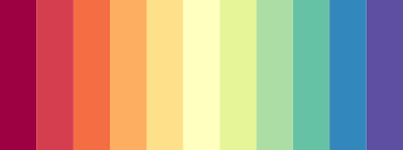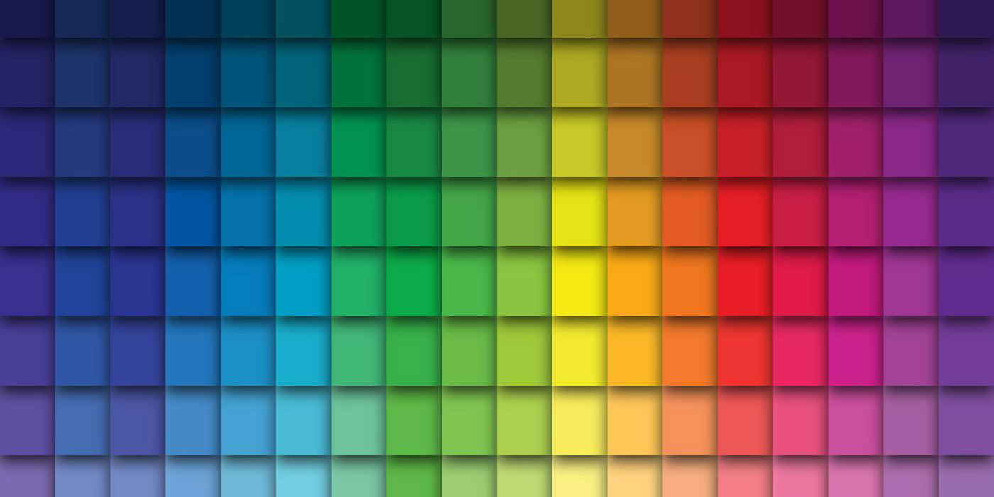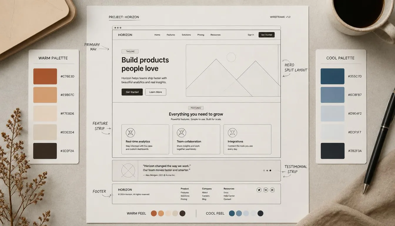
Every interface speaks before a single word is read. A blue button feels safe to click. A red banner feels urgent. That instant, pre-verbal reaction is color psychology in UX design at work, the study of how hue, saturation, and contrast shape perception, emotion, and behavior inside a digital product. For designers, product managers, and marketers, this discipline isn’t decorative polish; it’s a measurable lever on trust, usability, and conversion rate.
This guide breaks down the cognitive science behind color, translates it into practical UI decisions, and shows how to validate every palette against real accessibility standards rather than personal taste. You’ll learn what each core hue communicates, how color harmony models affect visual hierarchy, and how to stress-test a scheme for WCAG contrast and color blindness before it ships. Along the way, we’ll show how a dedicated color theory calculator turns these principles into an exact, exportable palette in seconds rather than hours of manual swatch-matching.
What Is Color Psychology in UX Design?
Color psychology in UX design is the applied study of how specific colors and color combinations influence a user’s emotions, attention, and decisions while navigating an interface. It sits at the intersection of cognitive psychology, visual design, and behavioral marketing: cognitive psychology explains why a color triggers a reaction, learned association, cultural conditioning, and physiological response to wavelength and brightness, while UX design applies that reaction to specific decisions, such as button color, background tone, error-state red, or success-state green.
Unlike general color theory in art, color psychology in UX is outcome-driven: every hue choice is measured against a usability or business goal, reducing bounce rate, increasing checkout completion, or improving a brand’s perceived trustworthiness.
Why Color Psychology Matters in User Experience Design
The 90-Second Rule and First Impressions
Design research frequently cited in UX literature suggests people form a judgment about a product within roughly 90 seconds of first viewing it, and that up to 90% of that snap judgment can be attributed to color alone. In practice, this means the palette itself is the first micro-interaction a user has with a product, arriving before they read a single headline.
Color, Cognitive Load, and Visual Hierarchy
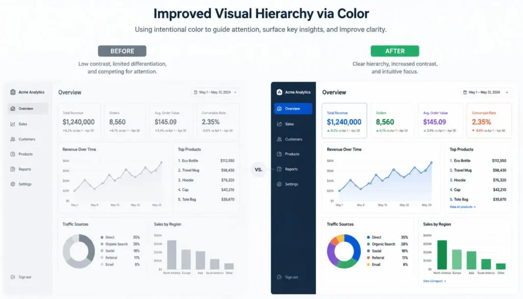
Color is one of the fastest visual cues the brain processes, faster than shape or text. Used well, it reduces cognitive load by reinforcing visual hierarchy: the deliberate use of size, contrast, and hue to signal what matters most. A single saturated accent color against a neutral background tells the eye “look here” without a word of copy. Used poorly, too many competing saturated hues, or insufficient contrast between foreground and background, it does the opposite, forcing users to consciously hunt for the primary action.
The Emotional Meaning of Core Colors in UI Design
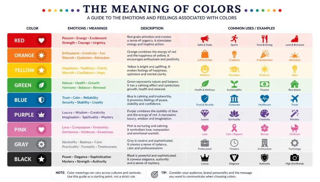
No color carries a single universal meaning, but decades of design and marketing research point to consistent directional associations in Western digital contexts. Use this as a starting hypothesis to test, not a fixed rule:
| Color | Common Emotional Association | Typical UX Use Case |
| Red | Urgency, alertness, appetite, passion | Error states, sale banners, low-stock flags |
| Blue | Trust, calm, security, competence | Fintech/SaaS brand color, links, form fields |
| Green | Growth, health, success, “go” | Confirmation states, wellness/finance-growth apps |
| Yellow | Optimism, caution, attention | Warning states, highlights, budget-friendly brands |
| Orange | Energy, enthusiasm, affordability | CTA buttons, e-commerce urgency |
| Purple | Luxury, creativity, wisdom | Beauty, premium SaaS, education brands |
| Black / White / Gray | Sophistication, clarity, neutrality | Minimalist UI backgrounds, text hierarchy |
| Pink | Playfulness, romance, youth | Beauty, fashion, lifestyle apps |
Culture reshapes these associations significantly, white signals purity in many Western contexts but mourning in parts of East Asia, for example. Global products should validate these assumptions with regional user research rather than a single meaning of colors in marketing chart.
Color Harmony Models Every UX Designer Should Know
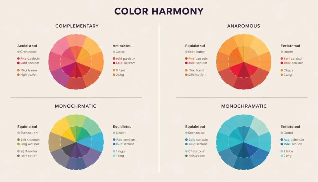
Complementary schemes, colors sitting opposite each other on the color wheel, create the highest achievable contrast, which is exactly why they dominate CTA button design against a brand’s primary color. Explore how these pairings interact visually with an interactive color theory wheel.
Monochromatic schemes rely on a single hue at varying tints and shades, and are the go-to structure behind a minimalist color scheme where restraint itself communicates confidence and clarity.
Analogous schemes use three neighboring hues for a cohesive, low-tension feel, while triadic schemes (three evenly spaced hues) create higher visual energy but are harder to balance for accessible contrast, a trade-off worth testing before committing at scale.
Color Psychology and Branding: Aligning Palette with Brand Identity
A UI’s color palette is a brand identity system operating in real time. Every recurring exposure to a brand’s primary hue reinforces recognition, so the meaning of colors in marketing and the meaning of colors on-screen must match, a brand built on “trust and stability” undermines its own message if its dashboard leans on aggressive, high-saturation reds for routine navigation.
- Reserve your most saturated brand color for the single most important action per screen, diluting it across ten elements erases its signal value.
- Keep semantic colors (error red, success green, warning yellow) consistent across the entire product, even where they conflict with brand palette, since safety clarity outranks brand purity in these states.
- Pair brand hue with confident neutrals; a two-neutral, one-accent structure (the 60-30-10 rule) keeps identity strong without visual fatigue.
Designing Accessible Color Palettes: WCAG Contrast and Color Blindness
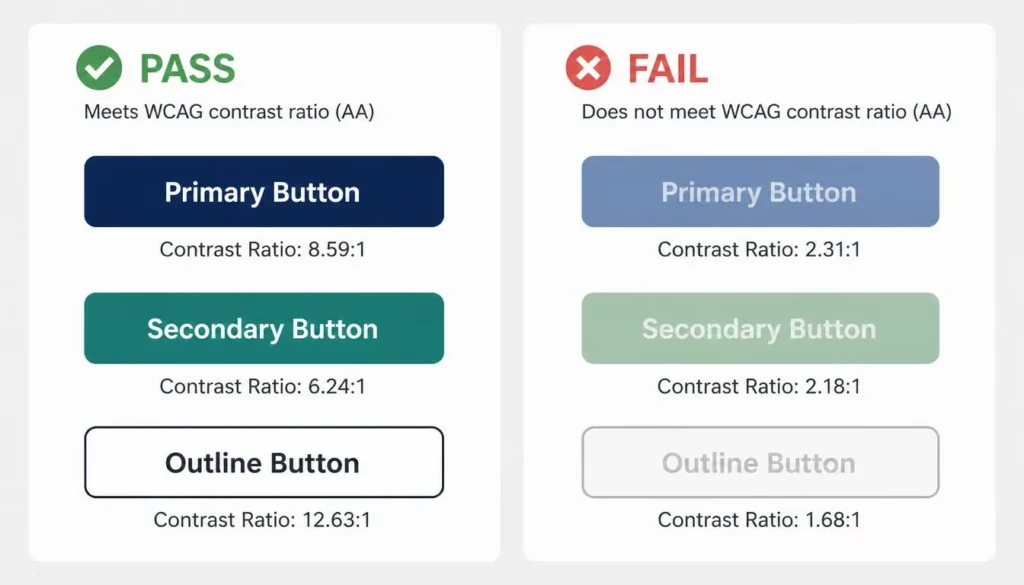
Color psychology only matters if every user can actually perceive the color relationships you designed. The Web Content Accessibility Guidelines (WCAG) 2.1 require a minimum contrast ratio of 4.5:1 for normal text and 3:1 for large text and UI components at the AA level; the stricter AAA level requires 7:1. These aren’t suggestions, they’re the baseline for legal compliance in many jurisdictions and the baseline for basic usability everywhere else.
Roughly 8% of men and 0.5% of women live with some form of color vision deficiency, most commonly red-green (deuteranopia/protanopia). That single statistic is why “never rely on color alone” is a core UX heuristic: pair every color-coded meaning with an icon, label, or pattern. Before shipping a palette, run it through a free color contrast checker and a color blindness simulator guide to confirm every state is distinguishable, not just visually pleasant.
How to Choose a Website Color Scheme Using Color Psychology
- Define the single emotional outcome you want the palette to produce, trust, urgency, playfulness, or authority, before picking any hex code.
- Apply the 60-30-10 rule: one dominant neutral, one secondary color, and one high-contrast accent reserved for calls to action.
- Test the accent color against its background using a WCAG contrast checker before finalizing any button style.
- Validate the full palette under a color blindness simulation so semantic states remain distinguishable without color.
- Ship to a small cohort and A/B test real behavior, psychology principles predict direction, not certainty, for your specific audience.
Best Colors for Call-to-Action Buttons
There is no universally “best” CTA color, the myth that orange or green always outperforms every other hue ignores context. The color that converts best is the one with the highest contrast against its immediate background while still fitting the emotional tone of the action (urgent purchase vs. a calm “save for later”). Contrast against surrounding UI, not the hex value in isolation, is the real driver of best colors for call-to-action buttons.
Color Psychology in Dark Mode UI
Emotional associations shift when luminance context changes. Highly saturated colors that read as energetic on a white background can vibrate or cause halation on a dark background. A dark mode color scheme generally needs desaturated, slightly muted accent tones and a softened pure-black backdrop (near-black grays reduce eye strain) to preserve the same emotional read without visual fatigue.
Real-World UX Use Cases
- Fintech onboarding: blue-dominant palettes with white space consistently reinforce security and competence during account setup, when trust anxiety is highest.
- Healthcare portals: cool blues and greens lower perceived stress in patients scheduling appointments or reviewing results.
- E-commerce urgency: red or orange countdown banners paired with a neutral base drive time-sensitive action without overwhelming the product imagery.
- SaaS dashboards: a neutral gray-and-white base with a single accent color for data highlights keeps visual hierarchy intact across dense information screens.
How a Color Theory Calculator Speeds Up Psychology-Driven Design
Translating every principle above into an exact, exportable palette by hand is slow and error-prone. A dedicated color theory calculator encodes harmony rules (complementary, analogous, triadic, monochromatic) and contrast checks into one workflow, so a designer can pick an emotional target and immediately see valid, accessible hex values rather than manually testing contrast ratios one pair at a time. On Color Scheme Calculator, you can build your palette directly from a base brand color and export it with contrast data already verified.
Frequently Asked Questions
What is the psychology of color in UX design?
It’s the study of how specific hues and color combinations influence a user’s emotions, trust, and decisions while interacting with a digital interface, applied deliberately to usability and business goals.
Which color increases conversions the most?
No single hex code universally converts best. The color with the highest contrast against its background, aligned with the action’s emotional tone, consistently outperforms any “best” color myth.
Is blue always the most trustworthy color?
Blue is strongly associated with trust and competence in most Western contexts, which is why it dominates fintech and SaaS branding, but cultural context and brand consistency matter more than the hue in isolation.
How many colors should a UI palette have?
Most accessible, cohesive UI palettes follow the 60-30-10 rule: one dominant neutral, one secondary color, and one accent, plus semantic colors for success, warning, and error states.
Does color psychology differ by culture?
Yes. Associations like purity, mourning, luck, or danger attached to specific colors vary significantly across regions, so global products should validate assumptions with local user research.
What’s the difference between color theory and color psychology?
Color theory describes the structural relationships between colors on a wheel (complementary, analogous, triadic). Color psychology describes the emotional and behavioral response those color relationships produce in a viewer.
Conclusion: Turning Color Psychology Into Better UX
Color psychology in UX design is not decoration layered on top of an interface, it is one of the fastest, most consistent signals a product sends before any copy is read. Treat every hue decision as a hypothesis: define the emotional outcome, apply an established harmony model, validate against WCAG contrast and color blindness, and measure real behavior rather than assumption.
- Color is the first micro-interaction a user has with your product, often before they read anything.
- Emotional associations are directional, not universal; culture and brand context always modify them.
- Accessibility (WCAG contrast, color blindness simulation) is non-negotiable, not an afterthought.
- A color theory calculator turns these principles into exact, tested hex values in seconds.