A neon color palette looks incredible in a mood board and falls apart the moment it hits production. The hex codes bleed into muddy gradients, the contrast ratio fails an accessibility audit, and after twenty minutes on screen the colors genuinely start to hurt to look at. None of that is inevitable, it’s usually a handful of fixable mistakes: pairing two saturated neons against each other instead of a neutral base, skipping the math behind complementary contrast, or picking a hue that exists in sRGB but disappears the moment a printer tries to reproduce it in CMYK. This guide gives you the exact hex values, the pairing rules, the CSS for the glow effect, and the accessibility numbers to build a neon palette that actually holds up.
What Actually Makes a Color “Neon”?
“Neon” isn’t a hue family, it’s a saturation and lightness signature. In HSL terms, most true neons sit around 90–100% saturation and roughly 50–60% lightness: full-intensity color with just enough lightness to stop it from collapsing into a dark, ordinary primary. Drop the saturation below about 85% and a “neon green” reads as an ordinary grass green. Push the lightness past roughly 65% and it washes out toward pastel.
That narrow band is also why neon is notoriously hard to reproduce off-screen: many neon hex values sit right at, or outside, the edge of the CMYK gamut used in standard printing, which is smaller than the sRGB gamut a monitor displays. Neon Green at #39FF14 can look flawless on a screen and print as a flat, disappointing olive on a business card, because CMYK ink physically cannot mix a color that saturated. If a neon palette is heading to print as well as screen, budget time for a physical proof, never trust the on-screen preview for this.
How to Pair Neon Colors Without Visual Chaos
The most common mistake in neon design is treating every color in the palette as a hero. Two or more fully saturated neons placed directly against each other create simultaneous contrast: each color makes its neighbor look duller by comparison, and the eye can’t settle on either one. The fix is structural, not stylistic:
- Pick one neon as the dominant accent and treat every other color as support.
- Anchor the palette in a near-black or deep charcoal base (#0D0D0D–#1A1A1A tends to work better than pure #000000, which can look harsh next to fully saturated color).
- Keep neutrals, grays, off-whites, muted secondary tones, at roughly 60–70% of total color usage, with neon reserved for the remaining 10–30%. It’s the classic 60-30-10 rule with a neon accent standing in for the ‘10.’
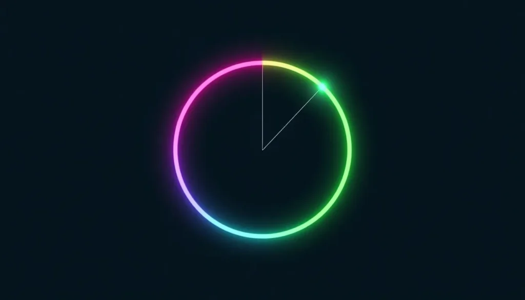
- When combining two neons, keep at least a 90° hue gap between them on the color wheel rather than reaching for whatever looks brightest.
Before locking in a combination, run the candidate hues through our color theory calculator to check the harmony math, it flags when two colors sit close enough in hue to fight rather than complement each other.
Make One Color Pop: High-Contrast Complementary Pairing
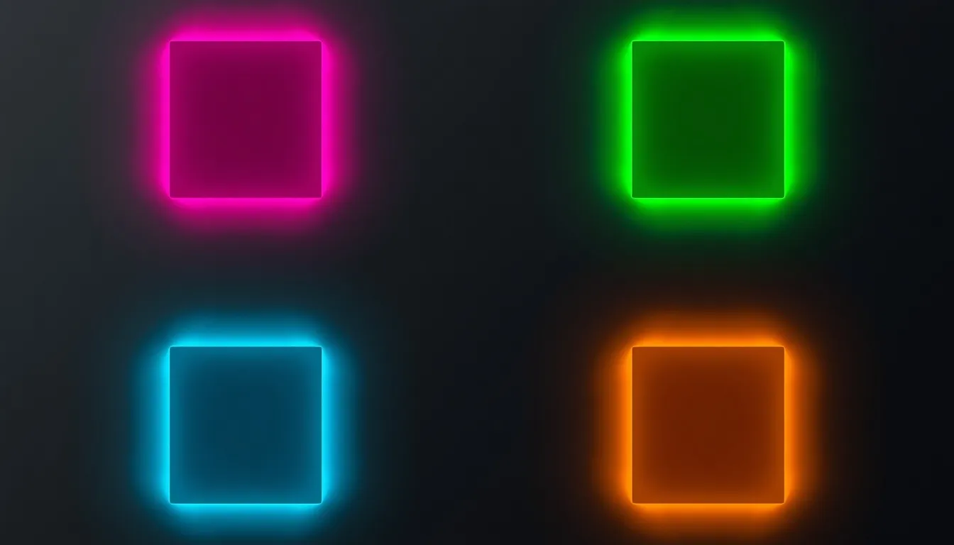
When a single neon color needs to command attention, a CTA button, a sale banner, a highlight inside a data visualization, the most reliable technique is a complementary pairing: two hues sitting opposite each other on the color wheel. Neon pink (#FF10F0) against a deep green, or electric cyan (#0FF0FC) against neon orange (#FF5F1F), creates the kind of contrast the eye reads as motion even in a static image. That isn’t a matter of taste; it’s how the visual system processes opponent colors. Our high-contrast complementary colors tool maps these opposite-hue pairs automatically, so you’re not eyeballing a color wheel and hoping the pairing holds up outside the design file.
30+ Neon Hex Codes You Can Copy
Each hue below ships as a three-step tonal ramp, a base accent plus a lighter tint and a deeper shade, because a real interface needs hover and pressed states, not just one bright value. The “Deep” shade in each group is also the safer choice for text, since it keeps the hue while pulling contrast back into a legible range (more on that in the accessibility section below).
| Color Name | Hex | RGB | Role |
| Neon Pink | #FF10F0 | 255, 16, 240 | Base / primary accent |
| Neon Pink Light | #FF62F5 | 255, 98, 245 | Hover state |
| Neon Pink Deep | #BD00B2 | 189, 0, 178 | Pressed state / text-safe |
| Hot Magenta | #FF00FF | 255, 0, 255 | Base / primary accent |
| Hot Magenta Light | #FF52FF | 255, 82, 255 | Hover state |
| Hot Magenta Deep | #AD00AD | 173, 0, 173 | Pressed state / text-safe |
| Neon Coral | #FF6EC7 | 255, 110, 199 | Base / primary accent |
| Neon Coral Light | #FFC0E7 | 255, 192, 231 | Hover state |
| Neon Coral Deep | #FF1CA7 | 255, 28, 167 | Pressed state / text-safe |
| Neon Red | #FF3131 | 255, 49, 49 | Base / primary accent |
| Neon Red Light | #FF8383 | 255, 131, 131 | Hover state |
| Neon Red Deep | #DE0000 | 222, 0, 0 | Pressed state / text-safe |
| Neon Orange | #FF5F1F | 255, 95, 31 | Base / primary accent |
| Neon Orange Light | #FF9971 | 255, 153, 113 | Hover state |
| Neon Orange Deep | #CC3A00 | 204, 58, 0 | Pressed state / text-safe |
| Neon Yellow | #FCEE09 | 252, 238, 9 | Base / primary accent |
| Neon Yellow Light | #FDF45A | 253, 244, 90 | Hover state |
| Neon Yellow Deep | #B1A702 | 177, 167, 2 | Pressed state / text-safe |
| Cyber Lime | #CCFF00 | 204, 255, 0 | Base / primary accent |
| Cyber Lime Light | #DCFF52 | 220, 255, 82 | Hover state |
| Cyber Lime Deep | #8BAD00 | 139, 173, 0 | Pressed state / text-safe |
| Neon Green | #39FF14 | 57, 255, 20 | Base / primary accent |
| Neon Green Light | #7EFF66 | 126, 255, 102 | Hover state |
| Neon Green Deep | #1EC100 | 30, 193, 0 | Pressed state / text-safe |
| Neon Turquoise | #00FFEF | 0, 255, 239 | Base / primary accent |
| Neon Turquoise Light | #52FFF4 | 82, 255, 244 | Hover state |
| Neon Turquoise Deep | #00ADA3 | 0, 173, 163 | Pressed state / text-safe |
| Electric Cyan | #0FF0FC | 15, 240, 252 | Base / primary accent |
| Electric Cyan Light | #60F5FD | 96, 245, 253 | Hover state |
| Electric Cyan Deep | #02AEB7 | 2, 174, 183 | Pressed state / text-safe |
| Neon Blue | #1F51FF | 31, 81, 255 | Base / primary accent |
| Neon Blue Light | #7190FF | 113, 144, 255 | Hover state |
| Neon Blue Deep | #002ECC | 0, 46, 204 | Pressed state / text-safe |
| Neon Purple | #BC13FE | 188, 19, 254 | Base / primary accent |
| Neon Purple Light | #D364FE | 211, 100, 254 | Hover state |
| Neon Purple Deep | #8901BF | 137, 1, 191 | Pressed state / text-safe |
Every hex code above is a starting point, not a rule. If a project needs a slightly different lightness or saturation, open the color palette generator and dial in the exact shade, it generates matching tints and shades automatically so hover and pressed states don’t have to be eyeballed by hand.
CSS & Digital Execution: Making Neon Glow On Screen
Getting a neon color to actually glow on screen takes more than a background-color declaration. A single flat color reads as bright but flat; the perception of “glow” comes from stacking soft, semi-transparent shadows around the element, mimicking how light bleeds outward from a real neon tube.
.neon-cta {
background-color: #0D0D0D;
color: #39FF14;
text-shadow:
0 0 4px #39FF14,
0 0 11px #39FF14,
0 0 19px #39FF14,
0 0 40px #1EC100;
box-shadow:
0 0 6px rgba(57, 255, 20, 0.6),
0 0 20px rgba(57, 255, 20, 0.4);
}
Three technical notes worth knowing before shipping this:
- Stack 3–4 shadow layers at increasing blur radius and decreasing opacity rather than one large blur, it reads as a truer glow and renders more consistently across browsers.
- Use rgba() or hsla(), not a lighter hex, for the outer glow layers. A glow is the color fading into its background, not the color getting paler.
- Gradients built from two fully saturated neons (a cyan-to-magenta background, for example) are the most common source of visible banding, because 8-bit color doesn’t have enough intermediate steps to transition smoothly between two extreme, high-chroma values. A 2–3% opacity noise overlay, or a third, lower-saturation midpoint color, breaks up the banding.

Accessibility & Eye Strain: Making Neon Usable
Neon’s biggest UX liability isn’t taste, it’s contrast math and eye strain, and both are measurable. WCAG 2.1 requires a contrast ratio of at least 4.5:1 for normal text and 3:1 for large text and UI components. Neon behaves inconsistently here because saturation and lightness pull in opposite directions:
- Neon yellow (#FCEE09) on black: roughly 17.4:1, excellent, among the highest contrast available.
- Neon green (#39FF14) on black: roughly 15.5:1, comfortably compliant.
- Neon pink (#FF10F0) on black: roughly 6.6:1, compliant for text, with less margin.
- Neon blue (#1F51FF) on black: roughly 3.7:1, fine for a large heading or a button border, too low for body copy.
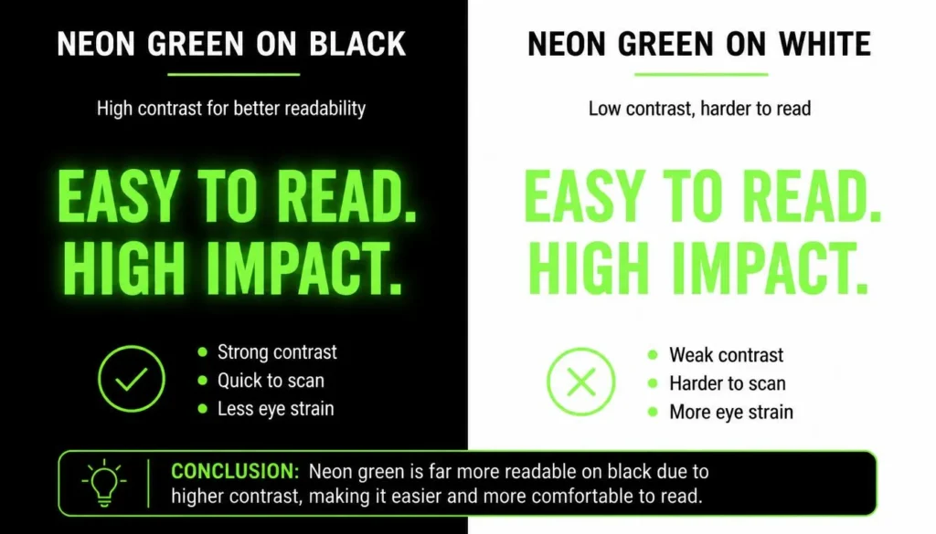
- Any of these flipped onto white instead of black mostly fail outright, neon green on white is roughly 1.4:1, unreadable.
That last line is the rule worth memorizing: light, saturated neons need a dark background to hit compliant contrast, and collapse on white. If a design calls for neon on a light background, use the “Deep” shade from the hex table above for any text, and reserve the true neon value for non-text elements like borders, icons, or fills sitting behind white text.
Before shipping a neon-heavy interface, run every foreground-background combination through our ADA compliant color checker. Neon fails compliance far more often than muted palettes because it lives at the edges of what’s technically “bright,” and a color that looks vivid isn’t automatically legible.
Eye strain is the second, less-discussed cost. Fully saturated color at high lightness increases the luminance contrast the eye processes continuously, which is part of why neon reads as “loud.” That’s a feature for a five-second CTA and a liability for a full-screen background or a long-form reading surface. Treat neon as seasoning, not the main dish: cap it at the 10% accent role from the pairing rules above, and never set a body-copy background to a fully saturated neon.
Where Neon Color Palettes Work (and Where They Don’t)
Where it works
- Dark-mode dashboards and admin panels, where neon accents read as clear data highlights against a near-black canvas.
- Data visualization, where saturated hues stay distinguishable even in small chart elements or thin line segments.
- Call-to-action buttons and urgency messaging, where a single neon accent against a muted page directs attention on purpose.
- Gaming, nightlife, events, streetwear, and youth-oriented brand identity, categories where “loud” is the brand promise, not a mistake.
- Seasonal campaigns: Halloween marketing leans on neon orange and green specifically because those hues read as “glow-in-the-dark” at a glance.
Where it doesn’t
- Long-form reading surfaces or editorial body text, where sustained saturation is fatiguing rather than engaging.
- Financial, healthcare, legal, or other trust-driven categories, where lower-saturation palettes tend to read as more credible.
- Print collateral, for the CMYK gamut reasons covered above.
- Landing pages that reach for more than one dominant neon at once, the eye needs somewhere to land.
Why Neon Keeps Coming Back: Psychology & Trend Cycles
Color psychology treats high-saturation, high-luminance-contrast color as an arousal signal, it reads as energetic, urgent, and youthful largely because it demands more visual processing than a muted tone. Marketers lean on that deliberately: energy drinks, gaming peripherals, festival branding, and fast-fashion drops all reach for neon specifically to signal ‘new,’ ‘fast,’ and ‘now.’
The aesthetic itself traces back to 1980s advertising, arcade signage, and VHS-era graphic design, and it resurfaces on a cycle: synthwave and vaporwave music culture revived it in the 2010s, cyberpunk media kept the neon-and-night-city association alive, and a broader Y2K nostalgia wave has pulled it back into UI and packaging design again. Because it moves in cycles rather than sitting as a permanent style baseline the way navy or forest green do, it’s worth checking current trend forecasting before committing a full brand system to it rather than just a single seasonal campaign.
Frequently Asked Questions
What HSL values make a color read as neon?
Roughly 90–100% saturation and 50–60% lightness. Below about 85% saturation, the color reads as an ordinary hue; above roughly 65% lightness, it washes out toward pastel instead of reading as neon.
What is the best background color for a neon palette?
A near-black or deep charcoal, such as #0D0D0D to #1A1A1A. It lets neon read as glowing rather than flat, and tends to look softer than pure black (#000000) next to fully saturated color.
Can neon colors be printed accurately?
Not reliably. Many neon hex values fall outside the CMYK gamut used in standard printing, which is smaller than the sRGB gamut a screen displays, so a color that looks perfect on-screen can print noticeably duller. Always check a physical proof before a print run.
How many neon colors should one design use?
One dominant neon accent paired with neutral tones, roughly following a 60-30-10 ratio where neon fills the smallest share. Two or more fully saturated neons placed directly next to each other create simultaneous contrast, which makes both harder to read.
Are neon color palettes WCAG accessible?
It depends on the specific pairing, not on how bright a color looks. Neon yellow and neon green on black both clear a 15:1 contrast ratio; neon blue on black sits closer to 3.7:1. On white backgrounds, most light-toned neons fail outright, so every foreground-background pair needs to be checked individually rather than assumed.
Key Takeaway
A neon color palette isn’t hard to get right once the two problems people usually conflate are separated: picking hues that look good together, and making those hues perform once they’re rendered on a screen, printed, or read by someone with the brightness turned down. Anchor the palette in a dark neutral, limit any one composition to a single hero neon, check every pairing for both harmony and contrast, and treat the CSS glow as its own small craft rather than an afterthought. Start from the hex codes above, and build outward from there instead of guessing at what “feels” bright enough.