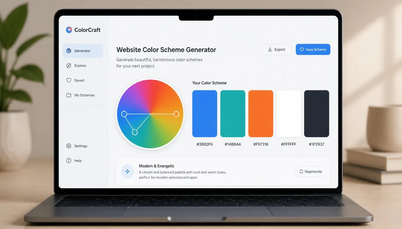
Choosing colors for a website used to mean staring at a color wheel and guessing. A website color scheme generator turns that guesswork into a repeatable, data-informed process: enter a base color (or pull one from a logo or image), and the tool calculates harmonious pairings, tints, shades, and accent colors using color theory math instead of intuition.
For designers and developers building SaaS products, dashboards, marketing sites, or portfolios, a strong color scheme is a business decision as much as an aesthetic one. The right hues improve readability, direct attention toward calls-to-action, and signal brand personality before a single word is read.
This guide covers how these generators work, the color theory behind them, how to build an accessible and ADA-compliant palette, and how to take a generated scheme from swatch to shipped CSS. If you want to jump straight in, try the free website color scheme generator and produce a full palette from any base color in seconds.
What Is a Website Color Scheme Generator?
A website color scheme generator is a tool that calculates a complete, harmonious set of colors for a site, primary, secondary, accent, background, and text, from a single input, using established color theory rules such as complementary, analogous, triadic, and monochromatic harmony rather than manual trial and error.
Most generators output ready-to-use hex, RGB, and HSL values for every color in the palette. That’s the key difference between a scheme generator and a simple color picker or hex-to-RGB converter: a picker isolates a single color, while a scheme generator’s real job is managing the relationships between colors, contrast, hierarchy, and harmony, across an entire interface.
A color palette generator built for the web also accounts for how colors behave in a UI specifically: hover and active states, disabled buttons, form validation colors, and dark mode variants, not just a static five-swatch mood board.
Why Your Website’s Color Scheme Actually Matters
Color is processed by visitors before they read a word of copy, which is why color psychology in UX design is treated as a functional design input, not decoration:
- Trust and stability: blues and deep teals are the dominant choice for finance, healthcare, and B2B SaaS products.
- Urgency and action: warm, saturated colors like orange and red draw the eye fastest and are common for calls-to-action.
- Growth and wellness: greens signal sustainability, health, and “go” states such as success messages.
- Premium and focus: near-black backgrounds with a single accent color are the current standard for developer tools and AI products.
This is also where the meaning of colors in marketing and the best colors for call-to-action buttons overlap: no single hue is universally “best.” What actually converts is contrast, a CTA button in a color that appears nowhere else on the page outperforms one that blends into the surrounding palette, regardless of the specific hue chosen.
The Color Theory Behind Every Great Scheme
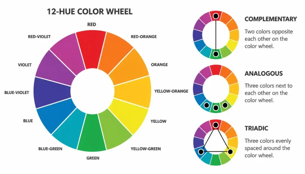
Every website color scheme generator is running the same underlying math: positions on a 360-degree color wheel. Understanding the five core harmony types makes it possible to predict what a generator will produce and to art-direct it intentionally, rather than clicking “shuffle” until something looks right.
Complementary Colors
Complementary colors sit directly opposite each other on the color wheel (for example, blue and orange). This pairing creates the highest possible contrast, which makes it ideal for calls-to-action, alerts, and anywhere something needs to visually pop against the rest of the page.
Analogous Colors
Analogous schemes use three colors that sit next to each other on the wheel. Because the hues are close in temperature, the result feels calm, cohesive, and low-tension, a strong choice for backgrounds, illustrations, and gradients that shouldn’t compete with content.
Triadic Colors
Triadic schemes select three colors spaced evenly around the wheel (120 degrees apart). They stay vibrant and playful while remaining balanced, which is why they show up often in consumer, education, and entertainment brands that want energy without visual chaos.
Tetradic (Double Complementary) Colors
Tetradic schemes use two complementary pairs, four colors total. They’re the richest option and the hardest to balance manually, which makes them a strong fit for data visualizations and dashboards that need several distinct, non-clashing categories rather than a single brand mood.
Monochromatic Colors
A monochromatic scheme uses a single hue across a range of tints and shades. It’s the safest option for clean, minimal, professional interfaces, most modern SaaS dashboards are monochromatic at the base, with one complementary accent layered in for CTAs and status indicators.
Rather than eyeballing these relationships on a static wheel, it’s faster to pull exact values from a color theory wheel calculator, which returns the precise complementary or triadic hex codes for any base color mathematically instead of by estimation.
How to Choose a Website Color Scheme (Step-by-Step)
- Start with one anchor color. This is usually your existing brand color, logo color, or the emotional tone you want the brand to carry.
- Pick a harmony type based on brand personality. Complementary for bold and action-driven, analogous for calm and editorial, triadic for playful, monochromatic for minimal and professional.
- Generate tints and shades, not just one flat hue per color. You’ll need 4–6 values of each core color for hover states, disabled states, borders, and backgrounds.
- Set a neutral base. 60–70% of a well-designed interface is neutral (white, off-white, gray, near-black), color should be used to draw attention, not fill space.
- Assign semantic colors. Success, warning, error, and info states need consistent, distinct colors that stay separate from the brand palette.
- Test contrast and validate in both light and dark mode before shipping.
If you’re still weighing a bold, high-contrast direction against a quieter, neutral-led one, this guide to choosing a website color scheme walks through the foundational decision framework in more depth before you start generating variations.
Color Schemes for Different UI Contexts
A generic “website color scheme” isn’t the same job as a UI color palette for a product interface. Context changes the requirements:
- Dashboards: need a categorical data palette of 6–8 distinct, colorblind-safe colors for charts, separate from the brand’s UI colors, so a dashboard color palette should be built as its own system rather than reused from the marketing site.
- SaaS product UI: a UI color palette typically needs one primary action color, one secondary, four semantic colors (success/warning/error/info), and a neutral gray scale with 8–10 steps.
- Landing pages: a landing page color palette should be contrast-heavy and deliberately narrow, one dominant color, one accent reserved exclusively for the primary CTA, and nothing else competing for attention.
- Mobile apps: mobile app UI colors need higher contrast than desktop equivalents since screens are smaller and viewed in more variable lighting, and every color needs a tested dark mode counterpart.
Established systems like Google’s Material Design color palette are useful references precisely because they define these roles explicitly (primary, on-primary, surface, on-surface) instead of treating color as a single flat list of brand hues.

Trending Website Color Palettes for 2026
The trending color palettes for 2026 lean away from decorative color and toward restraint:
- Minimalist, single-accent palettes: one neutral base plus one saturated accent color continues to dominate SaaS and product marketing sites.
- Dark mode as default, not an add-on: a dark mode color scheme is now expected to be designed alongside the light scheme from the start, not bolted on afterward with simple inversion.
- Deep, muted “luxury” tones: luxury brand color palettes built on deep jewel tones (emerald, burgundy, ink navy) are moving from fashion and hospitality into premium software branding.
- High-saturation accents on near-black: a single neon or electric accent color against a near-black background remains the signature look for developer tools and AI products.
Building an Accessible, ADA-Compliant Color Scheme
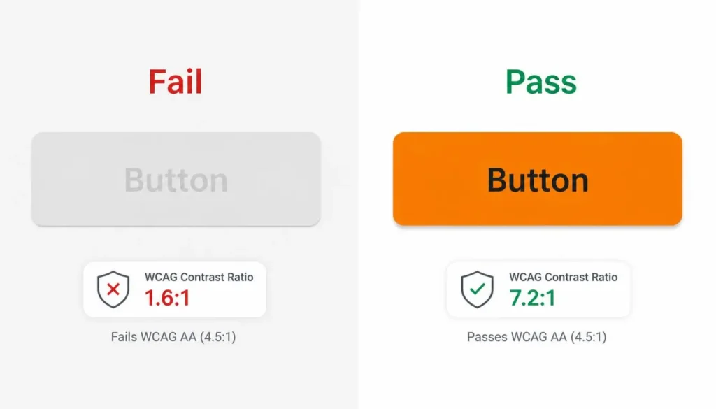
Color choices that fail accessibility standards aren’t just a legal risk under ADA and WCAG guidelines, they actively lose users. WCAG 2.1 AA requires a contrast ratio of at least 4.5:1 for normal text and 3:1 for large text and UI components like buttons and form borders.
Rather than checking contrast after a palette is finished, run every text-and-background pairing through a free color contrast checker while the scheme is still in progress, so low-contrast combinations get caught before they reach production.
Contrast is only half of accessible color: roughly 8% of men and 0.5% of women have some form of color blindness, most commonly red-green (deuteranopia). Running a palette through a color blindness simulator, including specific checks for tritanopia (blue-yellow deficiency), reveals whether critical information (errors, chart categories, status badges) is still distinguishable without color as the only signal. As a rule, never let color alone carry meaning: pair it with an icon, label, or pattern.
An accessible color palette generator that bakes contrast checking into the generation step, rather than treating it as a separate audit, is significantly faster than designing a palette first and retrofitting accessibility second.
From Palette to Code: Developer Handoff
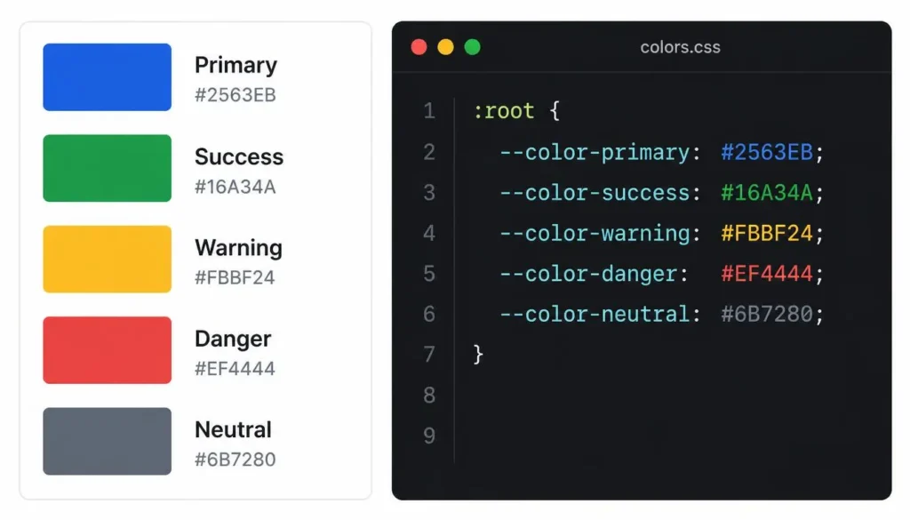
A color scheme is only useful once it’s implemented consistently, which is where most hand-off friction happens between design and development. The fastest path is exporting the generated palette directly into the format the codebase already uses:
- CSS custom properties: hex codes mapped to semantic variable names (–color-primary, –color-accent) so the palette can be updated in one place.
- Tailwind config tokens: a tailwind color generator workflow that outputs a palette directly into the theme.colors object keeps class names consistent with design tokens.
- Bootstrap theme variables: a bootstrap theme generator approach maps the palette to Sass variables ($primary, $secondary) for teams already on that framework.
- Gradients: a CSS gradient generator can extend two palette colors into a linear or radial gradient without introducing an off-palette third color.
:root {
–color-primary: #1D4ED8;
–color-secondary: #0EA5A0;
–color-accent: #F97316;
–color-bg: #FFFFFF;
–color-text: #111827;
}
This also matters for web safe colors and legacy support: modern palettes rarely need to be restricted to the historic 216-color web-safe set, but keeping hex codes clean and rounded (rather than arbitrary values like #4C7A9E) still makes a design system easier to scan and maintain.
Generating a Scheme in Under a Minute
- Open a free color scheme generator and enter a base hex code, your existing brand color, or one pulled from a reference image.
- Choose a harmony rule: complementary, analogous, triadic, tetradic, or monochromatic, based on the brand personality decided earlier.
- Review the generated primary, secondary, accent, and neutral values, and run a random color scheme generator pass if you want alternative directions from the same base color.
- Check contrast ratios for every text/background pairing directly in the tool.
- Export the final palette as hex, RGB, or CSS variables and hand it to development.
A dedicated color scheme calculator removes the two slowest parts of this process by hand, calculating exact harmony math and checking contrast ratios, so a usable, accessible palette takes minutes instead of a full design session.
Common Mistakes to Avoid
- Using more than one or two accent colors, extra accents dilute visual hierarchy instead of adding energy.
- Designing only for light mode and inverting it later instead of testing a real dark mode color palette generator pass.
- Skipping contrast checks until final QA, when fixing them means reworking finished screens.
- Copying a competitor’s palette exactly, which erodes the differentiation color is supposed to create.
- Relying on color alone to communicate status (errors, warnings, chart categories) without a secondary indicator.
- Choosing colors that look good in isolation but were never tested together as a full palette.
Frequently Asked Questions
What is a website color scheme generator?
A website color scheme generator is a tool that calculates a full, harmonious color palette, primary, secondary, accent, and neutral colors, from a single base color or image, using color theory rules instead of manual guesswork.
How many colors should a website color scheme have?
Most well-balanced website palettes use three to five core colors: one primary, one secondary, one accent reserved for calls-to-action, and one or two neutrals for text and background, plus optional semantic colors for success, warning, and error states.
What is the best color scheme for a website?
There’s no single “best” scheme, it depends on brand and audience, but the strongest schemes share three traits: one dominant color, one high-contrast accent reserved for calls-to-action, and WCAG-compliant contrast between text and background.
How do I make sure my website’s colors are accessible?
Check text-to-background contrast against the WCAG 2.1 AA minimums, 4.5:1 for normal text and 3:1 for large text and UI components, using a contrast checker, and confirm the palette stays distinguishable in a color blindness simulator before shipping.
What’s the difference between complementary, analogous, and triadic color schemes?
Complementary schemes pair colors from opposite sides of the color wheel for maximum contrast, analogous schemes use neighboring colors for a calm, cohesive feel, and triadic schemes use three evenly spaced colors for a vibrant but balanced look.
Are website color scheme generators free to use?
Yes, most, including Color Scheme Calculator’s generator, are free with no signup required, generating unlimited hex, RGB, and HSL palettes instantly.
How do I match a color scheme to my existing brand?
Enter your brand’s existing primary hex code (or upload your logo) as the base color, then let the generator calculate complementary and neutral colors around it rather than picking new colors that clash with existing brand assets.
What color scheme is trending for websites in 2026?
Minimalist palettes built around one neutral base and a single saturated accent color, paired with a fully-supported dark mode variant, are the dominant trend for SaaS and product websites in 2026.
Try It Yourself
A great website color scheme isn’t a matter of taste alone, it’s color theory, accessibility, and brand intent working together. The fastest way to put everything in this guide into practice is to generate a palette with the free website color scheme generator and adjust from there.