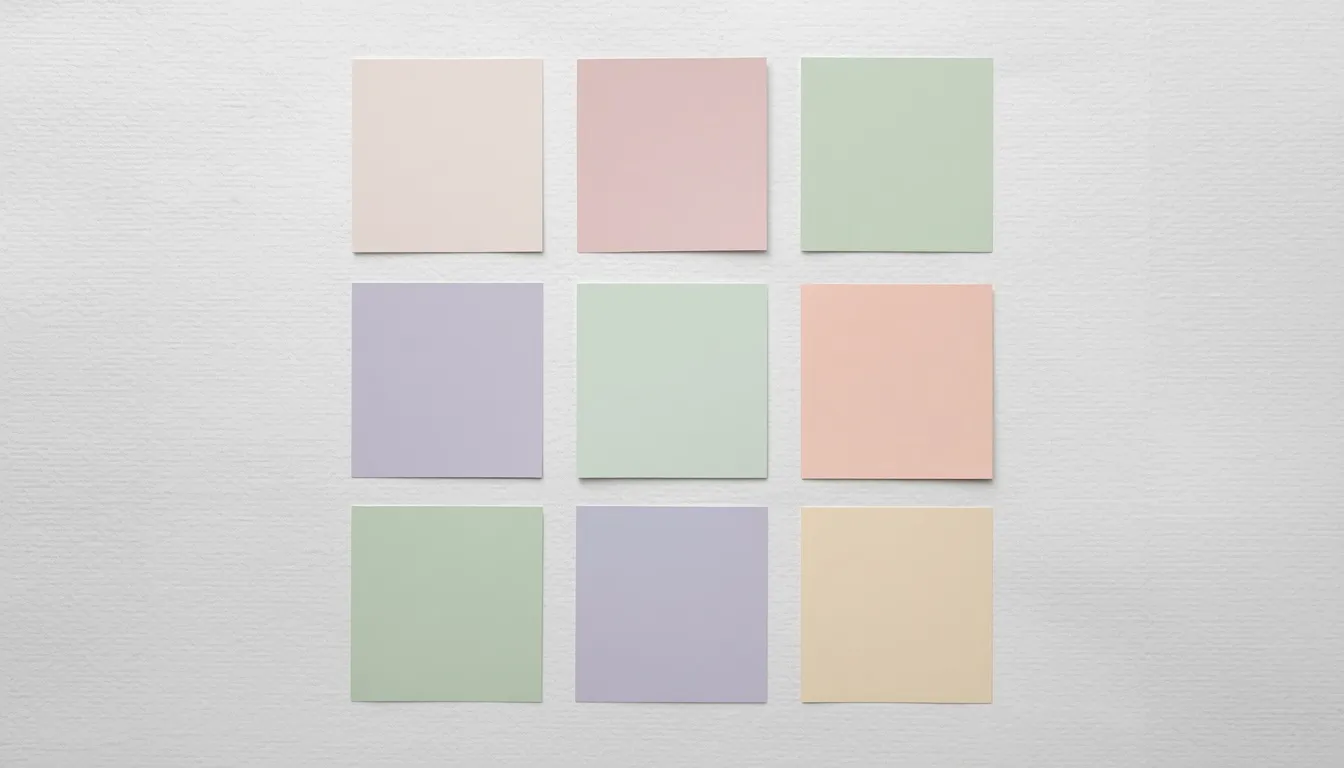
A pastel color palette works by subtraction, not addition. Each hue carries the same fundamental identity as its saturated counterpart, the same position on the color wheel, but with white folded in to raise lightness and pull back chroma. That single move changes how a viewer’s eye travels across a page: instead of demanding attention, the color recedes and lets type, imagery, and negative space carry more of the visual weight.
That’s why a pastel color palette shows up everywhere from spring product launches to minimalist SaaS dashboards to wedding stationery, it lowers the emotional volume of a design without making it flat or boring. Below are 30+ tested combinations with copy-paste hex codes, sorted into five practical categories, followed by the color science that makes pastels work and the accessibility math that keeps them readable.
| 🎨 Related Tool |
What Makes a Color “Pastel”?
Definition: A pastel color is any hue mixed with a high proportion of white, producing high lightness (value) and low chroma (saturation) in the HSL color model. Most pastel hex codes fall between roughly 80–96% lightness and 15–45% saturation, regardless of which hue family they belong to.
In practice, three HSL properties do all the work:
- Hue, the base color family (pink, green, blue, violet). This value stays identical between a saturated color and its pastel version.
- Saturation / chroma, how intense or grey the color reads. Pastels sit in the low-to-mid range, never fully saturated.
- Lightness / value , how close the color sits to white. This is the dial that turns any hue into a pastel; push it high enough and saturation almost stops mattering visually.
These three levers also define the difference between a tint, a shade, and a tone: a tint is a hue mixed with white (this is what makes a color pastel), a shade is a hue mixed with black, and a tone is a hue mixed with grey. A muted color and a pastel color are not the same thing, muted means desaturated at any lightness, while pastel specifically requires both low saturation and high lightness.
In RGB, this shows up as three channel values sitting close together and all skewed high, for example #F6C9CE (246, 201, 206) has R, G, and B values within 45 points of each other, all above 200. The tighter that spread and the higher the floor, the softer and more pastel the color reads.
| 🎨 Related Tool |
30+ Pastel Color Palettes by Category
Every combination below uses four hex codes: a base, a mid-tone, a supporting shade, and a deeper accent for contrast. Copy them directly into CSS, Figma, or your brand style guide.
1. Minimalist & Clean
Low-chroma neutrals with a single warm or cool undertone, built for interfaces and editorial layouts where the content, not the color, should lead.
| Palette Name | Hex 1 | Hex 2 | Hex 3 | Hex 4 | Dominant Tone | Primary Use Case |
| Quiet Linen | #F7F5F2 | #EAE6DF | #D8D2C7 | #B9B0A0 | Warm neutral taupe | Minimalist branding & editorial sites |
| Soft Fog | #F4F6F7 | #E3E8EA | #C9D2D6 | #A9B6BC | Cool grey-blue | SaaS dashboards & UI backgrounds |
| Powdered Stone | #F6F3F0 | #E4DED8 | #CFC6BD | #A69C90 | Warm grey | Architecture & interior brand sites |
| Sage Whisper | #F2F5F0 | #DFE6DA | #C3D0BB | #9FAE94 | Muted sage green | Wellness & eco brands |
| Blush Concrete | #F7F2F0 | #EBDFDC | #D8C6C2 | #B8A29D | Warm pink-grey | Beauty & lifestyle landing pages |
| Milk Glass | #FAF9F6 | #EFEAE3 | #DED6C9 | #C7BBA9 | Ivory / cream | Product photography backdrops |
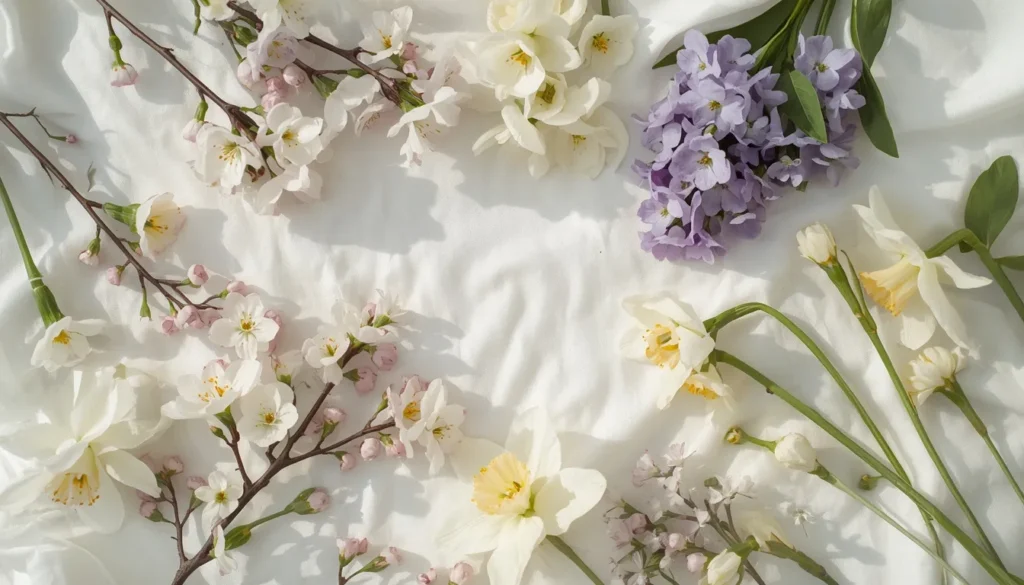
2. Soft Spring & Floral
Higher-chroma pastels drawn from blossoms, new leaves, and spring produce. These read fresh rather than washed-out because the saturation sits slightly higher than the minimalist set.
| Palette Name | Hex 1 | Hex 2 | Hex 3 | Hex 4 | Dominant Tone | Primary Use Case |
| Cherry Blossom | #FBE4E4 | #F6C9CE | #E8A6B3 | #D98CA0 | Blush pink | Spring seasonal campaigns |
| Fresh Meadow | #EAF5E0 | #D3ECC0 | #B8DDA0 | #9BCB84 | Soft green | Garden & nature branding |
| Lilac Field | #F1E7F7 | #E2D0F0 | #CBB2E6 | #B396D9 | Soft lavender | Floral shops & event branding |
| Daffodil Morning | #FFF8DE | #FFEFB0 | #FDE58A | #F8D35C | Pastel yellow | Cheerful spring email headers |
| Peach Blossom | #FFE9DD | #FED3BC | #FCBB98 | #F7A379 | Peach | Wedding save-the-dates |
| Robin’s Egg | #E3F6F5 | #C6EBE9 | #A3DAD8 | #7DC5C2 | Soft teal | Spring product packaging |
3. Sugar & Candy Aesthetics
The most saturated end of the pastel range, bubblegum, sherbet, and macaron tones for playful, youth-oriented, or dessert-adjacent branding.
| Palette Name | Hex 1 | Hex 2 | Hex 3 | Hex 4 | Dominant Tone | Primary Use Case |
| Cotton Candy | #FCE1F1 | #F7BEE0 | #F0A0D6 | #E888C9 | Candy pink | Confectionery & dessert brands |
| Bubblegum Pop | #FFE0F0 | #FFC2E6 | #FF9FDA | #FF7ACB | Bright bubblegum | Youth / Gen-Z social campaigns |
| Sherbet Swirl | #FFF1D9 | #FFDDB8 | #FFC38F | #F7A96A | Orange sherbet | Ice cream & summer branding |
| Macaron Box | #F4E3EE | #E7C9DF | #D6E8D0 | #FCE9C3 | Multi-pastel | Bakery packaging & menu design |
| Marshmallow Cloud | #FFF6F2 | #FFE9E1 | #FFD9CB | #FFC7B4 | Warm cream-pink | Kids’ product branding |
| Grape Fizz | #EDE4F7 | #DCC9F0 | #C6ACE8 | #AE8FDD | Soft violet | Beverage & soda branding |
4. Feminine & Elegance (Wedding & Bridal)
Muted, warm-leaning pastels paired with metallics and dusty neutrals, the palette family most requested for wedding stationery, bridal branding, and luxury cosmetic packaging.
| Palette Name | Hex 1 | Hex 2 | Hex 3 | Hex 4 | Dominant Tone | Primary Use Case |
| Champagne Silk | #F9F1E7 | #EFE0CC | #E1CBA8 | #D0AF7C | Champagne gold | Wedding invitations |
| Dusty Rose | #F3E2E2 | #E6C6C6 | #D6A5A8 | #C2868C | Muted rose | Bridal branding |
| Ivory & Sage | #FBF8F1 | #E9E5D4 | #D3D6C1 | #B9C2A6 | Ivory-sage | Elegant stationery |
| Mauve Whisper | #F0E3E6 | #E0C6CC | #CBA6B0 | #B38794 | Mauve | Luxury cosmetic branding |
| Blush & Gold | #FBE9E7 | #F5D0CB | #E8B8AE | #D6A98F | Blush-gold | Editorial fashion layouts |
| Antique Lilac | #EFE6F1 | #DCCADF | #C4A9CB | #A98BB2 | Antique purple | Vintage-luxury brand identity |
5. Modern Web UI / SaaS
Cool, low-saturation pastels designed to sit behind data, forms, and dashboards without competing with content. Each includes one slightly deeper tone suitable for accessible text or icon fills.
| Palette Name | Hex 1 | Hex 2 | Hex 3 | Hex 4 | Dominant Tone | Primary Use Case |
| Cloud SaaS | #EFF6FF | #DCEBFB | #BFD9F5 | #9CC1EC | Pastel blue | Dashboard UI backgrounds |
| Mint Interface | #E6FBF4 | #C7F3E4 | #A0E7CE | #75D9B4 | Mint green | Fintech app UI |
| Lavender Dashboard | #F0EBFB | #DDD1F5 | #C4B2EC | #A990E0 | Soft violet | Analytics & data-viz UI |
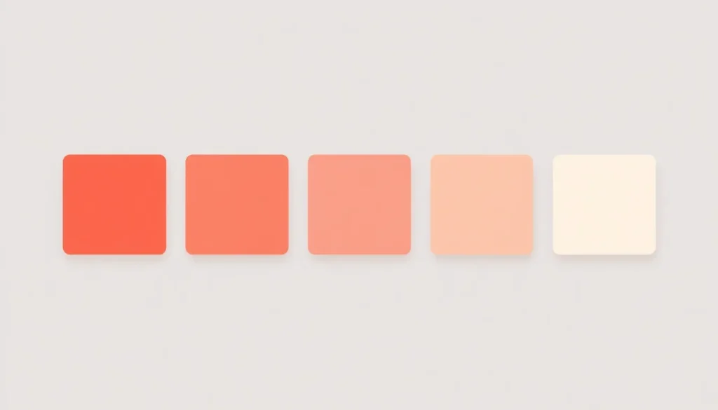
| Coral Accent | #FFEFEA | #FFDBCF | #FFC1AE | #FFA588 | Soft coral | CTA buttons & alerts |
| Sky UI | #E9F6FB | #CDEBF5 | #A9DCEC | #82CBE1 | Sky blue | Onboarding screens |
| Slate Pastel | #F0F2F4 | #DDE1E5 | #C3CAD1 | #A6B0BA | Cool slate grey | Enterprise SaaS neutrals |

Accessibility: Keeping Pastel Palettes WCAG-Compliant
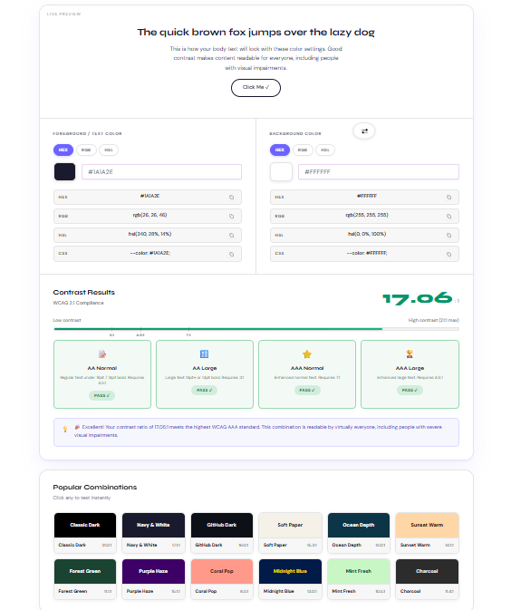
Pastel’s biggest design risk is contrast. Because pastel backgrounds already sit near white, white text on top of them almost always fails WCAG 2.1 requirements, 4.5:1 for normal text and 3:1 for large text or UI components (AA level). The fix isn’t to abandon pastels; it’s to control where they sit in the value scale.
- Use pastels as backgrounds, not text colors. Pair them with a dark neutral (charcoal, deep navy, or near-black) for body copy.
- Reserve the palette’s deepest swatch for text or icons when you want a monochromatic look, most of the palettes above include one tone dark enough to approach AA contrast on white.
- Test every pastel-on-color pairing before shipping, not just pastel-on-white, combining two light pastels is the most common accessibility failure in practice.
- Design for color blindness. Pastel palettes compress hue differences even further, so pair color-coded UI states (success, warning, error) with icons or labels, not color alone.
| 🎨 Related Tool |
Practical Implementation Tips
Typography Pairing
Set headlines and body copy in a dark neutral (near-black or deep charcoal) or in the same hue family pushed several shades darker, never white. Sans-serif typefaces with moderate weight (Inter, Poppins, Work Sans) hold up best against pastel backgrounds; hairline-weight fonts tend to disappear.
Background Contrast & Layering
Anchor every pastel composition with one true neutral, pure white, off-white, or near-black, so the eye has a resting point. Stacking three or more pastels of similar lightness with no anchor reads as visually flat and makes UI hierarchy hard to parse.
Brand Application: The 60/30/10 Rule
Assign one pastel as the dominant background color (60% of the composition), a second as a supporting fill or section divider (30%), and reserve a single more saturated accent, often the deepest swatch in the palette, for calls to action (10%). This keeps pastel branding soft without losing a clear visual hierarchy.
Build Your Own Custom Pastel Palette
Not seeing the exact shade your brand needs? You don’t have to eyeball hex codes by hand. If you already have a reference photo, moodboard, or product shot in the right tone, extract pastel tones from an image directly instead of guessing at values.
| 🎨 Related Tool |
Frequently Asked Questions
What is a pastel color palette?
A pastel color palette is a set of colors that share high lightness and low saturation values, produced by mixing hues with a large proportion of white. It creates a soft, muted visual effect rather than the bold contrast of fully saturated colors.
How do you turn a regular color into a pastel color?
Increase the lightness (value) and reduce the saturation (chroma) of the hue while keeping the hue angle unchanged. In HSL, that means raising the L value toward 85–95% and lowering S into the 15–45% range, in RGB terms, this simply means mixing in more white.
Are pastel colors accessible for web design?
Pastel backgrounds can meet WCAG AA standards, but pastel text usually cannot. Use pastels as backgrounds or large-surface fills, pair them with dark neutral text, and verify every pairing against the 4.5:1 (normal text) and 3:1 (large text/UI) contrast thresholds before publishing.
What’s the difference between pastel and muted colors?
Pastel colors are always high in lightness and low in saturation, they read as ‘light.’ Muted colors are simply low in saturation and can sit at any lightness level, including darker, dustier tones. Every pastel is muted, but not every muted color is pastel.
What hex codes are considered pastel?
There’s no single official range, but most pastel hex codes cluster around 80–96% lightness and 15–45% saturation in HSL, for example #F6C9CE (pastel pink), #C6EBE9 (pastel teal), and #DDD1F5 (pastel lavender) all fall within that band.