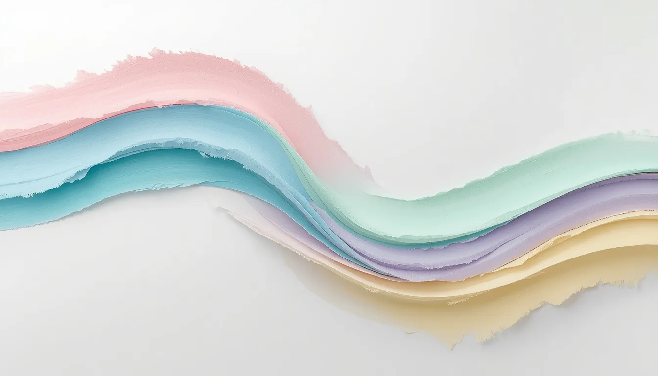
A pastel color palette is a set of high-lightness, low-saturation hues, think powder blue, blush pink, mint green, and buttery yellow, built by mixing a base color with white to soften its intensity. In HSL terms, pastels typically sit at 70–95% lightness and 20–55% saturation, which is why they read as gentle and calm rather than bold or saturated. Designers reach for pastel palettes in UI systems, wedding branding, packaging, and editorial work whenever the goal is approachability over impact.
Below you’ll find the color theory behind pastel hues, 34 ready-to-use hex code combinations organized by use case, a step-by-step method for building a custom palette, and the accessibility rules that keep soft colors from becoming a usability problem.
What Makes a Color “Pastel”? The Color Theory Behind Soft Hues
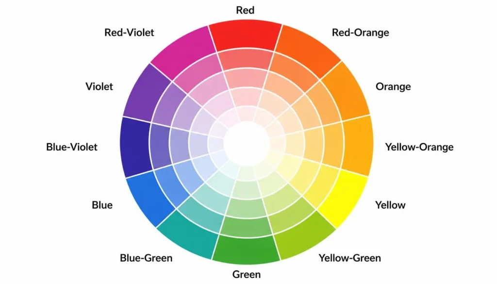
Every pastel starts as a fully saturated hue on the color wheel, then gets pushed toward white. Understanding the mechanics, tints, tones, and saturation, is what separates a genuinely cohesive pastel palette from a random assortment of light colors.
Tints, Tones, and Saturation Explained
A tint is any hue mixed with white, this is the technical definition of a pastel. A tone is a hue mixed with grey, which mutes it without necessarily lightening it, producing dustier pastels like sage or mauve. Saturation measures color intensity on a 0–100% scale; pastels generally fall between 20% and 55% saturation paired with lightness values above 70%. Push saturation too low and a pastel reads as grey; push lightness too low and it stops being a pastel at all.
Pastels on the Color Wheel: Complementary, Monochromatic & Analogous
Pastel palettes still follow the same harmony rules as fully saturated colors, they’re just built at lower intensity. A monochromatic pastel palette takes a single hue through several tints and tones for a calm, cohesive look common in minimalist UI. An analogous pastel palette pulls three to four neighboring hues on the wheel, blush, peach, and butter yellow, for example, for a warm, harmonious spread. Complementary pastel pairings, like soft blue with pale coral or lavender with butter yellow, create gentle contrast without the visual tension of saturated complementary colors.
If you want to test these relationships against real hues before committing to a palette, our interactive color wheel makes it easy to preview tints, tones, and complements side by side.
The Psychology of Pastel Colors in Design
Pastels read as calm, non-threatening, and approachable because low saturation removes visual urgency, it’s part of why healthcare, wellness brands, and children’s products lean on soft blues and greens. In UX design specifically, pastel backgrounds reduce eye strain during long sessions and create enough contrast to guide attention toward saturated CTA buttons without overwhelming the interface. In marketing, pastel pink and lavender skew toward softness and inclusivity rather than a strictly gendered association, while sage and muted blue-greens communicate sustainability and trustworthiness. The trade-off: pastels alone rarely carry enough contrast for accessibility-critical text, which is why most professional pastel systems pair soft backgrounds with a small set of deeper anchor colors for type and interactive elements, a detail covered in the accessibility section below.
40+ Pastel Color Palette Hex Code Combinations
Below are 34 curated pastel hex codes organized into six practical categories, from minimalist interfaces to retro branding. Each includes a ready-to-use hex code and its best real-world application, so you can copy a value directly into your design tool.
Minimalist Modern Pastels
Neutral-leaning pastels with just enough color to feel intentional, ideal for SaaS interfaces, editorial sites, and calm brand systems.
| Swatch | Color Name | Hex Code | Best Use Case |
| Cloud White | #FAFAFA | Background base for clean minimalist layouts | |
| Fog Grey | #E8E6E1 | Neutral section dividers and borders | |
| Powder Blue | #C9DDE4 | Primary accent for calm, airy UI sections | |
| Soft Sage | #D8E2DC | Secondary accent for eco or wellness branding | |
| Warm Taupe | #DDD0C8 | Grounding neutral for body text blocks | |
| Muted Sand | #EDE4DA | Card backgrounds and hover states |
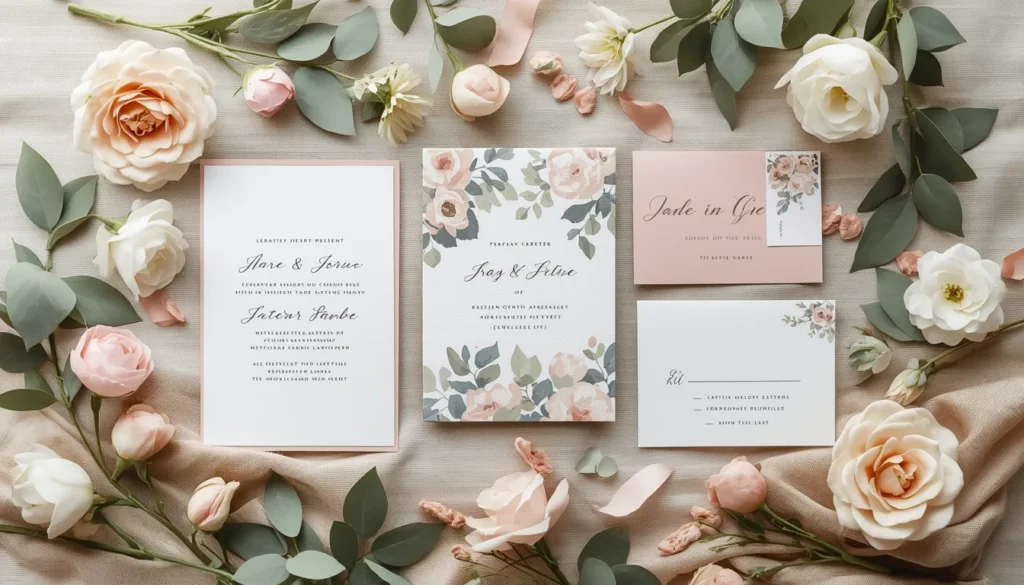
Soft Spring & Wedding Pastels
Warm, romantic pastels built around blush, sage, and buttercream, the backbone of spring wedding stationery, floral branding, and seasonal campaigns.
| Swatch | Color Name | Hex Code | Best Use Case |
| Blush Pink | #F7CAC9 | Bridesmaid dresses and invitation accents | |
| Buttercream | #FFF5D7 | Table linens and cake fondant tones | |
| Sage Green | #B2C8B2 | Bouquets and greenery-forward decor | |
| Lilac Mist | #DCD0E0 | Floral centerpieces and ribbon accents | |
| Peach Fuzz | #FFDAB9 | Sunset-themed wedding palettes | |
| Dusty Rose | #DCAE96 | Boho and rustic wedding stationery |
Retro Pastel Aesthetic
Slightly higher-saturation pastels with a mid-century-to-80s edge, perfect for diner branding, synthwave visuals, and playful packaging.
| Swatch | Color Name | Hex Code | Best Use Case |
| Retro Mint | #A8E6CF | Diner-style signage and nostalgic branding | |
| Coral Sunset | #F88379 | 80s poster art and retro logos | |
| Butter Yellow | #FDFD96 | Vintage kitchen and packaging design | |
| Lavender Haze | #C8A2C8 | Synthwave gradients and album art | |
| Bubblegum Pink | #F4C2C2 | Retro candy branding and playful type | |
| Sky Cyan | #A0E7E5 | Retro-futuristic web backgrounds |

Japanese-Inspired Pastel Palettes
Muted, nature-drawn pastels inspired by sakura season and traditional Japanese design, well suited to tea branding, wellness products, and minimalist packaging.
| Swatch | Color Name | Hex Code | Best Use Case |
| Sakura Pink | #FADADD | Cherry blossom motifs and seasonal branding | |
| Matcha Green | #C5D9B7 | Tea packaging and wellness product lines | |
| Wisteria Purple | #D9C9E8 | Kimono-inspired textile patterns | |
| Mist Grey-Blue | #D2DCE1 | Zen and minimalist interior palettes | |
| Cream Washi | #F5EEDC | Paper goods and stationery design |
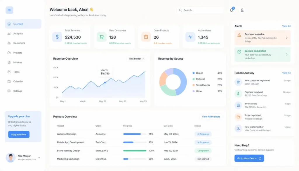
Modern UI/UX Pastel Palettes
Functional pastels built for interfaces, soft enough to sit behind content all day, distinct enough to communicate state.
| Swatch | Color Name | Hex Code | Best Use Case |
| Interface Lavender | #E6E0F8 | App background for low-eye-strain UI | |
| Action Blue | #A7C7E7 | Primary buttons and calls-to-action | |
| Success Mint | #B5EAD7 | Confirmation states and positive alerts | |
| Alert Peach | #FFD8B1 | Warning banners and non-critical notices | |
| Neutral Cloud | #F0F0F3 | Card backgrounds and dashboard base | |
| Focus Periwinkle | #C7CEEA | Input field highlights and active states |
Pastel Branding & Logo Palettes
Pastel systems built for brand recognition across skincare, fintech, sustainability, and lifestyle categories.
| Swatch | Color Name | Hex Code | Best Use Case |
| Signature Rose | #F2C6C2 | Beauty and skincare brand identity | |
| Trust Sky | #BFD8E5 | Fintech and healthcare logo systems | |
| Growth Sage | #C0D6C0 | Sustainable and eco brand marks | |
| Playful Lilac | #D9C6E0 | Children’s product branding | |
| Warm Apricot | #F6D6BE | Food and lifestyle brand palettes |
How to Build Your Own Pastel Color Palette
Every combination above is a starting point, most brands eventually need a custom pastel palette tuned to a specific hue. Here’s a practical workflow:
- Pick a base hue, start with your brand’s core color at full saturation.
- Lighten and desaturate, push lightness to 75–90% and saturation to 25–50% in HSL to create the tint.
- Test harmony relationships, run your new tint through a free color palette generator to preview monochromatic, analogous, and complementary variations instantly.
- Pull from real references, if you already have a mood board, fabric swatch, or brand photo, pick color from image to extract exact pastel hex values instead of eyeballing them.
- Convert between formats, most design tools need hex, but developers often need RGB or CMYK for print; a color converter handles the translation without manual math.
- Lock in 4–6 colors, a workable pastel system usually needs one dominant tint, two supporting tints, and one or two deeper accent colors reserved for text and buttons.
Accessibility & Contrast: Making Pastels Work for Everyone
Pastel palettes have a well-documented accessibility problem: two light colors placed next to each other rarely clear the 4.5:1 contrast ratio WCAG AA requires for body text. The fix isn’t abandoning pastels, it’s pairing them correctly. Reserve your lightest pastels for backgrounds only, never for text on a similarly light surface. Pair each pastel background with a darker, desaturated version of the same hue (or true charcoal) for all copy.
Before publishing a pastel-based design, run your background-and-text pairs through a free color contrast checker to confirm you’re clearing AA or AAA thresholds. It’s also worth testing your palette against a color blindness simulator, since pastel greens, pinks, and yellows can look nearly identical to users with deuteranopia or protanopia, a five-minute check that prevents a redesign later.
Trending Pastel Palettes for 2026
Pastel trends move in roughly five-to-seven-year cycles, and 2026’s direction leans toward warmer, slightly higher-saturation pastels, think butter yellow, peach, and sage, replacing the cooler, almost-grey pastels that dominated the early 2020s. Dusty, “muted” pastels like mauve, olive, and warm taupe are also gaining traction in branding as an alternative to the brighter, candy-toned pastels that peaked in UI design a few years ago. If you’re building a palette meant to feel current rather than nostalgic, lean toward the warmer end of the spectrum in the Minimalist Modern and Branding tables above.
Frequently Asked Questions
What is a pastel color palette?
A pastel color palette is a coordinated set of light, low-saturation colors, typically 70%+ lightness and under 55% saturation in HSL, created by mixing a base hue with white. Common examples include baby blue, blush pink, mint green, and lavender.
What hex codes are considered pastel colors?
Any hex code that converts to roughly 70-95% lightness and 20-55% saturation in HSL generally reads as pastel. Reliable examples include #F7CAC9 (blush pink), #B2C8B2 (sage green), #C9DDE4 (powder blue), and #FDFD96 (butter yellow), all featured in the tables above.
What colors go well together in a pastel palette?
Pastels follow the same color-wheel relationships as saturated colors, just at lower intensity. Monochromatic tints of one hue create a cohesive look, analogous neighbors like blush, peach, and butter yellow add warmth, and soft complementary pairs like lavender and butter yellow create gentle contrast.
Are pastel colors accessible for web and UI design?
Pastel backgrounds are accessible when paired correctly, use them behind content rather than as text color on a similarly light surface, and pair each pastel with a darker anchor color for type. Always verify contrast ratios with a contrast checker before shipping a design.
How do I turn any color into a pastel shade?
Convert the color to HSL, keep the hue the same, then raise lightness to roughly 80-90% and lower saturation to 25-45%. Most color palette generators and converters handle this automatically from a hex code input.