A strong halloween color palette is the difference between a design that reads as generic autumn branding and one that immediately signals spooky season. For designers and developers building seasonal campaigns, UI themes, or social graphics, the right combination of orange, black, purple, and their supporting hues does more than set a mood, it drives click-through rates, reinforces brand recognition, and keeps accessibility standards intact. This guide breaks down the exact hex codes, color theory principles, and palette variations professionals use, plus how to generate, extract, and test your own Halloween color scheme in minutes.
What Makes a Great Halloween Color Palette?
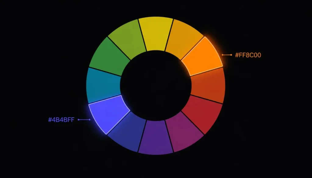
Every effective halloween color palette is built on a deliberate application of color theory, not hex codes pulled from memory. Halloween’s signature look, pumpkin orange against midnight black, works because orange sits near-complementary to blue-violet on the color wheel, creating the high contrast that makes festive and horror graphics pop against dark backgrounds.
Understanding where these hues sit relative to each other lets you swap in variations (deep purple, blood red, acid green) without breaking the contrast that makes the palette recognizable. If you’re unfamiliar with how complementary, analogous, and triadic relationships work, our color theory wheel breaks down the wheel visually before you start pulling hex codes.
The Classic Halloween Color Palette: Core Hex Codes
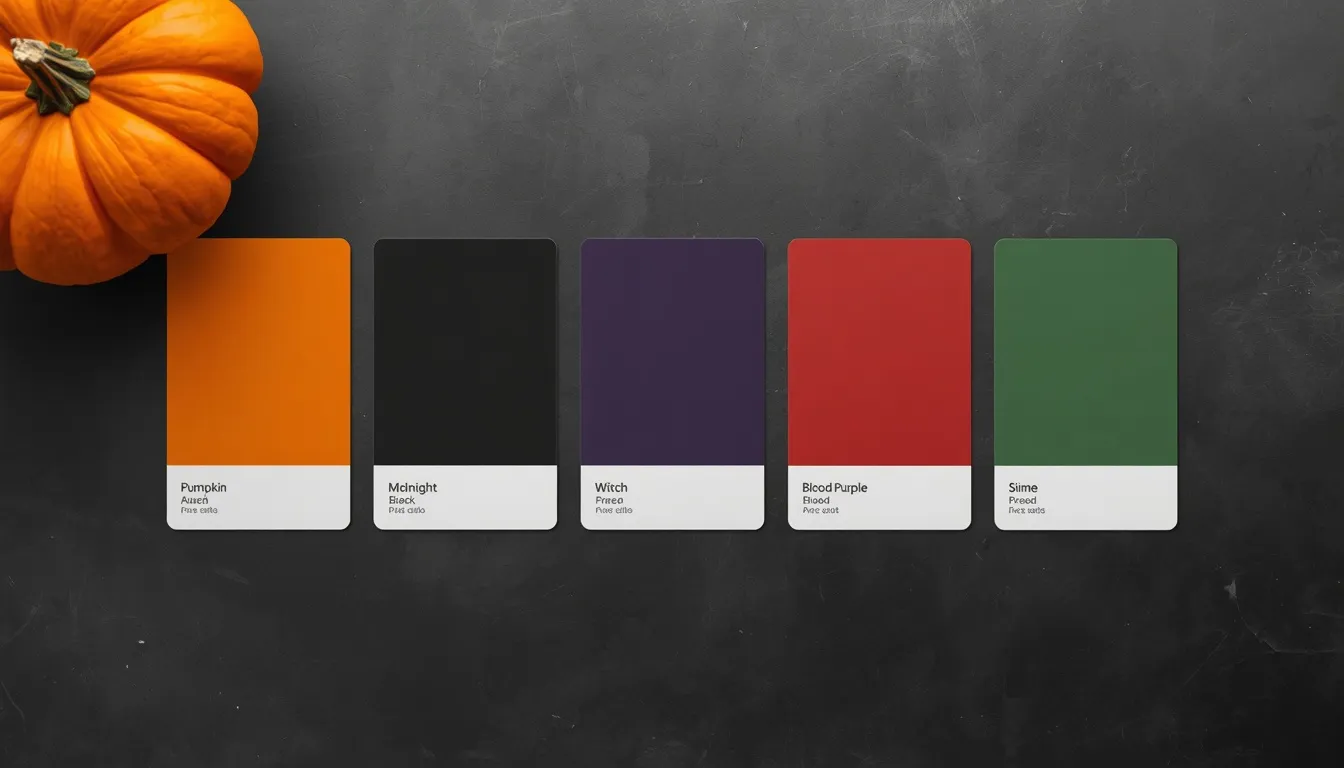
These five hex codes form the backbone of nearly every professional halloween color palette. They’ve been refined for consistent use across both screen (RGB) and print (CMYK-safe) output:
| Color Name | HEX | RGB | Role in Palette |
| Pumpkin Orange | #FF7518 | 255, 117, 24 | Primary / dominant hue |
| Midnight Black | #0D0D0D | 13, 13, 13 | Background / base |
| Witch Purple | #6A0DAD | 106, 13, 173 | Secondary accent |
| Blood Red | #4C0027 | 76, 0, 39 | Depth / shadow accent |
| Slime Green | #39FF14 | 57, 255, 20 | Highlight / CTA pop |
Pumpkin orange and midnight black alone will carry most designs, but adding witch purple as a secondary accent and slime green as a sparing highlight color gives you room to differentiate CTAs, hover states, and section dividers without introducing a sixth or seventh hue.
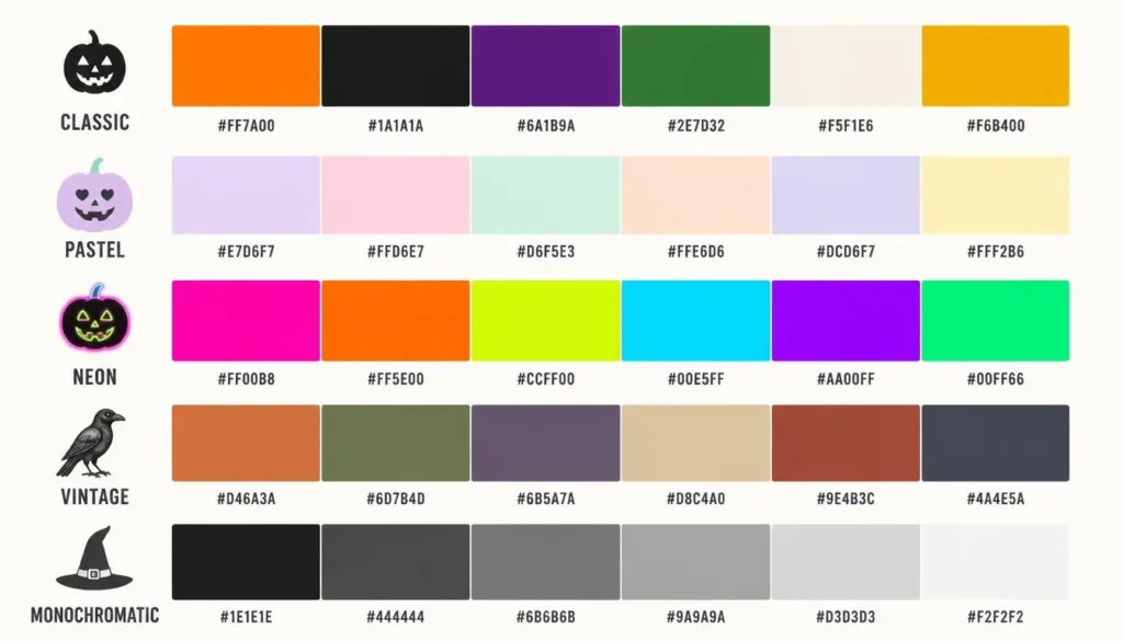
5 Halloween Palette Variations for Every Design Style
1. Classic Pumpkin & Midnight
- #FF7518, pumpkin orange (primary)
- #0D0D0D, midnight black (background)
- #6A0DAD, witch purple (accent)
- #FFFFFF, white (text/contrast)
The default choice for candy brands, event pages, and anything that needs to read as “Halloween” at a glance.
2. Pastel Halloween (Trending Soft Palette)
- #F4A261, dusty pumpkin
- #2A2A3B, soft charcoal
- #B497BD, lilac
- #6B8F71, sage
Muted, dusty versions of the classic palette have become one of the fastest-growing halloween color palette variations, especially for lifestyle brands and children’s content that want festive without feeling gothic.
3. Neon / Glow-in-the-Dark Halloween
- #39FF14, slime green
- #FF00FF, neon magenta
- #0D0D0D, black base
- #FFEA00, electric yellow
Built for digital-first content, social stories, streaming overlays, and app themes, where saturated hues need to survive screen glare and small thumbnails.
4. Vintage / Retro Halloween
- #C97C3D, burnt sienna
- #4A403A, aged brown-black
- #8A9A5B, olive
- #D8C3A5, cream
A warmer, desaturated take that mimics faded mid-century illustration work, popular in editorial and print-style branding.
5. Monochromatic Black Halloween (Minimalist)
- #000000, #1A1A1A, #333333, tiered blacks and greys
- #FF7518, single orange accent
One dominant neutral carried through multiple tints and shades, with a single accent color doing all the work. This is the safest choice when contrast and accessibility are non-negotiable, since you’re managing far fewer color relationships.
Halloween Color Psychology: Why Orange, Black & Purple Work
Color psychology in UX and marketing research consistently associates orange with energy, warmth, and approachability, which is exactly why it dominates Halloween candy packaging and event branding rather than feeling threatening on its own. Black communicates mystery and sophistication, purple signals the supernatural and luxury, and small doses of green or red introduce urgency or unease. The meaning of colors in marketing isn’t folklore, it’s why a checkout button in slime green or blood red will outperform the same button in a muted neutral during a Halloween promotion, simply because it interrupts the visual pattern the rest of the palette establishes.
How to Build Your Own Halloween Color Palette in Minutes
You don’t need to eyeball hex codes from inspiration images. A color palette generator lets you lock in one base hue, say, pumpkin orange, and instantly generate complementary, triadic, or monochromatic variations without breaking the underlying color theory. If you already have Halloween artwork, packaging, or a reference photo you want to match, you can pick color from image and pull the exact hex codes it contains, rather than guessing at values by eye.
Applying Your Halloween Palette to Web & UI Design
Once you’ve settled on hex codes, the harder job is applying them consistently across a UI without creating accessibility problems. Dark-mode Halloween themes are especially prone to low-contrast text, since designers lean on black backgrounds and forget that orange-on-black or purple-on-black can fall below the minimum readable ratio for body copy. Reserve your highest-contrast pairing, typically pumpkin orange or white on midnight black, for primary text and CTAs, and push lower-contrast combinations (purple on black, green on dark grey) to decorative elements only.
Accessibility Checklist: Contrast & Color Blindness for Halloween Designs
Halloween palettes lean heavily on red-green and orange-purple pairings, which are exactly the combinations that cause problems for readers with common forms of color blindness. Before shipping any Halloween-themed page, run your foreground and background pairs through a color contrast checker to confirm you’re hitting at least a 4.5:1 ratio for body text (3:1 for large text), and check how the palette reads for common color-blindness types, not just how it looks to you. Two quick fixes cover most cases: never rely on red versus green alone to convey meaning, and keep pure black text off pure-saturated backgrounds, since the vibration between them reduces readability for everyone.
Halloween Palette Ideas by Project Type
- Web & landing pages: dark base, pumpkin-orange CTAs, purple hover states
- Branding & packaging: pumpkin orange and witch purple as the core brand pair, black for typography
- Print & party invites: warmer, CMYK-safe versions of the palette to avoid dull print output
- Social & story graphics: the neon variation for scroll-stopping contrast on mobile screens
- Games & apps: monochromatic or vintage variation depending on tone (horror versus nostalgic)
Halloween Color Trends Emerging for 2026
Three directions are showing up repeatedly in current seasonal design work: a move toward the pastel, dusty palette described above for lifestyle and family brands; a parallel push toward high-saturation neon palettes for short-form video and app content; and continued use of the classic orange-black-purple combination for anything positioning itself as authoritative or established. Rather than chasing a single “palette of the year,” the more durable approach is picking the variation that matches your brand’s existing tone and staying consistent with it across the season.
Frequently Asked Questions
What are the best Halloween color palette hex codes?
The most reliable starting hex codes are Pumpkin Orange (#FF7518), Midnight Black (#0D0D0D), Witch Purple (#6A0DAD), Blood Red (#4C0027), and Slime Green (#39FF14). This five-color set covers a dominant hue, a dark base, a secondary accent, and two highlight colors for CTAs or decorative details.
What colors are traditionally used for Halloween design?
Orange and black form the traditional core, historically tied to harvest season (orange) and night or death (black). Purple and green are common secondary additions representing the supernatural and monster themes, while red appears as a smaller accent for danger cues.
How do I choose a website color scheme for Halloween?
Start with one dominant color, one dark neutral for backgrounds, and a single accent for CTAs, and resist adding a fourth or fifth hue until the first three are working. Test every text and background pairing against WCAG contrast minimums before launch, since dark, saturated Halloween themes fail accessibility checks more often than standard brand palettes.
What’s the difference between a monochromatic and complementary Halloween palette?
A monochromatic Halloween palette uses tints and shades of a single hue, such as multiple blacks and greys, which reads as minimal and is easier to keep accessible. A complementary palette pairs hues from opposite sides of the color wheel, typically orange and purple or blue-violet, for a higher-contrast, more traditional Halloween look, but it requires more careful contrast testing.
Whether you’re designing a single seasonal landing page or a full Halloween product line, the palette above gives you a tested starting point rather than a guess. Lock in your hex codes, run them through an accessibility check, and adjust saturation before you commit a full brand system to any single variation, Halloween palettes date faster than most, and the ones built on solid color theory are the ones that hold up past October.