Roughly 1 in 12 men and 1 in 200 women live with some degree of color vision deficiency, yet most digital products are still designed as though everyone sees color identically. A color blindness simulator closes that gap: it lets designers, developers, and marketers preview exactly how protanopia, deuteranopia, tritanopia, and achromatopsia change the appearance of a palette, logo, chart, or full webpage, before it ever reaches a real user. Whether you’re auditing a dashboard, testing a call-to-action button, or validating a brand’s hex codes, running your work through a color blindness simulator online is one of the fastest ways to catch accessibility failures that standard design reviews miss entirely.
This guide breaks down how color vision deficiency actually works, how simulation tools model it, and how to apply the results to build interfaces that meet WCAG 1.4.1 and hold up for every visitor, not just the ones with typical color vision.
What Is Color Vision Deficiency (CVD)?
Quick Answer
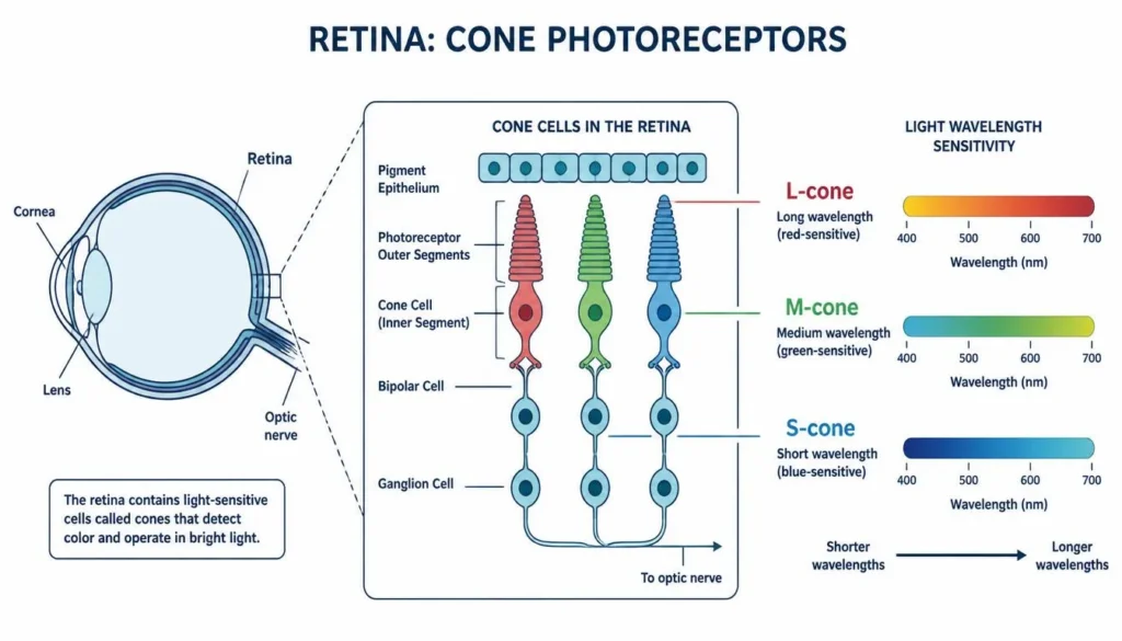
Color vision deficiency (CVD), commonly called color blindness, occurs when one or more of the eye’s three cone cell types (L-cones, M-cones, S-cones) don’t function typically, reducing the ability to distinguish certain color pairs. It affects roughly 300 million people worldwide, most commonly involving red-green confusion.
Typical human color vision is trichromatic: three types of cone cells in the retina each respond to a different range of light wavelengths, long (L-cones, red-sensitive), medium (M-cones, green-sensitive), and short (S-cones, blue-sensitive). The brain compares signals from all three to construct the full color spectrum we perceive. Color vision deficiency occurs when one cone type is missing entirely (dichromacy), shifted in sensitivity (anomalous trichromacy), or, in rare cases, when all three are absent (monochromacy). The result isn’t seeing in black and white for most people with CVD, it’s a narrower, often overlapping color range that makes specific hue pairs genuinely hard to tell apart.
Types of Color Blindness Explained
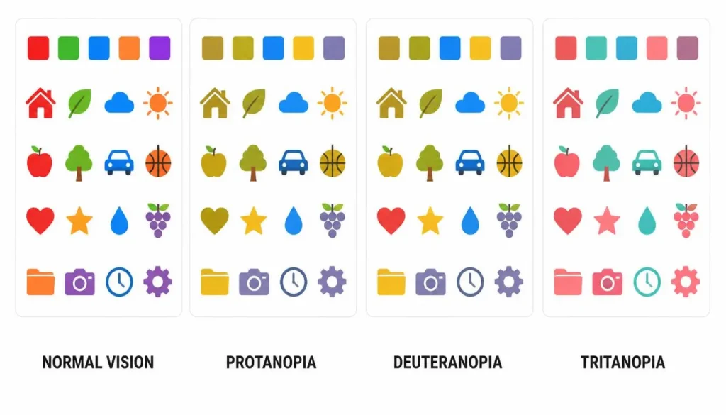
Not all color blindness looks the same, and a one-size-fits-all accessibility fix rarely works. Here’s how the four major types differ:
Protanopia
Protanopia results from a missing or non-functioning L-cone. Reds appear darker and muted, often shifting toward black or dark grey, and can be confused with dark greens or browns.
Deuteranopia
Deuteranopia, caused by an absent M-cone, is the most common form of color blindness. It produces significant red-green confusion, which is why building a reliable deuteranopia color palette, one that leans on blue-orange contrast instead of red-green, is one of the highest-impact accessibility fixes a design team can make.
Tritanopia
Tritanopia is far rarer and involves a missing S-cone, causing blue-yellow confusion instead of red-green. Because it’s so uncommon, many teams skip testing for it entirely, running a dedicated tritanopia simulator pass over a palette before launch closes that blind spot.
Achromatopsia
Achromatopsia is a rare, more severe condition affecting all three cone types, resulting in little to no color perception and heightened light sensitivity. Interfaces should remain fully usable in pure greyscale for this group.
| Type | Affected Cone | Prevalence | What They Perceive |
| Protanopia | L-cone (red) absent | ~1% of men | Reds appear darker and can be confused with black or green |
| Deuteranopia | M-cone (green) absent | ~1% of men, most common form | Reds, greens, and browns are difficult to tell apart |
| Tritanopia | S-cone (blue) absent | Fewer than 1 in 10,000 | Blues and yellows are confused; purples can look pink |
| Achromatopsia | All cone types affected | Extremely rare (~1 in 30,000) | Little to no color perception; the world appears in shades of grey |
How a Color Blindness Simulator Works
Simulation tools work by mathematically transforming an image or palette’s RGB values through models (such as the Brettel and Viénot algorithms) that approximate how each CVD type processes color, then rendering the adjusted result so you can see what a colorblind user would actually see, without needing to guess.
Most free tools only let you test one swatch at a time, which makes auditing a full brand palette or live page painfully slow. Color Scheme Calculator’s color blindness simulator was built to close that exact gap: it supports multi-swatch simulation, so you can load an entire palette and preview every color simultaneously across protanopia, deuteranopia, tritanopia, and achromatopsia, plus full image and URL inspection, so you can upload a screenshot or paste a live webpage link and simulate the complete design in context, not just an isolated color chip.
Why Color Blindness Simulation Matters for Accessible Design
The consequences of skipping this step show up constantly in real products: analytics dashboards that rely on red/green trend lines, form fields that flag errors in red text alone, and CTA buttons that visually disappear into their background for a meaningful share of users. Beyond the usability cost, there’s a growing compliance one, ADA, the European Accessibility Act, and Section 508 all point back to WCAG as the technical standard, and color-only signaling is one of the most common audit failures.
This is where WCAG 1.4.1 (Use of Color) comes in: it requires that color is never the only visual means of conveying information, indicating an action, or distinguishing an element. Contrast ratios are the other half of the equation, WCAG AA requires at least 4.5:1 for normal text and 3:1 for large text and UI components. Before you rely on a color pairing anywhere in your product, run it through a free color contrast checker to confirm it clears the threshold, simulation shows you the perceptual problem, and a contrast checker tool gives you the number to prove it’s fixed.
WCAG 1.4.1 (Use of Color), Compliance Checklist
Actionable Checklist for Designers & Developers
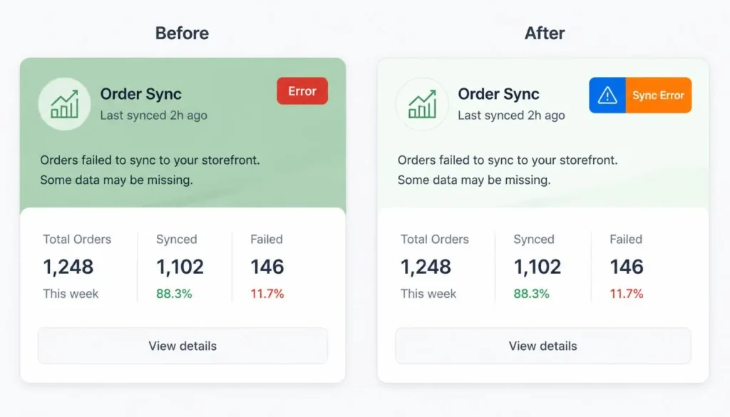
- Never use color alone to indicate state, pair error, success, and warning colors with an icon or text label
- Maintain minimum WCAG AA contrast ratios: 4.5:1 for body text, 3:1 for large text and UI components
- Run every palette through an ADA compliant color checker and a color blindness simulator before development, not after launch
- Avoid red/green-only status indicators in charts, graphs, and form validation, add shape, pattern, or direct labels
- Build a color blindness simulator online check into your design QA checklist alongside standard browser testing
- Label data points and legends directly instead of relying solely on a color-coded key
Designing Accessible Color Palettes for Every Vision Type
Building an accessible color palette starts earlier than most teams think, in the palette-creation stage, not the QA stage. A few practical rules:
- Prioritize luminance (brightness) differences over hue differences, brightness contrast survives most forms of CVD even when hue perception doesn’t.
- For a deuteranopia-safe palette, favor blue-orange combinations over red-green wherever the two colors need to be distinguished at a glance.
- For call-to-action buttons, blue and orange read reliably across nearly all CVD types; avoid placing a red button on a green background or vice versa.
- Pair color-coded data visualizations with textures, icons, or direct labels so the information survives even in greyscale.
- Test brand and UI kit colors early using an accessible color palette generator so accessibility is baked into the palette rather than patched on afterward.
Web safe colors were once the go-to shorthand for “safe” design choices, but that 216-color standard was built for old display hardware, not human vision, modern accessible design is about contrast and luminance, not a legacy hex list.
Applying This to UI/UX Design Systems
At the design-system level, a UI color palette needs to work as a set of accessible tokens, not just a mood board. When defining a UI/UX color palette, document each token’s approved use case (text, background, status, interactive state) alongside its contrast ratio against the surfaces it will sit on, including dark mode variants, which often quietly fail contrast checks even when the light-mode version passes.
Color psychology in UX design, the idea that blue reads as trustworthy or red signals urgency, is worth understanding, but it should never override accessibility. A visually “on-brand” red-on-green error state is still a failed error state for a meaningful share of your users. Use complementary and analogous color theory to find pairings that are both harmonious and perceptually distinct.
Tools & Techniques Beyond Simulation
A color blindness simulator is most powerful as part of a small toolkit, not a standalone check:
- Use a pick color from image tool to extract exact hex values from a photo, screenshot, or brand asset before testing them for accessibility.
- Cross-check every extracted or generated palette against WCAG contrast ratios, not just visual instinct.
- Re-run the simulator any time a palette, chart color, or button state changes, accessibility isn’t a one-time audit.
Together, these tools turn accessible design from a final-stage compliance task into a habit that’s built into the design process from day one.
Frequently Asked Questions
What does a color blindness simulator do?
A color blindness simulator recolors an image, palette, or webpage to show how it appears to someone with protanopia, deuteranopia, tritanopia, or achromatopsia, helping designers catch accessibility issues before launch.
What’s the difference between protanopia, deuteranopia, and tritanopia?
Protanopia and deuteranopia both cause red-green confusion but involve different cone cells, while tritanopia causes blue-yellow confusion and is far rarer. Deuteranopia is the most common form of color blindness overall.
Is color blindness simulation the same as a contrast checker?
No. A contrast checker measures the numeric luminance ratio between two colors against WCAG thresholds, while a color blindness simulator visually shows how colors are perceived with CVD. Accessible design typically relies on both together.
How do I make my website ADA compliant for color blindness?
Never rely on color alone to convey information, maintain WCAG-compliant contrast ratios throughout, and test every palette with a color blindness simulator and contrast checker during design QA rather than after launch.
Can color blind users use dark mode more easily?
Dark mode doesn’t fix color blindness, but a well-designed dark palette with strong luminance contrast can be easier to read for some users with CVD than a poorly contrasted light theme, luminance still matters more than the color scheme itself.
Conclusion
Accessible color isn’t a final polish step, it’s a design requirement for the roughly 300 million people worldwide living with some form of color vision deficiency. Running your palettes, charts, and UI through a color blindness simulator before launch is one of the simplest ways to catch failures that standard design reviews miss, and pairing it with a contrast check keeps your product on the right side of WCAG 1.4.1. Try Color Scheme Calculator’s free color blindness simulator now to preview your entire palette, or a live URL, across every major vision type in seconds.