A retro color palette does more than decorate a design, it transports the viewer to a specific decade in half a second, using nothing but hue and contrast. Whether you’re chasing the burnt-orange nostalgia of the 1970s, the neon overload of the 1980s, or the muted comfort of Mid-Century Modern interiors, the right retro color palette turns a flat design into a mood. This guide breaks down real, ready-to-use hex codes for every major retro era, explains the color theory that makes each palette work, and shows you exactly how to build your own vintage-inspired scheme for web or print.
What Is a Retro Color Palette?
A retro color palette is a curated set of colors, typically four to six hues, that recreates the hue, saturation, and undertone trends of a past design era, most often the 1950s through the 1990s. Unlike a random assortment of “old-looking” colors, an authentic retro color palette pulls from real material and print references of its decade: appliance enamel, vinyl record sleeves, packaging dye lots, and printed ephemera. That’s why an accurate 70s palette leans warm and muted, while an 80s palette leans saturated and cool-bright.
Why Retro Colors Feel Nostalgic
Color triggers memory faster than shape or typography, because the brain processes hue before it processes detail. A muted mustard yellow or a burnt orange doesn’t just look “old”, it visually matches the actual dye technology, paint chemistry, and printing limitations of its decade, so the brain files it under a specific era almost instantly. Designers use this shortcut deliberately: pairing period-accurate undertones with a modern layout creates instant emotional recognition without needing any literal retro imagery.
70s Earth Tone Retro Color Palette
The 1970s color story is warm, muted, and grounded in nature, avocado greens, harvest golds, and burnt oranges dominated everything from kitchen appliances to album covers.
| Color | Color Name | Hex Code | Best Use |
| Avocado Green | #568203 | Backgrounds, section dividers | |
| Harvest Gold | #DA9100 | Buttons, call-to-action elements | |
| Burnt Orange | #CC5500 | Headlines, highlights | |
| Chocolate Brown | #4E3524 | Body text, borders | |
| Butter Cream | #F3E5AB | Base background |
Retro 80s Color Palette: Neon Edition
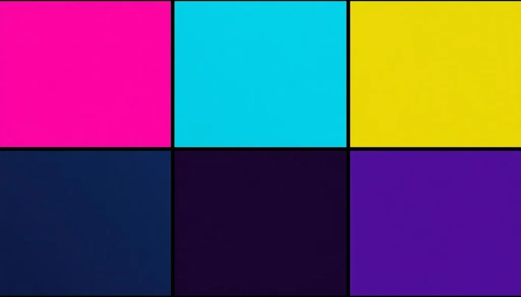
A retro 80s color palette trades earthy warmth for maximum saturation, hot pink, electric blue, and neon yellow, usually anchored by black or a deep violet to keep the brightness readable rather than overwhelming.
| Color | Color Name | Hex Code | Best Use |
| Hot Pink | #FF69B4 | Primary accent | |
| Electric Blue | #1F51FF | Secondary accent, gradients | |
| Neon Yellow | #FFFF33 | Highlights, CTA text | |
| Vivid Violet | #9D00FF | Gradient pairing | |
| Rich Black | #0D0D0D | Background, body text |
90s Grunge & Jewel Tone Retro Palette
The 90s pulled design in two directions at once: flannel-inspired grunge neutrals and deep jewel tones borrowed from velvet and denim. Mixing both gives an authentic, layered 90s color story instead of a single flat mood.
| Color | Color Name | Hex Code | Best Use |
| Deep Maroon | #722F37 | Headlines | |
| Forest Green | #013220 | Backgrounds | |
| Mustard Yellow | #E1AD01 | Accents | |
| Denim Blue | #2A4B7C | Secondary elements | |
| Off-Black | #1C1C1C | Body text |
Mid-Century Modern Retro Palette (Bonus: 50s–60s)
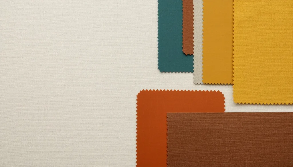
Mid-Century Modern design, roughly 1945–1969, favors clean, slightly muted colors that read as sophisticated rather than loud, teal, mustard, and burnt sienna set against warm neutrals.
| Color | Color Name | Hex Code | Best Use |
| Teal | #007A74 | Primary color | |
| Mustard Yellow | #E3B505 | Accent | |
| Burnt Sienna | #E97451 | Secondary color | |
| Walnut Brown | #5C4033 | Text, borders | |
| Cream | #FFF8E7 | Background |
Applying the 60-30-10 Rule to Vintage Palettes
The 60-30-10 rule keeps any retro color palette from feeling chaotic: 60% dominant color, usually the neutral or muted base; 30% secondary color; and 10% accent color reserved for calls-to-action or highlights. Applied to an 80s neon palette, black or deep violet takes the 60% role, electric blue takes 30%, and hot pink is saved for just the 10% accent, a button, an icon, or a single headline word. For a deeper breakdown of proportion-based color pairing, see the color palette best practices guide.
Warm vs. Cool Undertones in Retro Design
Every retro decade leans warm or cool, and mixing the two by accident is the fastest way to break the illusion. 70s and Mid-Century palettes lean warm, yellow, orange, and brown undertones. 80s and most 90s jewel tones lean cool, blue, purple, and teal undertones. Complementary pairing can bridge the two intentionally: a warm burnt orange offset with a cool teal accent creates a deliberate “retro-futurism” mashup, but that relationship needs to be exact, not accidental. Check the precise complementary and undertone relationships on the color theory wheel before locking a palette in.
How to Build Your Own Retro Color Palette
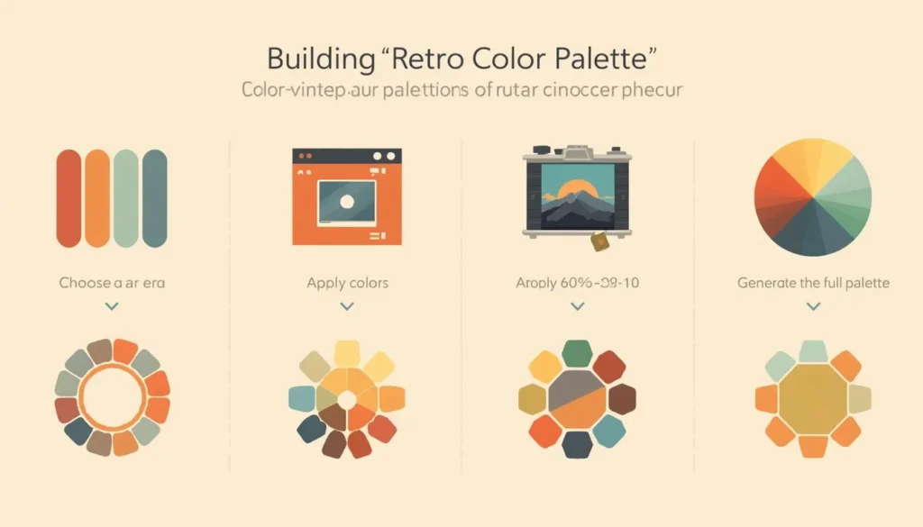
Follow this four-step workflow to go from a vague decade in your head to a finished, usable hex palette.
Step 1: Choose a Reference Era and Mood
Pick a specific decade or sub-style rather than “retro” in general, 70s earth tones and 80s neons produce opposite emotional results, so the choice sets the direction for every color decision that follows.
Step 2: Pull Colors From a Real Vintage Source
Instead of guessing at hex codes, extract them directly from an actual vintage photo, book cover, or product package. Upload the reference image and pick color from image to get exact, period-accurate hex values instead of approximations.
Step 3: Apply the 60-30-10 Rule
Sort your extracted colors into dominant, secondary, and accent roles before you touch a layout. This single step prevents the most common retro-palette mistake: letting every color compete for the same 10% of attention.
Step 4: Generate the Full Supporting Palette
Once you have two or three anchor colors, run them through a color palette generator to automatically fill out tints, shades, and a complementary accent, turning three hand-picked hex codes into a complete, production-ready palette.
Applying Retro Palettes to Modern Web and Graphic Design
A retro color palette can clash with modern accessibility standards if it’s used carelessly, many neon and jewel-tone combinations fail contrast minimums when used for body text. Keep saturated retro colors in accent roles such as buttons, icons, and borders, and use a near-black or near-white for actual reading text. Retro palettes also translate well into gradients: pairing hot pink into electric blue recreates the synthwave look that’s become popular again in current web and app design.
Retro Color Palette FAQ
What is a good retro color palette?
A good retro color palette uses four to six colors pulled from a specific decade’s real materials, appliance enamel, packaging, or textiles, rather than random “old-looking” colors. The 70s earth-tone palette (avocado green, harvest gold, burnt orange) and the 80s neon palette (hot pink, electric blue, neon yellow) are two of the most reliable starting points.
What colors were popular in the 1980s?
1980s design favored highly saturated, high-contrast colors: hot pink, electric blue, neon yellow, and vivid violet, almost always set against black or white to keep the saturation readable. This combination is often called a retro 80s color palette or a synthwave palette.
How do I make a vintage color palette?
Start by picking a single decade rather than “vintage” broadly, then extract two or three anchor hex codes from a real reference image from that era. Apply the 60-30-10 rule to balance the colors, then use a color palette generator to fill out the supporting tints and shades.
What’s the difference between retro and vintage color palettes?
Retro describes design that deliberately imitates the style of a past era using modern tools, while vintage describes colors and objects that are genuinely from that period. In practice, “retro color palette” and “vintage color palette” are used interchangeably, both describing period-accurate hues recreated for current use.
What color palette works best for Mid-Century Modern design?
Mid-Century Modern design, roughly 1945 to 1969, pairs muted teal, mustard yellow, and burnt sienna against warm neutrals like walnut brown and cream, avoiding both the high saturation of the 80s and the very dark tones of the 90s.
Final Thoughts
A strong retro color palette really comes down to one repeated color-theory decision: pick a decade, respect its undertone, and hold the 60-30-10 balance. Whether you land on full 80s neon or a quieter Mid-Century palette, start with the hex codes above, extract your own from a real reference image, and generate the full supporting palette before you ship the design.